• Procreate Tutorial: How to Create Lettering Textures and Brushes

    Procreate Tutorial: How to Create Lettering Textures and Brushes

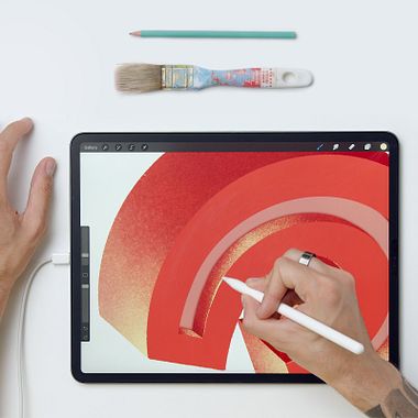
    Learn how to create your own brushes and textures from scratch for digital lettering projects, with Jimbo Bernaus Messages can communicate more than just words when they’re styled with beautiful, standout lettering. That’s why Procreate is such a great tool for digital lettering artists, offering a range of brushes with different textures. If you want to create something a little different and uniquely yours, you can make your own Procreate brushes from scratch. Jimbo Bernaus (@jimbobernaus) is a graphic designer and lettering artist whose clients include BMW and Carlsberg. Working from his studio in Croatia, Jimbo often incorporates his bold and lively lettering into colorful illustrations. Join him in this step-by-step tutorial as he shows you how you can create your own Procreate brushes using just a photo.

  • 5 Free Lettering Tutorials for Perfectionists

    5 Free Lettering Tutorials for Perfectionists

    Discover excellent professional resources, and be inspired by the styles of great lettering artists You can express yourself through lettering and challenge the rules of creativity. Furthermore, while you learn this discipline, you have many opportunities to experiment with different techniques, styles, and processes. When you’re working on your lettering design, you’ll find yourself wanting to look for perfection. This is normal, and it means you are developing your skills. As for all creative fields, you get to say what you want to achieve.

  • Free Procreate Brushes for Lettering

    Free Procreate Brushes for Lettering

    Add personality and style to your lettering strokes by using this free set of eleven brushes In digital lettering, learning how to use different brushes and having a deep understanding of your software (like Procreate) can really boost your creativity. The combination means you can design letters with lots of personality and high precision. Graphic designer Eduardo Mejía (@eduardograph) specializes in branding and lettering, he experiments with digital brushes to add different textures to his works and try out various compositions.

  • Arabic Calligraphy Tutorial: Basics for Beginners

    Arabic Calligraphy Tutorial: Basics for Beginners

    Learn step-by-step the basics for writing in this ancient Arabic script style, with Joumana Medlej Born during the Islamic Golden Age, Kufic script is the earliest invented style of Arabic calligraphy and is prized for its beautiful compositions and the harmony of its lines and forms. Calligraphy artist Joumana Medlej (@majnouna) helps keep this ancient practice alive by sharing the often meditative process for creating these characters. In this tutorial she shows you how you can begin making the basic shapes you’ll need to start building letters and words. She also shares tips for how to warm up your hand, and advises against common mistakes.

  • Free Illustrated Typography Glossary for Beginners

    Free Illustrated Typography Glossary for Beginners

    Discover typography and lettering terms such as stem, serif or spine and learn how to identify them in other languages Unlike calligraphy, the practice of lettering does not follow predetermined patterns or rigorous standards. Although it follows, in some cases, a typographic basis, the act of drawing letters goes through a freer and more spontaneous creation. To create your own letterings, therefore, it is necessary that you have knowledge of typographic terminology to understand where and how you can innovate to create new combinations. After all, the possibilities are endless for you to test and experiment by combining manual and digital techniques.

  • Get Inspired by These 7 Incredible Female Typographers

    Get Inspired by These 7 Incredible Female Typographers

    Discover these stereotype-defying women and their creations It's a well-known problem. History often forgets, ignores, or downright omits women's contributions to the field of typography. From their role in developing the first printing presses to the design of modern-day typesets, great women have always stood out in the design world, creating beautiful fonts we commonly use now. Here are 7 of those women who have shaped this fascinating discipline throughout history. Zuzana Licko Czech Republic / United States Notable fonts: Mrs. Eaves, Philosophy, Lo-Res. Zuzana cofounded Emigre Graphics in the 80s, famous for publishing a magazine with the same name dedicated to typography. One of the firsts to adopt the Macintosh, her company is dedicated to traditional and experimental fonts. Five of her fonts now belong to the MoMA design collection, and you can use them in your projects if you have an Adobe license. Find them here.

  • 36 Days of Type 2021: This Challenge Pushes the Boundaries of Letter and Number Design

    36 Days of Type 2021: This Challenge Pushes the Boundaries of Letter and Number Design

    From April 5 to May 10, this challenge invites you to design a letter or number every day for 36 consecutive days 36 Days of Type is the challenge par excellence that explores the graphic possibilities of the letters and numbers in the Latin alphabet. For the eighth edition, represented by the color orange, letter lovers, designers, illustrators, and graphic artists from all over the world will create and share one letter or number a day for 36 days, from April 5 to May 10.

  • Curious Minds Podcast: Why Do People Hate Comic Sans?

    Curious Minds Podcast: Why Do People Hate Comic Sans?

    Listen here to our first podcast episode, dedicated to the world’s most hated font Curious Minds is an original podcast by Domestika that explores the curiosities and untold histories of the creative world. Each week we’ll bring you a new episode, interviewing experts and creatives as we dive into the unusual origins of the images, patterns, and designs we take for granted. Subscribe for free on Apple Podcasts, Spotify, or your favorite podcast app to never miss an episode.

  • Lettering, Calligraphy, and Typography: Do You Know the Differences?

    Lettering, Calligraphy, and Typography: Do You Know the Differences?

    These three concepts all refer to disciplines involving letters, which is perhaps the only thing they really have in common Creating letters is a whole world, and it is not surprising that people who are not fully familiar with this field have some doubts. In this blog post, we take a look at what exactly is lettering, calligraphy, and typography, and the differences between them. We describe the characteristics of each discipline and show examples to help you recognize which is which. Hopefully, after reading this post, you will be able to avoid any of the confusion that novice designers, or those specializing in other areas, often feel. Calligraphy

  • Why Is Calligraphy So Good for Your Brain?

    Why Is Calligraphy So Good for Your Brain?

    Discover why writing by hand with pen and paper can be extremely beneficial Ever thought of what writing by hand entails? The brain and bodily processes involved in this activity are phenomenal. The first step is to stop and focus, feel, and invoke one’s memory. Then comes planning the idea to convey to the reader by connecting with one’s intentions and emotions. Then, again, we need to build a grammatical structure from our semantic word stock. Finally, we select the graphic signs and sequence of movements that correspond to each letter so that our hand can put it together. Writing may seem like quite a tiring process, but all the benefits this exercise brings to our body, heart, and mind make it worth repeating over and over again. On International Day Of Handwriting, we spoke to Alejandra Marcos, an educational psychologist specializing in cognitive neuropsychology, and calligraphy teacher Bego Viñuela Galarraga (@caligrafiabilbao). They helped us to better understand what goes on in our brain and heart when we write by hand.

  • Bullet Journal Tutorial: Ideas To Improve Your Hand-Lettered Fonts

    Bullet Journal Tutorial: Ideas To Improve Your Hand-Lettered Fonts

    Improve your hand-lettered fonts, with bullet journal expert Annie Weir AKA A Journal by Annie A bullet journal offers a way of documenting our lives with craft, care, and calligraphy. They require us to take pride over not only what we write but how we write it. Annie Weir (@a_journal_by_annie), the bullet journalist behind the page A Journal By Annie, is an artist who uses her bullet journals to practice mindfulness every day. In this tutorial, she shares a few basic tips on how to improve your hand-lettered fonts.

  • Ed Benguiat: Stranger Things, Esquire and the 600 Creations of a Unique Typographer

    Ed Benguiat: Stranger Things, Esquire and the 600 Creations of a Unique Typographer

    A retrospective on the prolific typographer and logo designer, featuring some of his most emblematic creations Ed Benguiat (1924-2020) was an American typographer, designer, and lettering artist whose influence on the creative world is difficult to overstate. In addition to having served as associate director of Esquire magazine—whose logo he designed, he was a prestigious jazz percussionist under the name Eddie Benart, a pilot, a teacher with more than 50 years of experience, and, every now and then, he found the time to retouch some "scandalous" images in magazines.

  • Brief History of Lyric Videos in Music: Type in Motion

    Brief History of Lyric Videos in Music: Type in Motion

    Learn about the origin of music videos where typography is the protagonist The lyric videos are the music videos in which instead of seeing stories or the musicians performing the song, the main element is the typography. Since the advent of music videos, they have been a creative resource used by bands of all genres. For about a decade now, bands have often released a song with a lyric video before releasing the official one. For independent musicians, this type of video is attractive as it can be made with fewer resources than traditional productions, while fans can learn the lyrics of the songs. They have become so popular that in 2014, MTV included a lyric video category in their annual Music Video Awards. Here are some exceptional examples that truly bring the use of typography to the spirit of each song.

  • What is Calligraphy and What Materials Do I Need to Get Started?

    What is Calligraphy and What Materials Do I Need to Get Started?

    Know the fundamentals of this creative discipline and express your love for handwriting If you are passionate about letters, maybe a calligraphy artist has caught your attention. On social media, we see captivating videos of creatives creating beautiful compositions in which written messages transcend on paper. If you too want to learn this beautiful art, you've come to the right place! Discover some basic calligraphy concepts and the materials you need to start practicing right now.

  • Creating Fonts in Glyphs

    Creating Fonts in Glyphs

    What makes Glyphs the go-to program for designing and creating fonts? Juanra Pastor, better known as @Wete, is a Barcelona-based graphic designer specializing in typography. He is the founder of Wete studio and has worked on lettering, typography, and advertising projects for clients such as Adobe, Carolina Herrera, Reebok, Desigual, and LVMH. In this blog post, Juanra, who first developed a passion for letters as a 14-year-old graffiti artist, will explain the advantages of working in Glyphs when designing and creating typefaces.

  • The History of Typography: From 11th Century China to the Digital Age

    The History of Typography: From 11th Century China to the Digital Age

    Discover how, throughout history, typography has been used to communicate more than just the words it spells out Typography is sometimes easy to take for granted: you’re reading these words, absorbing their meaning, but probably aren’t paying close attention to the letterforms that compose them. Other times typography can be impossible not to notice, like when a wedding invitation is written in Comic Sans, or a sign is hard to read because of an unfortunate font choice. The history of typography is about more than how easy something is to read or write. It reveals how the design of letterforms has shaped societies and transformed the meaning of the written word. So, where did typography come from and what do typefaces have to tell us?

  • Illustrator Tutorial: 17 Essential Keyboard Shortcuts for Illustrated Lettering

    Illustrator Tutorial: 17 Essential Keyboard Shortcuts for Illustrated Lettering

    Learn essential Adobe Illustrator shortcuts that will improve your workflow when designing illustrated lettering When working with software like Adobe Illustrator, there are often commands and tools that you use frequently, making shortcuts a great way to save time and maintain your creative focus. For Birgit Palma (@birgitpalma), an illustrator and multidisciplinary designer who specializes in creating illustrated letterforms, Adobe Illustrator shortcuts are a crucial part of her workflow. In this tutorial she explains 17 important shortcuts and how they will help you when designing illustrated letterforms.

  • How to Vectorize a Lettering Design

    How to Vectorize a Lettering Design

    Learn to digitize your letters easily using Adobe Illustrator with tips and directions from Daniel Hosoya Advertising designer Daniel Hosoya (@danielhosoya) specializes in digital lettering and teaches the Domestika courses, Introduction to Lettering in Procreate and Digital Lettering with Illustrator and Photoshop. Here, he tells you how to digitize your lettering designs, an essential step if you want to work on your hand-drawn creations and turn them into more ambitious projects.

  • 5 Free Classes to Master the Brush Pen for Perfectionists

    5 Free Classes to Master the Brush Pen for Perfectionists

    Learn with 5 experts to master this tool to create attractive compositions For all the letters and drawing lovers, brush pen calligraphy is an extremely stimulating activity. Almost like an extension of your hand, it allows you to create beautiful lines for compositions that can be used in different projects, from those of personal expression, to those of design or brand identity. Learn the basics of the brush pen calligraphy with five experts and get to work right away. To watch each class, just click on its red title. Enjoy!

  • 5 Courses to Get You Started in Lettering

    5 Courses to Get You Started in Lettering

    Learn to master the basics of lettering with top professionals in this field For many artists, letters are their greatest muse. These artists extract a sentiment from a word that catapults their creativity. Lettering is a medium that many use to capture their passion for letters. Discover the methods, tips, and unique visions of these five lettering experts, who will help you to channel emotion through illustrated letters: Illustrated Digital Lettering, a course by Birgit Palma Austrian illustrator and artist Birgit Palma shows you have to convey meaning with words through shape, color, and volume. Her projects are brimming with positive energy and have so much more to say than a plain and simple word. In this course, you’ll learn to create expressive letters.

  • 10 Basic Typography Design Principles for Creating Memorable Logotypes

    10 Basic Typography Design Principles for Creating Memorable Logotypes

    Learn to use letter shapes to communicate beyond what your words spell out Typography is a crucial element in logotype design. Using shape, not only can we communicate verbally, but we can also channel the brand’s personality visually. Elias Mule (@elias_mule) is a graphic designer specializing in branding and typography. In this blog, he walks us through 10 basic typography design principles for creating memorable logotypes. They can be applied to any style of typography, whether that be with or without serif, italicized, monospaced, or display (which is often applied to logotypes). 1. Skeleton This is the internal line that defines the basic structure of your letter. It exists for the same reason that a human skeleton does, anatomically speaking. According to Elias, it’s a great starting point for working out how to connect your letters and define aspects such as height and width.

  • Cinema 4D Tutorial: How to Animate Letters Simply

    Cinema 4D Tutorial: How to Animate Letters Simply

    Learn a technique to animate letters using a motion capture from Mixamo bookstore with Holke Animating typography is a very useful resource for your experimental animation works. The possibilities are infinite and you can create very fun, interesting results In this tutorial, motion designer Holke 79 (@holke79) teaches us a quick and simple way to animate words or phrases in Cinema 4D, using the gallery of resources found at mixamo.com. You can find it here:

  • Challenge: Illustrated Letterform

    Challenge: Illustrated Letterform

    Illustrator and multidisciplinary designer Birgit Palma takes on the Domestika Challenge Through blending illustration with typography, illustrator and multidisciplinary designer Birgit Palma creates colorful and expressive letterforms that add another layer of meaning to the words they spell out. With clients that include Adidas, Coca-Cola, Samsung, and Adobe, she plays with shapes, colors, and volume to add imaginative, expressive twists to familiar letterforms. In this Domestika Challenge, Birgit is given a mystery box filled with random items and asked to create a letterform using three of them. Want to see how it turns out? Find out in the video below:

  • Creating a Magazine Cover with Illustrated Type

    Creating a Magazine Cover with Illustrated Type

    Birgit Palma shares her process for creating a magazine cover in her latest Domestika Live Birgit Palma (@birgitpalma) is an Austrian illustrator and lettering expert based in Barcelona who’s been freelancing for the best part of the last decade. She’s worked on projects for major clients, including Adidas, Adobe, Diesel, Hyundai, and Coca-Cola. After revealing that she shares her birthday with Hugh Hefner (April 9th, in case you were curious!) and that she used to love playing Counter-Strike and headbanging to heavy metal, Birgit shares her top tips for combining illustration and typography in her latest Domestika Live. Before showing us how to create illustrated modular typography from scratch, Birgit shares her process behind creating a cover for the magazine, Yorokobu.