


10 Basic Typography Design Principles for Creating Memorable Logotypes
Learn to use letter shapes to communicate beyond what your words spell out
Typography is a crucial element in logotype design. Using shape, not only can we communicate verbally, but we can also channel the brand’s personality visually. Elias Mule (@elias_mule) is a graphic designer specializing in branding and typography. In this blog, he walks us through 10 basic typography design principles for creating memorable logotypes. They can be applied to any style of typography, whether that be with or without serif, italicized, monospaced, or display (which is often applied to logotypes).
1. Skeleton
This is the internal line that defines the basic structure of your letter. It exists for the same reason that a human skeleton does, anatomically speaking. According to Elias, it’s a great starting point for working out how to connect your letters and define aspects such as height and width.

2. Proportions
The width of your letters will help define the personality of your logotype. You should decide on the proportions you’re going to use at the start of your process and keep them consistent in all of the letters you create. Typefaces with modern proportions have been designed so that each letter has the same geometric width. In Roman proportions, the characters fit in a box or in half a box, and these are often used to give a logotype a more classic feel.

3. Grid
These are a series of lines that will help you decide the key aspects of your letters. When working with typography, you don’t have to strictly follow the grid. By bending the rules, you can often make the brand’s image stand out against the competition.

4. Contrast
Playing with the strokes in your letters to create contrasts will also give your logotype personality. You can experiment as much as you want, as long as your letters are always legible–this is rule one when designing a logotype.

5. Shape and negative space
The shape is the space that the letter takes up. The space around and in between the letter is negative space. You can use this negative space to add unexpected details that enhance communication and make your logotypes more memorable.

6. Ductus
Although this term comes from calligraphy, it can also be applied to designing typefaces for logotypes. The modulation and speed of a stroke help you to channel the brand through the letters.

7. Ligature
The ligature refers to when two or more characters are joined together. It’s often used to make the shapes in the typefaces and logotypes look more elegant. When done well and kept simple, it can create a big impact and give your logotype a unique quality.

8. Serif
This is a small decorative stroke added to the end of the stem or the arm of your letter. There are lots of different types–old style, transitional, didone, glyphic, geometric, and square. You can use them to add character to a typeface. They will also make your logotype stand out.

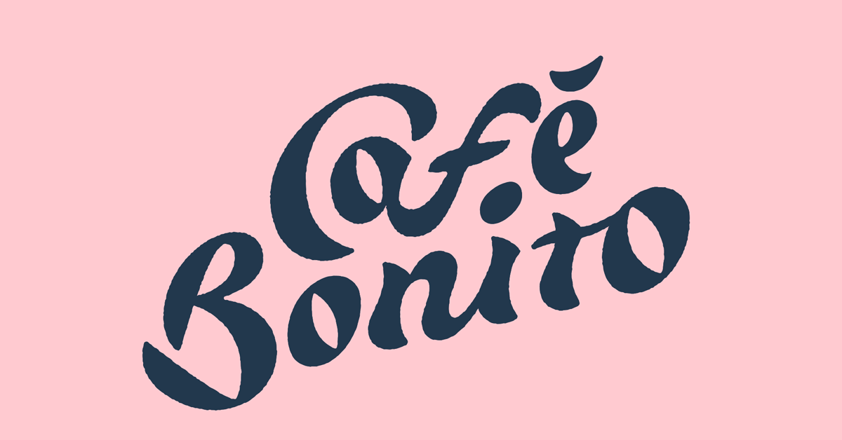
9. Axis
This is an invisible line that dissects the round shapes that make up your letters from top to bottom, at their thinnest points. This line can be vertical or have an incline. In designs with lots of round letters, like the one shown below, it’s interesting to see how moving the axis creates different effects.

10. Ink trap
This technique was used in typeface design for print purposes in order to prevent ink from spreading too far. Now it’s become popular in the digital world and can make your logotype more peculiar and memorable.

In his course, Typographic Design for Logos, Elisa will teach you a method for making letters for a brand so you can incorporate them into the design of a unique logotype.
You may also like:
–Type Illustration: Transform Your Inspiration
–Branding Tutorial: How to Make a Logo
–Logocentric vs. Flexible: Two Approaches to Branding


0 comments