• "Family Portrait: an intimate homage to everyday love."

    "Family Portrait: an intimate homage to everyday love."

    The photographer Diana Catalina Patiño, third place in the contest, invites us to look with different eyes at what makes our home unique. In a world where visual perfection seems to reign, Colombian photographer Diana Catalina Patiño reminds us of the power of the authentic. Her project Family Portrait, winner of third place in the Domestika contest, is a declaration of love for the everyday: her partner, her cats and the intimate space they have built together. Through digital photography, art direction and 3D, Diana achieves a narrative full of symbolism, sensitivity and honesty, demonstrating that the imperfect can also be deeply moving. We share with you the full interview: What inspired you to create the winning project? Honestly, the inspiration came from something I saw on networks a long time ago, among so much information that sometimes passes without leaving a trace. At that moment in my life I wasn't very emotionally present, I felt disconnected, and I didn't pay much attention to it. But something was hanging around. Some time later, I saw it again and it was like a call. I felt I wanted to create something more personal, more intimate, more honest. Something that came from the love for the real and the everyday, but also from what moves me, from what moves me inside. For some years I have worked doing photography and video production for brands and companies. We have created visually very beautiful things, well produced projects, with talented teams. But there came a point where I didn't feel inspired anymore. Then I understood that I needed to come back to myself, to reconnect with what excited me at the beginning: to observe, to imagine, to play with the senses, to explore the symbolic and to tell something that really spoke to me. This project was a way to return to that place. It was my way of reminding myself why I started creating images in the first place, and to open up a space to express what doesn't usually fit into commercial commissions: the vulnerable, the invisible, the intuitive. I wanted to make something with more soul than formula, with more skin than perfection. What story or emotion did you want to convey? I wanted to tell that story: that families come in many forms, that everyday love also deserves to be portrayed, and that photography can be a bridge to embrace who we are, just as we are. I wanted to capture the love I have for my cats, who for me are part of my family. For a long time I dreamed of having a family portrait, but not a traditional one, but one that represented what home is for me today: my partner, my cats, and that intimate space we have built together. What is your process for developing original ideas from scratch? Since I started in photography I have been surrounded by creative people who constantly inspire me. Each one, from their specialty, has shown me different ways of seeing the world, and transforming the everyday into something powerful. That creative energy has always pushed me to always want to think that the best way to create is from feelings, from what you think and from being a very good observer. An idea can start in many ways, but with this project, it all started when I saw something that inspired me - a painting, a story, an image on networks, even a person. In my situation something of that stuck in my mind, and without realizing it, I began to imagine an aesthetic, to give it soul, to make it something more mine, more organic. For me, creating is like putting together an emotional collage. I start to ask myself: what if we make a narrative where the subject is in the center, as the protagonist? Where is that subject? Is he in his living room, in a flat color background, in a natural location? Does that place exist or am I going to build it from the art, from the art direction? Then come more sensitive decisions: what color palette do I want to use? What kind of wardrobe best tells that story? What objects accompany it: a plant, a painting, a chair? Those elements are not there just for aesthetics, but because they are symbolic. They give emotional weight to the portrait, they make it unique. That's where it all makes sense to me: when every decision has intention and every image begins to tell something that feels real, even if it's constructed.

  • Pride Month – An Interview with Third Place Winner Monika Evstatieva

    Pride Month – An Interview with Third Place Winner Monika Evstatieva

    Capturing the quiet, radical beauty of love through color, tenderness, and authenticity. For Bulgarian artist [url=https://www.domestika.org/en/evstatieva_monika Id_user: 6474802]Monika Evstatieva, her third-place entry in the Design with Pride contest was more than a visual statement—it was a heartfelt tribute to the everyday courage of living authentically. Her piece, Pride Month, portrays two people simply existing together in love, without performance or pretense, bathed in the optimism of a bright yellow background. “I wanted to capture the tenderness of love as something beautifully ordinary yet profoundly powerful,” Monika shares. The work was deeply inspired by her best friend, whose openness and vulnerability reshaped her understanding of love and freedom. “This artwork became a quiet tribute to him, and to everyone who has ever fought for the simple right to love and be loved.” Blending traditional materials like watercolor pencils with the flexibility of digital tools in Procreate, Monika’s process is intuitive and playful, guided by mood boards, sketches, and even poetic phrases. Her goal is never perfection, but presence—a visual language that speaks honestly to the soul. Read the full interview with Monika Evstatieva here to discover how she keeps her work authentic, overcomes creative self-doubt, and finds inspiration in the unfiltered creativity of children. 1. Can you tell us what inspired you to create the winning project? What story or emotion did you want to convey? My inspiration came from a deep desire to celebrate love as something beautifully ordinary yet profoundly powerful. Pride Month isn’t just about bold statements - it’s also about quiet truths, about being seen without pretense. I wanted to capture the tenderness of two people simply existing together in love, free from performance, free to follow their happiness. To me, that quiet authenticity is a radical act in itself. The yellow background reflects optimism and the joy of living truthfully, a reminder that love, in its gentlest form, is a source of strength and resistance and everyone has the right to be happy and free to be. While creating this piece, I often thought of one of the people dearest to me - my best male friend, who is gay. His openness, his vulnerability, and the way he chooses to live authentically have touched me deeply. He showed me a new way of seeing love and freedom - through eyes that have longed for acceptance and found it within. This artwork became a quiet tribute to him, and to everyone who has ever fought for the simple right to love and be loved. 2. What is your process for developing original ideas from scratch? My process begins with the intention to play and have fun, it may sound childish, but this is what works for me, it liberates me and ignites my mojo flow. I am more of a spontaneous and intuitive person and I allow what needs to come through me to come without really thinking what I am doing. 3. Do you start with a sketch, an inspiration board, or something else? I have the problem that my mind lights up like a Christmas tree with all sort of ideas almost simultaneously. Associations, colors, forms, textures, words, music lyrics my brain becomes a crazy vibrant amusement park. It can be quite overwhelming, so what I do in order to ground myself is - I pour myself a cup of tea (+ something sweet) and I put everything in an inspiration board, combined with quick, loose sketches. The board helps me create a mood - colors, shapes, visual metaphors - while sketching keeps my ideas flowing without judgment. Sometimes I even write short poetic lines or phrases that set the tone for the piece before I touch the canvas. 4. How would you define your style, and how has it evolved? My style is rough, intuitive, playful and spontaneous. It blends softness and boldness - simple forms with layers of meaning. Over time, I’ve moved away from trying to “impress” with complexity, and instead, I focus on creating honest visuals that speak to the soul. My style is now less about perfection and more about presence and feeling.

  • Inverted ink: celebrating left-handed creativity in the world of design

    Inverted ink: celebrating left-handed creativity in the world of design

    August 13 is International Left-handedness Day, a date to celebrate the uniqueness and talent of left-handed people.. Although left-handers face constant challenges in a world made for right-handers, they develop a unique visual and technical approach that enriches the creative world. The world is designed for right-handers. This means living at a constant disadvantage and learning to deal with it in the most creative way possible. 1. The challenge of creating against the grain. From graphics tablets with buttons on the "wrong" side to notebooks that force you to cover yourself in ink, the life of the left-handed designer is full of daily adjustments. These challenges are not just obstacles: they become catalysts for creative solutions that change processes and outcomes, driving innovation. 2. Adaptations that inspire In graphic design, adapting tools and methods for left-handers involves rethinking the ergonomics and functionality of each element: - Reversing shortcuts in software to make functions more accessible. - Customize the interface so that everything is "on the left". - Choosing fonts and stroke techniques that reduce hand rubbing and avoid smudges.

  • Urban Landscapes: Imagine, Trace, Reveal - A conversation with second place winner Claudia Silva

    Urban Landscapes: Imagine, Trace, Reveal - A conversation with second place winner Claudia Silva

    From experimentation to award-winning: how Claudia Silva transformed the chaos and calm of the city into a work that captivated the jury. When Claudia Silva heard about the Urban Landscapes contest: Imagine, Trace, Reveal from Domestika, she didn't hesitate to jump in and participate... although she didn't expect her project to end up among the winners. In the middle of two creative courses -one of urban sketching and another of freehand drawing with acrylic and watercolor- he found the perfect opportunity to experiment, play and let the process guide the result. His work captures two opposing sides of the city: the constant bustle of traffic and the serenity of green areas. Using a completely analog technique, and relying on materials such as markers, wax pencils and drawing pencils, Claudia achieved a balanced composition that conveys contrast and harmony at the same time. "For me, the most important thing is to find my own voice and my own language," she explains. "I do challenging projects that I am passionate about, both in subject matter and technique, to capture my own visual codes in the work." Read the full interview with Claudia and find out how she developed her project, which artists inspire her and what her advice is for those looking for their own style. What inspired you to create the winning project? What story or emotion did you want to convey? The inspiration came from an event that happened simultaneously. I was studying two courses at the same time: Urban Sketching: "draw your city in motion by Inma Serrano" and "Freehand drawing with acrylic and watercolor by Mokshini" when I found out that Domestika had launched the contest "Urban Landscapes: Imagine, Trace, Reveal" (honestly I had no idea about this kind of contests). I literally jumped into the void without expecting anything at all, that is, I developed the project because I love to experiment and play with the process. The story or emotion I wanted to convey was the opposite sides that can exist in a city: the noisy chaos that generates all kinds of cars and the calm that green areas provide. What is your process for developing original ideas from scratch? It can come from a simple word or an image that triggers another. Eventually it escalates to finding more elements to develop the final idea. Do you start with a sketch, a moodboard or something else? I start with sketches: graphite pencil, eraser, pencil sharpener, sketchbook and/or printer sheets accompanied by photographic references; after that I start to develop the so-called "templates" that I will be working on the light table to finally arrive at the desired image. How would you define your style and how has it evolved over time? My style is quite versatile and I love that it has endured over time in this way. It gives more freedom of expression in the use of both analog and digital materials and the combination of both gives a very enriching visual language. What tools or techniques did you use to give life to your project? (Traditional, digital, mixed media, etc.) For the project I used the analog technique: a notebook, graphite pencil, eraser, pencil sharpener, markers, crayons/colored pencils, and drawing pencils.

  • FUTURE / PRESENT / PAST - A visual reflection on time and transformation.

    FUTURE / PRESENT / PAST - A visual reflection on time and transformation.

    Mexican artist Lauren Fortoul, second place in the contest, transforms stagnation into hope through digital photography. For Lauren Fortoul, her work FUTURE / PRESENT / PAST was born out of a very personal need: to illuminate that feeling of stagnation that we can all experience at some point in life. With an introspective gaze, the artist invites the viewer to reflect on how the decisions we make today and the way we reinterpret our past shape our future. "I wanted to give the viewer a sense of hope and empowerment - and also remind myself. It all depends on the interpretation we choose to give the past and the actions we take in the present," explains Lauren. Her creative process always starts with an internal conflict or a recurring situation she observes around her. From there, she synthesizes the idea into a word or phrase and builds a visual universe through references gathered from Pinterest, walks, movies, books or exhibitions. The result in this case was a minimalist, reflective and contemplative digital composition, created with Adobe Photoshop, photographs taken with his Sony a7 iii camera and a simple white background. Discover the full interview with Lauren Fortoul on Domestika's blog to learn more about how she maintains her authenticity, the routines that nurture her creativity and the artists that inspire her. -Can you tell us what inspired you to create the winning project? What story or emotion did you want to convey? I was inspired by the concern to shed light on the feeling of stagnation that we experience at some point in life. I want to give the viewer a feeling of hope and empowerment, to do so and make me remember that it depends on the interpretation we decide to give to the past and the actions we take in the present that will shape our future. - What is your process for developing original ideas from scratch? It all starts with the need to transform or shed light on an internal conflict, either my own or a recurring situation I observe around me. I synthesize the concept in a phrase or a word. I look for visual references in Pinterest and in information that I collect from walks, movies, series, books and exhibitions. I make several digital collages, until I reach a feasible idea. - Do you start with a sketch, an inspiration board or something else? I start with a digital sketch - How would you define your style and how has it evolved? Currently I would define it as minimalist, reflective and contemplative, previously it was loaded and confusing. - What tools or techniques did you use to bring your project to life (traditional, digital, mixed media, etc.)? The technique I used is digital - Adobe Photoshop (main software) Main tool for image composition, manipulation and editing. - Collections of images pulled from Pinterest for reference collages. - Sony a7 iii camera - Tripod - White background ( a wall )

  • Threads of Freedom – An Interview with Design with Pride Contest Second Place Winner Viktoria Odor

    Threads of Freedom – An Interview with Design with Pride Contest Second Place Winner Viktoria Odor

    Weaving love, diversity, and sustainability into a powerful piece of textile art. For Hungarian textile artist Viktoria Odor, the Design with Pride contest was an opportunity to combine two of her core values: love without limits and care for the planet. Her project, Threads of Freedom, is a vibrant wall rug created with the tufting technique, blending the colors of the rainbow flag with a rich variety of textures and sustainable materials. “I believe loving freely is a basic human right,” Viktoria says. “To me, the beauty of the world lies in its diversity, and I wanted to express that not just through color, but also through texture.” The work incorporates cotton, wool, alpaca, merino, and even yarn unraveled from a skirt knitted by her grandmother—each element carrying its own story. Created almost entirely from natural and second-hand fibers, Threads of Freedom is not only a celebration of the LGBTQ community but also a statement on conscious, responsible design. Viktoria’s thoughtful approach and bold creativity earned her second place in the Design with Pride contest, chosen from over 50 entries worldwide. Read the full interview with Viktoria Odor here to learn more about her process, inspiration, and why she believes in giving time for your true artistic voice to emerge. 1. Can you tell us what inspired you to create the winning project? What story or emotion did you want to convey? I honestly believe that loving freely is a basic human right, so I wanted to create a wall rug using the tufting technique that features a gradient made from the colors of the rainbow flag - the symbol of the LGBTQ community. To me, the beauty of the world lies in its diversity, and I wanted to express that not just through color, but also through texture. So I used a mix of cotton, mercerized cotton, wool, merino wool, New Zealand wool, alpaca and second-hand yarns. The whole piece was created with sustainability and environmental awareness in mind: I mainly used natural materials (plant- and animal-based fibers left over from previous projects), and some second-hand yarn too - one of them was actually unraveled from a hand-knit skirt my grandmother made. I also used jute fabric as the base and attached a cotton backing with 100% natural glue. All in all, I wanted this piece to stand not only for the LGBTQ community but also for conscious, responsible thinking about our planet. 2. What is your process for developing original ideas from scratch? I believe inspiration can come from literally anything - any color, shape, sound or smell around us. Recently, the rusty pattern on an old mailbox caught my eye and sparked an idea for a future project. I like to keep my eyes open (even online), and whenever something grabs my attention or gives me a feeling, I save it for later. 3. Do you start with a sketch, an inspiration board, or something else? I usually sketch my ideas digitally on a drawing tablet, especially if I’m planning something figurative. But sometimes I just let the process lead me - shapes and colors evolve naturally as I go. There was even a time when a few yarns randomly landed next to each other, and the composition basically created itself from that moment. 4. How would you define your style, and how has it evolved? Honestly, I’m still in the process of finding my voice - I wouldn’t say I have a signature style just yet. A few months ago I felt like nonfigurative designs weren’t really my thing, but now I’m not so sure. What I do know is that I love experimenting with mixing different yarns, playing with textures and colors to create something special. I feel like that playful, tactile approach might become the core of my style in the long run.

  • Home of the "Garbage Plate" – An Interview with Urban Landscape Contest Winner Amy Pak

    Home of the "Garbage Plate" – An Interview with Urban Landscape Contest Winner Amy Pak

    From local memories to international recognition: how a historic diner inspired Amy’s award-winning gouache painting When Amy Pak decided to enter Domestika’s Urban Landscape Contest, she didn’t just submit a painting—she captured a piece of her city’s soul. Her winning piece, Home of the Garbage Plate, is more than a depiction of a building; it’s a heartfelt homage to Nick Tahou’s, a century-old restaurant famous for its iconic dish and for the memories it holds in her community. For Amy, this artwork was a way to preserve the bittersweet beauty of a place that has seen better days but still holds a special spot in her heart. “I like painting scenes from around my hometown and city, especially ones that have history and memories attached,” she says. “The area has changed and is looking more run down, which created a melancholy feeling for me. This contest gave me the perfect opportunity to capture that.” Working in gouache, a medium she’s embraced over the last year and a half, Amy skillfully balanced realism with impressionistic touches, allowing the piece to evoke both nostalgia and a sense of time passing. Her creative process blends photography, sketching, and keen observation—always ready to capture those fleeting moments when the light hits just right or a scene tells a story worth remembering. Read Amy Pak’s full interview to discover how she developed her unique style, overcame creative challenges, and found confidence through competition.

  • August's Lives at Domestika!

    August's Lives at Domestika!

    Learn, get inspired and create with great professionals from the creative world. August arrives full of creative proposals to keep learning from wherever you are. Illustration, composition, writing, design, AI... This month on Domestika, experts share their knowledge in live sessions full of inspiration and practical tips. If you can't attend live, no problem! All the live sessions will be available on a live stream so you can watch them whenever you want. Take note and don't miss any of them: July 31 Rimiyoho + Jhãna: Creative Live Session ⏰ 18:00 h (GMT+1) | 🗣️ English This Creative Live Session brings together for the first time on stage Rimiyoho, a project by illustrator and visual artist Fernando Sica, and Jhãna, the new alias of Mexican producer Alejandro Merodio. Watch the live August 7th 📚 Libracos - From flat paper to nature-inspired pop-up art. ⏰ 17:00 h (GMT+1) | 🗣️ English Learn how to create pop-up structures inspired by insects and plants. Together with Libracos you will build a paper kingfisher step by step. A practical and poetic session about paper design. Watch live

  • Chocolates with history: the sweet project of ChodyBom

    Chocolates with history: the sweet project of ChodyBom

    ChodyBom, an artisan confectionery owned by Rodrigo, a master confectioner with Down syndrome, and his family, has been sweetening hearts for five years. At Domestika, each project reflects a personal story, and some of them deserve to be told with special attention. Today we want to share the inspiring story of Rodrigo, a young master pastry chef with Down syndrome, and his family, who have united talent, love and entrepreneurship to give life to ChodyBom, a store of handmade chocolates that has been sweetening hearts for five years now.

  • 5 Projects to Commemorate Pride Day
    Art

    5 Projects to Commemorate Pride Day

    Pride Day is a global celebration of diversity, identity and free love.[/h Each year, from the creative community of Domestika hundreds of visual proposals are raised that explore the power of design and art to communicate messages of inclusion. In this edition of the "Design with Pride" contest, we have selected 5 outstanding projectsthat not only demonstrate talent, but also a strong commitment to visibility and diversity.

  • Creativity without limits: Canva contest winner Elenomeleno shows us that we can all design.

    Creativity without limits: Canva contest winner Elenomeleno shows us that we can all design.

    With his project "Ad It If You Canva", he transforms famous brand ads to inspire those who believe that design is only for professionals. What would a Starbucks ad look like if you redesigned it yourself? And one for NIVEA, Gillette or KitKat? The answer lies in "Ad It If You Canva", the project by Elenomeleno who took home one of the prizes in the Canva contest. This creative self-taught designer shows us that, with imagination and a good tool, you don't need to be an expert to create stunning advertising pieces. Through six posters for six world-renowned brands, Elenomeleno explores the universe of advertising design using Canva exclusively. Her goal? To inspire others to experiment, lose their fear of design and dare to tell their own visual stories. In this interview, she tells us what the creative process was like, what she learned during the contest and why she believes we can all be potential designers. What was the concept behind the design you submitted to the contest? What story or idea were you trying to convey? The concept behind the design was to demonstrate how, with a tool as accessible as Canva, you can create great designs. I wanted to convey that you don't need to have a long career or use the most expensive application on the market to be creative and make an impact on others. What elements do you think are essential to create a "professional" design in Canva (typography, color palette, layout, etc.)? For me, the essential thing when creating a professional design in Canva is to first define the message or emotion you want to communicate. From there, I choose the typography and color palette that best fits the idea. Regarding typography, it is key to consider factors such as style (serif, sans serif, script, display), weight (light, regular, bold), and legibility. For example, to convey joy or dynamism, a typography with rounded and fluid shapes can be effective. On the other hand, to communicate seriousness or sadness, it is more appropriate to use a typeface with clean lines and neutral structure. Regarding color, color theory principles should be applied. Warm tones (such as yellows, oranges and soft reds) evoke closeness and enthusiasm, while cool tones (such as blues, grays and dark greens) convey calmness or even sadness. Color harmony and contrast also play an important role in achieving a visually appealing and coherent design. In summary, a good design does not always depend on using the most advanced tools; many times it is also about making decisions that adapt to what you want to communicate.

  • Inside the Creative World of avgust_point: Winner of the “Creating Original Illustrations” Challenge

    Inside the Creative World of avgust_point: Winner of the “Creating Original Illustrations” Challenge

    Discover how this artist blends emotion, storytelling, and unique visual language to craft illustrations that stand out Every stroke tells a story—and for avgust_point, one of the standout winners of our “Creating Original Illustrations” contest, storytelling is at the heart of their creative process. With a distinctive style that merges minimalism, mood, and meaning, avgust_point captured the attention of both the community and the jury. In this exclusive interview, we dive into avgust_point’s creative journey, their inspiration behind the winning piece, and how they approach the blank page. Whether you're an aspiring illustrator or a seasoned artist looking for fresh insight, their perspective is as inspiring as their art. Ready to learn what drives this illustrator to keep creating? Let’s jump into the full interview. Can you tell us what inspired you to create the winning illustration? What story or emotion did you want to convey? I wanted to show that creating a portrait isn't as complicated as it may seem. Once you understand the structure, it becomes more accessible. I hoped the project would support beginner artists, because I know how even just one helpful insight from another artist can really help and encourage someone to keep going. What is your process for developing original ideas for illustrations from scratch? I start by connecting with the emotion or inner state I want to express. I think about how it could be visualized — through form, color, or texture. Then I collect reference images that reflect the mood I’m after and choose a color palette that supports that feeling. How would you define your illustration style, and how has it evolved? I’d describe my style as bold and emotional. I tend to focus on capturing the essence of a subject rather than its precise details. I used to work more realistically, but over time I moved toward simplified forms and vibrant colors, letting go of literal copying from photographs.

  • The Magic of Embroidery: How Lady Quintero Turned a Paris Moment into an Award-Winning Piece

    The Magic of Embroidery: How Lady Quintero Turned a Paris Moment into an Award-Winning Piece

    Discover how Colombian artist Lady Quintero transformed the inspiration of a bumblebee spotted in Paris’s Parc de Bercy into a unique piece, blending traditional, magical, and stumpwork embroidery techniques—while reflecting on the healing power of creating with your hands. I’m @ladyautonauta, a Colombian embroiderer passionate about traditional and magical embroidery. In this project, you’ll see how I finally brought to life a little bee that had been on my to-do list for a while. It’s inspired by a bumblebee I saw one day in a park in Paris—so beautiful and fuzzy that it stayed with me. I took this opportunity to embroider it using magical embroidery techniques combined with stumpwork for the wings. I invite you to take a look at my creative process behind this little embroidered bee.

  • 5 Creative Projects Inspired by Van Gogh’s Art

    5 Creative Projects Inspired by Van Gogh’s Art

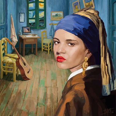
    On March 30, in honor of the anniversary of the iconic artist Vincent Willem van Gogh, we’re showcasing five projects from the Domestika community. A Look at Van Gogh and His Impact on Art Vincent van Gogh (1853–1890) was a Post-Impressionist painter known for his bold use of color and expressive brushstrokes. Masterpieces like The Starry Night, Sunflowers, and The Bedroom in Arles have inspired countless artists. Below, we explore how some members of the Domestika community have paid tribute to his work.

  • 6 Projects to Celebrate Yayoi Kusama's Art
    Art

    6 Projects to Celebrate Yayoi Kusama's Art

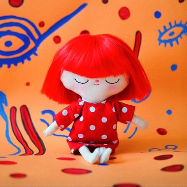
    On March 22, the artist Yayoi Kusama will turn 96. To celebrate her legacy, we’ve selected 6 Domestika projects inspired by her style. On March 22, the iconic artist Yayoi Kusama will turn 96. To honor her legacy and influence on the art world, we’ve selected 6 projects from the Domestika community inspired by her unmistakable style. Each of these works was created by different authors and artists who have reinterpreted her visual universe from their own perspective. 1. Fabric Dolls Inspired by Yayoi Kusama Professor Elena Sánchez Santos has created a project that pays tribute to Kusama through the design and sewing of fabric dolls. Her work reflects the signature patterns and style of the Japanese artist, featuring polka dots and vibrant colors that evoke Kusama’s visual imagination. Discover the project: Yayoi Kusama - Fabric Dolls

  • Participate in Domestika’s 4 Active Contests and Boost Your Creativity

    Participate in Domestika’s 4 Active Contests and Boost Your Creativity

    Showcase Your Talent, Build Your Portfolio, and Win Exclusive Prizes If you’re looking for an opportunity to challenge your creative skills, expand your portfolio, and win prizes, Domestika’s contests are the perfect excuse! Currently, there are four active challenges open until April 22, where you can participate based on your specialty: design, illustration, or embroidery. Discover the details and choose the one that inspires you the most. 1. Canva: Create Professional Designs If you love graphic design and enjoy creating compositions in Canva, this contest is for you. Domestika is looking for original and professional designs that reflect your unique style and creativity. 🏆 Prizes: $1,000 in rewards ⏰ Deadline: April 22, 2025 📝 How to participate

  • From Havana to the world: Wanda's story, third place in Domestika contest

    From Havana to the world: Wanda's story, third place in Domestika contest

    The young Cuban designer tells us how Domestika boosted her creativity and led her to place third in the Domestika contest. In the dynamic world of design and illustration, talent finds its way in many forms. For Wanda, a recent graduate in Visual Communication Design from the Instituto Superior de Diseño (ISDi) in Havana, Cuba, Domestika became a key platform in her creative development. After participating in the Domestika Contest and being named one of the winners, her confidence and motivation have reached new heights. She shares her experience on the platform, the lessons that have shaped her journey, and the impact this recognition has had on her career. How did you discover Domestika, and what motivated you to join the platform? I first came across Domestika during my studies at ISDi. One of my professors, noticing my passion for illustration, recommended several courses—many of them from Domestika. From that moment, I was drawn to the platform and its content. What really pushed me to officially join was the Character Design Contest, an opportunity I simply couldn’t pass up. How many Domestika courses have you taken, and which ones are your favorites? Throughout my studies, I’ve explored numerous Domestika courses, guided by my professor’s recommendations. However, illustration-focused courses—especially those related to scene and character creation—have been my favorites. I love the variety of approaches and techniques that each instructor brings, and I’m always eager to learn from their tips and tricks.

  • Meet the Winners of the Domestika Contest

    Meet the Winners of the Domestika Contest

    At Domestika, we highly value creativity, but also the ability to share the process and teach others. Recently, we held an illustration contest in which we received 142 high-quality projects from our creative community. Domestika invited its creative community to design a captivating character inspired by two themes: "The Bright Side," focused on positivity and joy, and "The Dark Side," centered on mystery and intrigue. With a $500 prize at stake, the competition was fierce, and the level of entries was exceptional.

  • Stig Legrand's Journey: Turning Daily Gratitude into Illustrated Masterpieces

    Stig Legrand's Journey: Turning Daily Gratitude into Illustrated Masterpieces

    Discover how Stig Legrand found art, mindfulness, and community through daily sketch journaling inspired by Domestika courses For Stig Legrand, a Domestika enthusiast, creating an illustrated daily journal started as a simple project and grew into a life-changing practice. With influences from renowned artists and courses, Stig has turned everyday moments into vibrant visual stories, blending gratitude, art, and reflection. Her journey reminds us that even small creative steps can lead to transformative experiences. What initially inspired you to start an illustrated daily journal, and how did you keep yourself motivated to continue this practice for three years? I first heard about sketchbooking and illustrated journaling through Domestika. Even though I always liked illustrated travel journals from various artists, I didn’t know I had it in me to want to draw this much and share personal stories this way. I begun Domestika courses with Mattias Adolfsson’s “The Art of Sketching”, then first tried watercolor with different teachers, discovered wonderful artists that I learned so much from, and one day in 2021, I came across Kate Sutton’s “Illustrated Life Journal: A Daily Mindful Practice”. I did the exercises she had devised, drawing tables loaded with what we ate, cutting up short stories into squares, picturing things that inspired me… In the end, I prepared my course Project, and little did I know that it would snowball into this daily rendez-vous that deeply changed my life in these three last years. Actually, I don’t have to keep myself motivated. It has become an essential part of my life without my noticing. The only problem is that it takes a few hours each day, so I would love to have a PAUSE button on my timeline, to be able to use extra time for other creative ideas… But compiling these gratitude moments is important and therapeutic for my balance. Due to health problems, I don’t go out much, or see people, so drawing the moments that I find precious at home allows me to share my outlook, to build a memory of life at Maison Legrand. It isn’t the same with photography, even though I use a lot of photos to capture the look of these moments. Drawing is an alchemy that materializes my singular perspective into a personal artistic production, with its flaws, its qualities, its uniqueness. And it sharpens my perception of the intensity of life’s little moments! Can you walk us through your creative process? How do you decide what to illustrate each day? First, there always is a delay of 5 to 6 days between real-time and the moment I draw a page. I like to keep it that way as it gives me a buffer, and time to settle my feelings. I keep a journal of written notes where I jot down moments when I felt conscious, or poetic, or touched by events, or even distraught. I also take lots of photos to help me remember how it felt and how it looked. It can be pictures of our 7 cats being sweet or silly, of recipes that I just prepared, or how I felt freshly dressed in the morning, what music I listened to… When I am in front of the blank page, I always begin by writing at the top a title that comes from Kate Sutton’s course : «Today, I’m grateful for». It’s like a magic formula but it’s also true to my purpose. Then, I look at my notes and photos, to remember everything and select what will end up in the illustration of the day. Most of the time, I have to trim things down, I’m lucky to have so much to be grateful for, or items I want to share. When I have chosen the elements, I imagine them assembled on paper, I give them each a space in my mind, and often, I run my fingertips over the page, to kind of press them there symbolically. Then I first draw a light sketch in graphite (Faber Castell, and Pentel Graphgear 1000). I would like to be able to skip this part and draw directly with fineliners and color, like lapin encouraged us to do in his courses; it felt so liberating… I know I would also gain much time, and hone my skills for urban sketching which takes place in a tighter timeframe… But I’m still too line-shy somehow and can’t always find ways to play around obvious mistakes. Yes, I use an eraser. When I’m done with the graphite, I use fineliners to ink the illustration. My favorites are Uni Pin in Dark Grey, Black and Light Grey, my most common weight is 0.5, but for details I go down from 0.1 to 0.003 ! One must remember that my Carnet de gratitude sketchbook is small (9x14cm, Art Creation by Talens). This is the perfect size for this project, even though details become really very tiny and my eyes aren’t this sharp anymore. Sometimes, I try to zoom with my fingers just like on a screen… LOL Then I add color last. I use water-based Tombows and Lyra brush pens. I like to blend colors on makeshift palettes, to mix shades, lighten them, and create color gradients. When color is finished, I sometimes add shadows with graphite blurs and highlights with gel pens. Then I photograph the page, always on the same table. I like to keep a coherence and try to have the same light, setting, etc. But it’s amateurish compared to what industry artists do when they maintain a graphic charter. Another of my kinks for this project is to keep the same color for my little sketchbooks covers, a light blue, called Fresh Mint. I have bought many in advance but am already finishing the 6th.