


Creativity without limits: Canva contest winner Elenomeleno shows us that we can all design.
With his project "Ad It If You Canva", he transforms famous brand ads to inspire those who believe that design is only for professionals.
What would a Starbucks ad look like if you redesigned it yourself? And one for NIVEA, Gillette or KitKat? The answer lies in "Ad It If You Canva", the project by Elenomeleno who took home one of the prizes in the Canva contest. This creative self-taught designer shows us that, with imagination and a good tool, you don't need to be an expert to create stunning advertising pieces.
Through six posters for six world-renowned brands, Elenomeleno explores the universe of advertising design using Canva exclusively. Her goal? To inspire others to experiment, lose their fear of design and dare to tell their own visual stories. In this interview, she tells us what the creative process was like, what she learned during the contest and why she believes we can all be potential designers.
What was the concept behind the design you submitted to the contest? What story or idea were you trying to convey?
The concept behind the design was to demonstrate how, with a tool as accessible as Canva, you can create great designs. I wanted to convey that you don't need to have a long career or use the most expensive application on the market to be creative and make an impact on others.
What elements do you think are essential to create a "professional" design in Canva (typography, color palette, layout, etc.)?
For me, the essential thing when creating a professional design in Canva is to first define the message or emotion you want to communicate. From there, I choose the typography and color palette that best fits the idea.
Regarding typography, it is key to consider factors such as style (serif, sans serif, script, display), weight (light, regular, bold), and legibility. For example, to convey joy or dynamism, a typography with rounded and fluid shapes can be effective. On the other hand, to communicate seriousness or sadness, it is more appropriate to use a typeface with clean lines and neutral structure.
Regarding color, color theory principles should be applied. Warm tones (such as yellows, oranges and soft reds) evoke closeness and enthusiasm, while cool tones (such as blues, grays and dark greens) convey calmness or even sadness. Color harmony and contrast also play an important role in achieving a visually appealing and coherent design.
In summary, a good design does not always depend on using the most advanced tools; many times it is also about making decisions that adapt to what you want to communicate.

Canva offers a wide range of templates and resources. How do you manage to balance the use of these resources with the originality of your work?
The great thing about having a wide variety of templates on Canva is that you can always use them as a starting point for inspiration. Sometimes I select a template as a conceptual base and, from there, I start customizing the design using the free resources offered by the platform. I modify the layout, adjust the typography, change the color palette and add my own visual elements to build a completely different story.
In this way, I can find the balance between the use of pre-designed resources and originality, adapting each element to the specific idea I want to communicate. The result is a unique design adapted without losing authenticity.
Did you face any challenges during the design process? How did you overcome them, especially within the Canva framework?
Halfway through the project I went completely blank. I couldn't come up with any ideas that really resonated with me, and even though I was trying to look everywhere for inspiration, nothing was working. It was frustrating, especially since I had a countdown to submit the design to the contest.
However, I understood that roadblocks are a natural part of the creative process. Instead of forcing myself to keep working without results, I decided to give myself a break, even if it was just for a day. I went for a walk, spent time with my friends and completely disconnected. The next day, I came back with a clearer mind and the ideas started flowing again.
I learned that sometimes the most productive thing you can do is to take care of yourself and take a break. Rest is also a very important tool in the creative process, and it allowed me to pick up the project again with energy and focus to finish it with gusto.
What Canva tools or features did you use the most in your winning design and why (e.g., brand kit, magic resize, animation, etc.)?
The tools I used the most in my winning design were "Duotone" and "Background Remover".
Duotone allowed me to modify the colors of images and elements to adapt them to the idea I had defined, that way I could unify them in a coherent way, without having to use other resources that didn't fit so well. It is a very useful tool when you are looking to maintain some consistency in your design.
On the other hand, the Background Remover tool was key to be able to work with images that did not have a transparent background. By removing the background, I was able to integrate those elements in a freer and more creative way in different compositions, creating cleaner and more dynamic designs.
Both features gave me the flexibility to customize resources and adjust them exactly to what I needed, without having to leave Canva.

Who is your design aimed at and how did you tailor your choices to connect with them effectively?
My design is aimed at different types of audiences, as each poster responds to a specific brand and seeks to connect with its audience in a direct and meaningful way. In each case, I adapted the different elements to achieve a communication according to the image of each brand:
- NIVEA: The poster is aimed at people interested in nighttime skin care. I started with a simple question: What do we associate with the night? The answer was immediate: the moon. That was the starting point to make it the central element of the design, symbolically connecting the concept of night with the product. The slogan "Overnight care. Long-term results" reinforces the idea that a consistent nighttime routine pays off in the long term. To contextualize the message, I chose a mockup in a subway station, that place where many people pass by at the end of the day, a visual wink just when the pace slows down and it's time to think about oneself.
- b]STARBUCKS:[/b] For the composition of this poster, I was inspired by that moment of the day when I most value a good cup of coffee: the pause in the middle of the day. From there, the phrase "Time for a coffee break?" was born, which perfectly sums up that feeling of waiting for a little breather. To represent it visually, I included a wristwatch, symbol of the daily gesture of checking the time while waiting for something we are excited about. I placed the mockup in a busy street, where the target audience -workers and students- could see it in the middle of the hustle and bustle, and thus function as a visual wink that invites to stop and enjoy that pending coffee.
- b]HELIOCARE:[/b] As I've already mentioned, during the creative process I had a big block, so I decided to go for a walk to clear my head. That's when inspiration struck. The sun kept bothering me and I thought: "If only I had worn sunscreen..." Eureka! Third idea: to promote a sunscreen. Now that summer is just around the corner, it's essential to take care of our skin. There's nothing worse than getting sunburned and spending days in discomfort because you haven't protected yourself. Hence the slogan: "Let the sun kiss, not mark". I wanted the image to be straightforward: just the texture of reddened, sun-spotted skin. To reinforce it, I designed a mockup on a surface of worn posters, creating a visual parallelism with burned and peeled skin. A texture that not only illustrates, but warns.
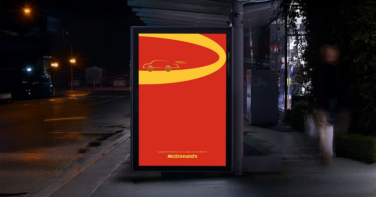
- b]McDONALD'S:[/b] After a long day and a long drive home, the last thing you want to do is think about dinner. Hence the slogan: "Long drive home? Let us take care of dinner". I placed the hamburgers on the wheels of a car you might be familiar with (the McAutp's logo) and transformed the McDonald's "M" into a road, representing the long drive home. Also, I positioned the mockup on a busy street, thinking of the tired drivers who would see it, connecting with that desire to let "someone else" take care of dinner.
- GILLETTE:[/b] This time I decided to start with the image instead of the slogan. After giving it a lot of thought, I found the solution in a tennis ball: its natural line allowed me to simulate shaving and also opened the door to a possible sports series for the brand. The slogan was the hardest part: how to combine sport and shaving? With one key word: precision. Thus was born: "Master the precision. Ace your shave." I placed the mockup outside sports centers. Thus, the association between precision shaving and sport reinforces the brand's connection to performance, discipline and personal care.
KITKAT: I took its iconic slogan "Have a break, have a KitKat" as a starting point, and asked myself: what do I need a break from today? The answer was clear: social media. Thus was born the phrase: "Have a break from social media. Have a KitKat." I placed the mockup on a bus shelter, that place where we all wait glued to our cell phones. I wanted this sign to interrupt that infinite scroll and, by the way, connect emotionally with the audience.
Each design is made for a different audience, and both the message and the elements that compose it were adapted to connect with their needs and emotions.
How do you make sure your designs remain creative and functional, especially for clients or for real use cases?
For me, the key is to connect with the emotional part of the audience. I always try to start from an idea or feeling that anyone can identify with: we all want to take care of our skin, take a break from busy days, protect ourselves from the sun in summer, avoid thinking about dinner after a tiring day, maintain good personal hygiene or even disconnect for a while from social networks.
It is in these everyday moments where I find the best starting points. From there, I build designs that are not only visually appealing, but also communicate something real, human and close. That emotional connection is what allows a design to work both in real campaigns and personal projects.
What is your process when you start a new design in Canva, from idea to final export?
My process always starts from an initial idea, even if it is still very undeveloped. The important thing is to start, test and experiment. Many times the ideas refine themselves or even evolve into better ones.
Once I have the basic idea, I think about the support where the design is going to be used (social networks, posters, outdoor advertising, etc.) and I create the canvas with the appropriate dimensions. From there, I start to move elements around, try out compositions and play with typographies, colors and visual hierarchies until I find a structure that works.
The secret is not to be afraid to make mistakes. Sometimes, the solution comes in five minutes; other times, in the hundredth attempt. The important thing is to remain open to change and not give up. If an idea doesn't end up working, it's probably paving the way for a better one.
Finally, I export the design in the most appropriate format according to its use: PNG if I need maximum quality, JPG for lighter files or PDF if it is to be printed. Canva makes this process much easier, allowing me to focus more on the creative part.

How has Canva influenced your growth as a designer? Would you say it has changed your approach to graphic design?
Canva has been instrumental in my growth as a designer because not only is it an accessible tool, but it's also very intuitive. When I started using it, I had no experience or advanced knowledge in design, but I learned to use it by exploring and experimenting with all the resources it offers.
Every time I had an important event, I took the opportunity to give it my personal touch: I designed invitations, created games or prepared the graphic instructions. This not only helped me to entertain myself, but also allowed me to practice and improve my skills constantly.
In short, Canva has changed my approach to graphic design, as it allowed me to experiment without fear of making mistakes.
What does winning this contest mean for you and your creative path? What are your next steps or future goals as a designer?
Winning this contest means for me a great impulse and motivation to continue creating and learning. I had never thought about participating in a design contest, let alone winning it, so this experience has taught me that you should never say never.
From here on, my goal is to continue my training through courses and constant internships to continue growing as a designer and thus be able to face increasingly complex and challenging projects.
Have you been inspired by Elenomeleno's story? Then it's your turn. Explore, play, design and dare to share your vision with the world. Canva contests are designed for creatives of all levels - who knows! Maybe the next winning project will be yours.
Stay up to date with our contests and join the community that proves, day by day, that creativity belongs to everyone.


0 comments