• From Movies to Space: José Fernández's Work

    From Movies to Space: José Fernández's Work

    Learn about the work of the artist who made it in Hollywood and then designed the SpaceX astronaut suit José Fernández is a Mexican-American designer who began working in Hollywood in the 1980s. His first costume design was for the movie Gremlins and, since then, he has been involved in the design of concepts, costumes, and accessories for major film studios and musicians. According to Fernández, when he was first invited to design the suit for SpaceX, he thought it was for a movie. He did not know that he was about to take his work from the big screen to space. Get to know some of the work this artist as well as his creative shop, Ironhead Studio, have done in recent years: Collaboration with Daft Punk In the 2010s, for Daft Punk's return to the stage as well as the band's involvement in the movie Tron Legacy, José's studio took over the design of the helmets for the famous French duo.

  • Keep track of your creativity and learn to sketch characters with Caio Martins

    Keep track of your creativity and learn to sketch characters with Caio Martins

    Turn your sketchbook into a paper lab for character design Whoever thinks that ideas are born ready to be shared is dead wrong. Every spark of creativity must be polished again and again, built little by little, and improved until it reaches its final version, especially when it comes to projects involving the conversion from analog to digital. Caio Martins (@caiorfmartins) is a visual artist specializing in character design and storyboarding who has worked for studios like DreamWorks, Netflix, and Disney Jr. Today he is sharing some tips for working with your creativity on a sketchbook using a simple guide:

  • What is Augmented Reality and How Does It Work?

    What is Augmented Reality and How Does It Work?

    Multimedia artist Solimán López explains the basis of the technology that allows us to merge real and virtual worlds From its origins in the Sensorama project to its popularization by the global phenomenon Pokémon Go, augmented reality has long been a part of our lives. But what exactly is it? How can we define it? Solimán López (@solimanlopez), multimedia artist and founder of Harddiskmuseum, explains what augmented reality is and how it works in the following video:

  • Creatives For Black Lives Matter

    Creatives For Black Lives Matter

    Get to know the pieces that some artists have made for #BLM After the Black Lives Matter social movement was revived in recent weeks, the international art community added their voices to the cause. We gather below some samples of these pieces of art, in which we find techniques of embroidery, painting, drawing, lettering, photography and illustration.

  • How to Make a Paper Cut Out Effect in Adobe Photoshop

    How to Make a Paper Cut Out Effect in Adobe Photoshop

    It looks like a paper cut out, but it's done digitally from start to finish. We show you how to create this effect using Adobe Photoshop A paper cut out effect tries to achieve the look of several superimposed layers of paper to create depth in a design. Cutting paper has proven to be a highly versatile technique in advertising, pop-up books, and mask making. It is the perfect example of how, with the simplest tools, such as paper, scalpel, glue, and scissors, you can create spectacular and highly complex work of art. The technique is simple, but, in the real world, it requires significant manual labor and the appropriate materials. Here, we will show you how to create the same look completely digitally, using only Photoshop:

  • Lettering Tutorial: The Basics of Beginning with a Brush

    Lettering Tutorial: The Basics of Beginning with a Brush

    Learn the basics of how to begin hand lettering with James Lewis Hand lettering only continues to grow more popular, and not just as a hobby. Beyond the satisfying time-lapses that are a favorite on social media, more companies are also using hand lettered designs to roll out logos and marketing campaigns. While the effortless elegance of hand lettering is what makes it so visually appealing, it’s also what can make it intimidating to those just starting out. In this tutorial, professional lettering artist James Lewis (@jamesllewis) shares the basics of how to begin with a brush, from how to prepare your materials, to how to position your hands, to even how to correct small mistakes. By practicing these techniques and brush strokes, you’ll be able to learn the basic shapes you’ll need to tackle any lettering project.

  • How to Make a Lucky Knot

    How to Make a Lucky Knot

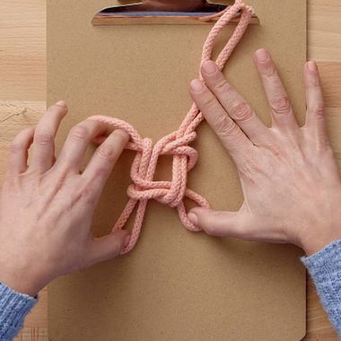
    Learn how to create a simple decorative knot for use in macramé with Belén Senra An easy way to get started in the fun and therapeutic world of macramé is by learning one of its most basic decorative knots: the lucky knot. All you need is a rope and the desire to express your creativity. In the following video, the textile artist who founded the brand RanRan Design, Belén Senra (@belensenra), shows you step by step how to create this simple and beautiful Chinese knot.

  • What is RAW Imagery and What is It For?

    What is RAW Imagery and What is It For?

    Find out what the main advantages of RAW photography are and why you should consider using it It is one of the most used image formats by professional photographers because of its great advantages when editing and the amount of information it is capable of storing, but do you know what RAW is and why you should consider using it? Photographer Edu Gómez (@edugomez) explains what its main features are and why it is the format of choice for connoisseurs of photography.

  • 5 Websites with Free Mockups For Brand, Image and Packaging Design

    5 Websites with Free Mockups For Brand, Image and Packaging Design

    Discover thousands of editable templates for your packaging designs on these websites Find mockups and reference files that will help you adapt your own designs: no matter if it's for stationery, packaging, or merch, its variety will allow you to take your creativity wherever you want for free and easily. GraphicBurger Raul Taciu is a self-defined Photoshop addict. He created this platform to share his passion and make a wide variety of editable .psd files ready to be integrated into your design ideas. All mockups are royalty-free for both personal and commercial use, and no credit is necessary for creators who contribute to the international creative community’s database.

  • Top 10: Typefaces from TV Series

    Top 10: Typefaces from TV Series

    Appreciate ten of the best fonts from series throughout TV history We often remember a television series for its shocking scenes or endearing characters. Their theme tunes can take us back to the first time we saw them. Here we have compiled ten of our favorite fonts that accompany that helped define these shows. The Twilight Zone (1959-1964) A classic series that laid the foundation for fantasy, science fiction, thriller, and horror television. The unmistakable logo invoked a sense of anguish and mystery, of course, accompanied by Marius Constant's musical score. Fonts: Bernhard Mod., Venus

  • Domestika Diary: Nathan Jurevicius

    Domestika Diary: Nathan Jurevicius

    The multidisciplinary artist shares his process for working at home and finding inspiration in the everyday Working from home can sometimes feel like it limits your creative opportunities, especially if you’re used to looking for inspiration in the outside world. But just because you’re stuck indoors, doesn’t mean you have to suffer from a creative block. Nathan Jurevicius (@nathanjurevicius) is—among other things—an illustrator, toy designer, author, creative director, and concept artist. His colorful characters, lushly imaginative worlds, and diverse projects (which include glass sculpture collaborations with IKEA, a film, toys, and graphic novels, and more) are all a testament to his boundless creative energy. In this Domestika Diary, he shares how he deals with the challenges of working from home and how he manages to find endless inspiration no matter where he is.

  • 5 Essential Courses for Getting to Grips With 3D Design

    5 Essential Courses for Getting to Grips With 3D Design

    Discover 3D design apps for architecture, creating characters, illustration, and social media Being able to create, design, and manipulate three-dimensional graphics are skills that are incredibly sought-after across a range of professions and disciplines. Developing your knowledge and experience in these areas is essential if you want to work on projects relating to design, architecture, content creation using different formats, and digital communication. Learn more about 3D design with these fellow artists and specialized studios. Introduction to 3D Design and Printing, a course by Agustín “Flowalistik” Arroyo Learn the step-by-step processes of 3D design, modeling, and printing to give shape to your ideas and develop your own projects with Agustín “Flowalistik” Arroyo.

  • Domestika Creatives: Petra Eriksson

    Domestika Creatives: Petra Eriksson

    We spoke with digital artist Petra Eriksson and explored the colored universe of her illustrations Petra Eriksson was born in Stockholm, Sweden, but her career has taken her to Malta, Dublin, and, finally, Barcelona. Despite originally studying fine art, her wish to use art as a practical vehicle to "solve problems" led her to the world of graphic design and editorial illustration, where she has experienced a meteoric rise thanks to her personal style. This distinctive aesthetic has seen her work appear in publications like Vice, Buzzfeed, and The New Yorker, and on the cover of Mackenzie Lee's book Bygone Badass Broads, a collection of celebrated women's stories and biographies. Petra Eriksson welcomed us into her Barcelona studio to talk about her career, her rise, and her approach to art. Watch our interview in the video below:

  • Illustration Tutorial: Coloring With Watercolors
    Teacher Illustration

    Illustration Tutorial: Coloring With Watercolors

    Learn how to apply color to your illustrations quickly and easily with Paula Bossio A good way to bring your illustrations to life is by coloring with watercolor. It is a very flexible technique that allows you to give your illustrations a unique style. If it fits your aesthetic, it is worth taking the leap and experimenting with it. If you are ready to try it, the graphic designer, illustrator, and author Paula Bossio (@paulabossio) will explain in this tutorial how to quickly and easily apply it to your drawings. Get your sketches ready, and let's go!

  • 5 Tips For Taking Creative Photographs Without Leaving Your Home

    5 Tips For Taking Creative Photographs Without Leaving Your Home

    Anna Devís and Daniel Rueda present “Visual Stay-rytelling” and inspire you to create within the walls of your home Anna Devís and Daniel Rueda are a creative duo with extensive experience working with top international brands such as Facebook, Netflix, and Disney. They have thousands of followers on social media, especially on Instagram. Earlier this year, they took part in our Domestika Live: Visual Stay-rytelling, sharing details of their creative process. Their work mixes architecture with photography; the way they approach new projects is sure to give you ideas for how to fulfill your creative potential without even leaving your house.

  • The Best Types of Shots You can Take with a Drone

    The Best Types of Shots You can Take with a Drone

    Director of photography Yeray Martín Perdomo shows you how to film outdoors with a drone A drone allows you to capture scenes that would be impossible or extremely costly to film using traditional methods. They can be used both indoors and outdoors to achieve stunning sequences and tell engaging stories. Yeray Martín Perdomo (@yeray_martin_perdomo), director of photography and filmmaker, has used them in more than 50 countries to approach remote tribes, jungles, and volcanoes. Here, he will explain the type of shots you can take when flying a drone outdoors and when it is best to use them. Wide Shot A shot that gives you a general overview of a specific area. The movement has to be very linear and smooth. You do not want it to be static, but it is convenient to move very slowly because it will always be easier to accelerate a sequence than to slow it down.

  • Challenge: Illustrate in Procreate with Just Two Colors

    Challenge: Illustrate in Procreate with Just Two Colors

    Samuel Rodriguez, an illustrator specializing in Procreate, has just ten minutes to, using two colors, create a digital illustration To say that Samuel Rodriguez (@samrodriguezart) is an illustrator focused on creating portraits would be an understatement: the American artist has made a name for himself by cultivating a unique style in which the human face is fused with typography, all through the digital drawing tools of Procreate. With clients from a wide variety of backgrounds, Rodriguez's work hangs in museums and features on the covers of various publications. But will he be able to overcome the Domestika Challenge? In this case, we asked him to create a digital illustration in Procreate with a time limit of ten minutes... using only two colors. Find out if he succeeded in the video below:

  • How to Create a Decorative Tassel

    How to Create a Decorative Tassel

    Learn a quick way to create tassels to decorate clothes, jewelry, and accessories with Binge Knitting Binge Knitting (@bingeknitting) is a duo of designers and weavers made up of Bárbara Bremer and Carolina Herrera. They knit all kinds of fashion and home accessories with traditional crochet or crochet and needle techniques. Both infuse in their pieces with a contemporary vision of design and sustainable fashion.

  • What is Negative Watercolor Painting?

    What is Negative Watercolor Painting?

    Find out what watercolor in negative is and how to use it to create light and depth in your illustrations Unlike other painting techniques, with watercolor, you can’t use white paint to add light and depth to your illustrations like you can with oil or acrylics. Instead, you must learn how to manage the white of the page on which you are painting to your advantage. One of the most effective ways to do this is by painting watercolor in negative: leave principal elements of your illustration unpainted so that they jump out at you. Instinctively, the most important elements of our paintings seem like the parts that we should be painting most. Painting in negative turns that idea on its head requiring you to paint everything but the object you want to highlight. Examine the picture below:

  • Top 10: V&A Illustration Awards

    Top 10: V&A Illustration Awards

    We select some of our favorite entries from this year’s shortlist and winners One of the UK’s most prestigious illustration competitions, the V&A Illustration Awards were established in 1972 and celebrate art across four categories: Student Illustration, Book Cover Design, Book Illustration, and Illustrated Journalism. To celebrate this year's competition, we have selected some of our favorite entries from the 2020 shortlist. Open to UK residents, those who have had work published in titles within the UK market, or who are attending university in the UK, the competition takes place annually and is free to enter, generously supported by the Enid Linder Foundation and the Moira Gemmill Memorial fund. Each winner receives £3,000, and the overall winner of the competition is awarded the Moira Gemmill Illustrator of the Year Prize of an additional £5,000. The student runner-up receives £2,000. Given the level of talent and the number of entries, just to be shortlisted is a huge achievement. Here are some of our favorite entries from this year’s shortlist. You can see the shortlist and winners in full here.

  • Typography Tutorial: Tips for Choosing the Perfect Font

    Typography Tutorial: Tips for Choosing the Perfect Font

    Discover the keys to choosing the most suitable typography for your editorial project with Violeta Hernández Choosing the ideal typography for a project is, for many, the most complicated aspect of editorial design. There is no one perfect typography that can do everything, or universal rules that limit the options available to us, which can make our work very complicated. That's why Violeta Hernández (@soyvioleta), graphic designer, artist, and illustrator, has given us a series of tips to help make this important decision and choose a typography that fits and contributes to our projects. Learn these keys in the following tutorial:

  • Discover Your Creative Type

    Discover Your Creative Type

    Empathy map: a simple exercise to grow creatively and professionally with Marcelo Tas It doesn't matter what your specialty is: we all have creative prejudices that, if we don’t know about them, can block development of our projects, as they distance us from objectivity. For Marcelo Tas (@marcelo_tas)–journalist, scriptwriter, actor, TV presenter and director–knowing your creative inclinations is fundamental to understanding your audience and communicating with them in the best way. Here, he shares a practical and simple exercise that will help you to find it. This exercise is ideal for communication projects that need to identify their audience. It is also useful for getting to know yourself as a professional.

  • What is Crewel Embroidery?

    What is Crewel Embroidery?

    Discover the characteristics, materials, and origins of this embroidery technique Crewel or crewelwork embroidery is characterized by the use of thick wool instead of delicate threads, as in other types of embroidery. This technique is at least a millennium old, and can be found on decorative objects such as tapestries and curtains, as well as luxury clothing. Recently it has been incorporated into contemporary embroidery in pieces such as cushions, clothing or decorative embroidery for walls. Origins The origin of the word is uncertain, but it comes from the name of a special type of wool that is used, which tends to twist. The Bayeaux Tapestry, or Queen Mathilde's Tapestry, is one of the oldest known pieces, and was embroidered in the 11th century. It recounts the events of the Battle of Hastings. This impressive piece has about 70 scenes from the battle, and is approximately 68 meters long.