


Lettering Tutorial: The Basics of Beginning with a Brush
Learn the basics of how to begin hand lettering with James Lewis
Hand lettering only continues to grow more popular, and not just as a hobby. Beyond the satisfying time-lapses that are a favorite on social media, more companies are also using hand lettered designs to roll out logos and marketing campaigns.
While the effortless elegance of hand lettering is what makes it so visually appealing, it’s also what can make it intimidating to those just starting out.
In this tutorial, professional lettering artist James Lewis (@jamesllewis) shares the basics of how to begin with a brush, from how to prepare your materials, to how to position your hands, to even how to correct small mistakes. By practicing these techniques and brush strokes, you’ll be able to learn the basic shapes you’ll need to tackle any lettering project.


1. Pick the right brush
To determine if your chiseled-edge brush is the right size, hold it against the thickest part of your letter to see if they are the same width.
It’s very important to pick the right brush for the letter strokes you’ll be using—go too big and it will be hard to get consistent strokes, go too thin and you’ll have to use multiple strokes to fill the space, making it difficult to get a smooth line.
2. Prepare your paint
You can use any brand of high flow acrylic paint. Because it has a very thin consistency, mix it with matte medium to add viscosity and give it a matte finish. Mix at a ratio of about 70% paint to 30% matte medium.
3. Prepare your brush
To make sure your paint is the right consistency, dip the brush in your paint pot and scrape the flat edge of your brush against the container’s lip to evenly distribute the paint.
Take your palette or a scrap of paper and apply a few strokes of paint to test the consistency. Depending on if it’s too watery or thick, you can add either more matte medium or paint.
4. Think about the direction of your stroke
Before you apply any paint, take a moment to look at the shape of the letter you’re about to fill so that you can figure out the direction of your strokes.
Brush lettering is characterized by thick downstrokes and thin upstrokes. What that means is whenever you pull your brush downwards, you apply pressure to get a thicker line. When you move your brush upwards, you only lightly apply pressure, which will create a thinner line. Thus, all the thick lines you see will be downward strokes, and all the thin ones will be upward strokes.

5. Figure out the angle to hold your brush
Hold your brush about 3 centimeters above the metal bit that connects the bristles to the handle.
To determine the angle you need to hold your brush at, find the flattest, thinnest point of your letter and align it with the flat edge of your brush. You’ll be maintaining this angle the entire time you work on this letter.

6. Steady your hand
As a final step before you begin lettering, make a fist with your non-dominant hand and place it on your working surface. You’ll be able to support your other hand here while you work, and this stability will help you move the brush more freely and smoothly.
7. Start lettering!
Go slowly and maintain the angle of the brush. Remember to apply pressure to create thickness when doing a downstroke, and to release pressure to create thin upstrokes.
As you reach a curve where the direction of the line changes, twist the brush slightly between your pointer finger and thumb. This subtle movement may take a bit of practice before you can achieve a fluid transition.

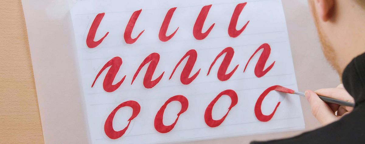
8. Repeat each shape
Try to repeat the same letter or shape at least five times back-to-back. You’ll be able to notice immediate improvements as you get used to the shape and brush position.
9. Reloading the brush
As you work, you’ll start to notice the brush drying up. When you reload the brush, simply make sure to do one or two strokes on another surface (like your palette or a scrap of paper) before you start lettering—this will ensure that there isn’t any excess paint that might cause drips.
10. Fix your edges
It’s good to pay attention to your mistakes so that you can try to avoid repeating them, but also don’t be afraid to go back and tidy tiny errors with your brush. An uneven place where you didn’t apply enough pressure with a downstroke, for instance, can easily be corrected with the edge of your brush and a light amount of pressure.
If you liked this tutorial, you can learn more about brush lettering from James Lewis through his online course: ‘Introduction to Brush Lettering’.
You may also be interested in:
- The Art of Record Covers: Illustration Meets Lettering, a course by Steve Simpson
- Italic Script with a Brush Pen, a course by Bego Viñuela Galarraga
- Uncial Calligraphy for Beginners, a course by Joaquín Seguí
- Adobe Illustrator for Typography, Lettering and Calligraphy, a course by Andrés Ochoa


0 comments