


@harry_davies
Top 10: Typefaces from TV Series
Appreciate ten of the best fonts from series throughout TV history
We often remember a television series for its shocking scenes or endearing characters. Their theme tunes can take us back to the first time we saw them.
Here we have compiled ten of our favorite fonts that accompany that helped define these shows.
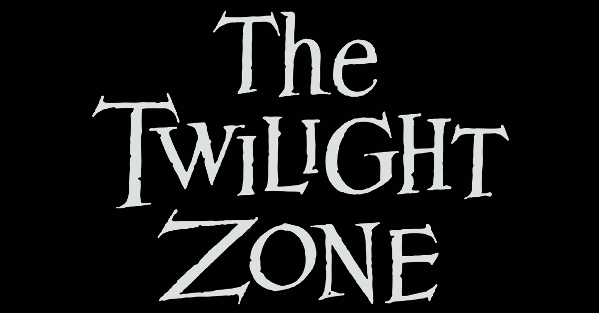
The Twilight Zone (1959-1964)
A classic series that laid the foundation for fantasy, science fiction, thriller, and horror television. The unmistakable logo invoked a sense of anguish and mystery, of course, accompanied by Marius Constant's musical score.
Fonts: Bernhard Mod., Venus


Astro Boy (1980)
The second incarnation of this character on TV, after the black and white series of the sixties. The typography, launched in 1970, is the work of designers Ronné Bonder and Tom Carnase. A stylization of this typeface was famously used for the Shaft opening sequence by Isaac Hayes, but we inevitably associate it with robots.
Fonts: ITC Pioneer.


Twin Peaks (1990-1991)
One of the most celebrated television intros, both in terms of music and images. The design is by Pacific Title, where the sepia images of the forest contrast with the bright green typography. According to the designer Mark Frost, this sequence "blew your mind". David Lynch repeated the aesthetic in the series' return in 2017.
Fonts: ITC Avant Garde Gothic


Batman: The Animated Series (1992-1993)
Producers Bruce Time and Eric Radomski wanted to give the series a noir air, similar to Tim Burton's two films, with an Art Deco influence from the 1930s and 40s.
Fonts: Plaza, Empire, Present, Kaptiva

Futurama (1999-2013)
The logo was hand-drawn, and both the title and the introduction were inspired by Disney's Art Deco and Tomorrowland amusement parks. The final product is an example of retrofuturism. The designers are Geraldine Symon, Scott Vanzo, Eric Whited, Conan Low, and Mike Smith.
Fonts: ITC Kabel, Insignia


Dexter (2006-2013)
A spectacular introduction sequence (for which the Digital Kitchen agency received an Emmy), combining elements of everyday life with bloody motifs. The logo is based on Zuzana Lucko's typography, with the detail of the letter T drawn in the shape of a knife.
Fonts: Soda Script, DIN 1451


Better Call Saul (2015- )
This Breaking Bad spin off has been universally acclaimed by critics. Each episode uses the logo with a low-fi VHS video effect. The goal was to create a logo with a cheap and tasteless aesthetic, typical of classified ads.
Fonts: Script Casual, Dancing Script, VCR OSD Mono


Atlanta (2016- )
This acclaimed black drama/comedy creatively integrates its logo into different city landscapes. It is characterized by the mirror-like use of the letters A at the beginning and end, and is inspired by the Benguiat Caslon typeface.
Fonts: Cabernet


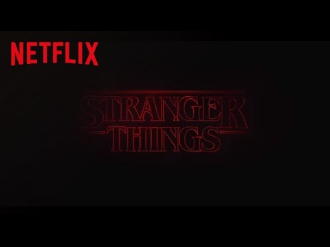
Stranger Things (2016- )
This series of fiction and mystery is a tribute to the eighties pop culture. The completely typographical title sequence, in which the lyrics appear with the music to produce a distressing sensation, was designed by the Imaginary Forces agency. The logo was inspired by the covers of Stephen King's books and the designs of Richard Greenberg, who worked on films such as The Goonies.
Fonts: ITC Benguiat, ITC Avant Garde Gothic

Euphoria (2019- )
Characterized by a neon color palette, reflected in makeup and clothing, as well as in the many nightlife scenes, this HBO series used a custom logo. With a five-line neon gradient, it is based primarily on Lineto's Prismaset typeface. For other applications, tiny fonts were used.
Fonts: Prismaset, Eeuw Haas Gr., Motter Ombra (intro)


If you want to discover more typographies used in real-life examples, visit Fonts in Use.
You may also be interested in:
- 10 Typefaces From Movies
- 7 Lettering and Calligraphy Artists That Will Inspire You
- 15 Free Typographic Resources


0 comments