Advanced Brand Typography
Spacing Review
A course by Plau , Designers
About the video: Spacing Review
Overview
“In typography, empty spaces count as much as filled spaces. When designing letters and logos, we must take great care of these relationships. In this class, we will see the main techniques for reviewing and adjusting letter spacing, from analog to digital.”
In this video lesson Plau addresses the topic: Spacing Review , which is part of the Domestika online course: Advanced Brand Typography. Discover how to design your own typography and create a unique brand with our step-by-step course. .
Partial transcription of the video
“Spacing is one of the most crucial aspects of typography. By joining the letters in our Gelato logo. to illustrate fundamental principles that can significantly enhance your understanding and proper spacing in design. Whether it's a logo. lettering. or a font. initially. the letters often appear jumbled. This issue doesn't occur in digital formats. but it's quite common in analog settings. I'll make adjustments to ensure the We can transform our business from our own perspective. gelato customers for galeta but that's not what we want. is it? Let’s go. Spacing is like a waltz. It's musical ...”
This transcript is automatically generated, so it may contain mistakes.
Course summary for: Advanced Brand Typography
-
Category
Calligraphy & Typography -
Software
Adobe After Effects, Adobe Illustrator, Glyphs, Procreate -
Areas
Branding & Identity, Typography, Typography Design

Plau
A course by Plau
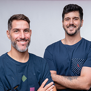
Carlos Mignot and Rodrigo Saiani are two passionate designers from Estúdio Plau, specializing in typography. Carlos, originally from Campos dos Goytacazes, began his career in engineering, but his creative streak led him to graphic design. In turn, Rodrigo, born in SJ dos Campos and based in Rio since a young age, discovered his passion for design when experiencing the power of animation with Flash macromedia.
Together, they form a talented team that has created popular typography used by millions of people around the world. His work has been recognized with awards at important events and honors, such as Cannes, D&AD Awards and BDA. Furthermore, they share the vision of making typography as popular as music, inspiring people of all tastes and making typographic design a democratic and admired discipline.
With Carlos Mignot and Rodrigo Saiani as your guides, you will be in the hands of experts who will teach you the secrets of pop typographic design and inspire you to explore new forms of expression through letters.
- 100% positive reviews (42)
- 4,289 students
- 21 lessons (4h 40m)
- 28 additional resources (17 files)
- Online and at your own pace
- Available on the app
- Audio: Portuguese, English, Spanish (Latam), French, Indonesian, Italian, Romanian, Turkish
- Spanish · English · Portuguese · German · French · Italian · Polish · Dutch · Turkish · Romanian · Indonesian
- Level: Beginner
- Unlimited access forever
Category
Areas


