Lettering as an Identity
Analysis and final adjustments
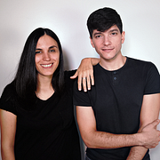
A course by Yani&Guille , Lyricists, Graphic Designers and Typographers
Joined January 2017
About the video: Analysis and final adjustments
Overview
“We will critically analyze our already vectorized design and make all the corrections and modifications that we believe necessary. ”
In this video lesson Yani&Guille addresses the topic: Analysis and final adjustments, which is part of the Domestika online course: Lettering as an Identity. Learn how the shapes of letters can strengthen the personality of a message.
Partial transcription of the video
“[Music] Now with our final vectorized designs we are ready then to go to our computer and carry out the final adjustments. This is, for example, modifying aspects such as spacing In some areas that we can already begin to identify, or some inclinations that were left in the pipeline, So let's start with a brief analysis of what we are seeing. Let's start by making some notes about what we see. Let's create a new layer, let's lock this layer with original design. [Music] So here we had identified an area quite open, let's then indicate it this way. In this case we can see that it looks quite...”
This transcript is automatically generated, so it may contain mistakes.
Course summary for: Lettering as an Identity
-
Category
Calligraphy & Typography -
Software
Adobe Illustrator, Adobe Photoshop -
Areas
Branding & Identity, Graphic Design, Hand Lettering, Lettering

Yani&Guille
A course by Yani&Guille
Guille Vizzari and Yani Arabena are lyricists, graphic designers and typographers. They met while studying at the University of Buenos Aires where they began to work together fusing calligraphy and illustration.
In 2014 they founded their own studio (Yani & Guille) specialized in calligraphy, lettering and typography applied to graphic design and giving workshops on these disciplines both in Argentina and in the rest of Latin America.
Both recognize that they are passionate about handmade design, especially those pieces with a high degree of refinement and care that reflect the dedication of the artist.
Throughout their career they have produced typographical works that can be found in foundries such as Sudtipos (Esmeralda, Abelina Pro and Quotes) and Latinotype and have worked for clients such as All Saints Cafe, the Masticar, Chandon and Arcor gastronomy fair as well as covers for books and magazines.
- 98% positive reviews (131)
- 1,749 students
- 16 lessons (2h 53m)
- 15 additional resources (9 files)
- Online and at your own pace
- Available on the app
- Audio: Spanish
- Spanish · English · Portuguese · German · French · Italian · Polish · Dutch
- Level: Beginner
- Unlimited access forever


