Basics of Typography from A to Z
Micro: the typographic detail 1
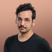
A course by Álvaro Franca , Graphic Designer and Lettering Artist
About the video: Micro: the typographic detail 1
Overview
“To take the first steps in our final project, let's focus on the details, think carefully about how the main text of the magazine works to create a solid basis that can support this graphic system. ”
In this video lesson Álvaro Franca addresses the topic: Micro: the typographic detail 1, which is part of the Domestika online course: Basics of Typography from A to Z. Discover the infinite possibilities of typography for conveying and enhancing your message.
Partial transcription of the video
“In this class. we will talk again about text hierarchy. but from a micro perspective. which means focusing on the finer details. This includes spacing. kerning. text styles. and all the elements we must address before evaluating the typographic system at its most I will teach this while taking the first steps in a magazine project. Shall we begin? When we are creating a complex piece like the magazine for this final project. It is very important to take some time at the beginning to experiment a lot and define what the detail appearance will be in our typographic system. So we need to start...”
This transcript is automatically generated, so it may contain mistakes.
Course summary for: Basics of Typography from A to Z
-
Category
Calligraphy & Typography -
Software
Adobe Illustrator, Adobe InDesign -
Areas
Art Direction, Editorial Design, Graphic Design, Typography, Web Design

Álvaro Franca
A course by Álvaro Franca
Álvaro Franca is a Brazilian graphic artist and an expert in typography and lettering who became fascinated with language at an early age. Álvaro holds a degree in Graphic and Industrial Design from the Rio de Janeiro State University and specialized in typography at EINA, the University School of Design and Art located in Barcelona, where he currently lives.
Since 2018. Álvaro has been working at Vasava, a multidisciplinary studio where he applies his mastery of font types to a wide range of projects, including animation, branding, editorial design, and lettering. He is also the co-founder of Naipe Foundry, a typography company that works with big-name clients like TV Globo, Sony Music and Descomplica.
- 99% positive reviews (158)
- 4,001 students
- 23 lessons (4h 58m)
- 19 additional resources (3 files)
- Online and at your own pace
- Available on the app
- Audio: Portuguese, German, English, Spanish (Latam), French, Indonesian, Italian, Dutch, Polish, Romanian, Turkish
- Spanish · English · Portuguese · German · French · Italian · Polish · Dutch · Turkish · Romanian · Indonesian
- Level: Beginner
- Unlimited access forever
Category
Areas


