Basics of Typography from A to Z
Course final project
A course by Álvaro Franca , Graphic Designer and Lettering Artist


About the final project for: Basics of Typography from A to Z
Basics of Typography from A to Z
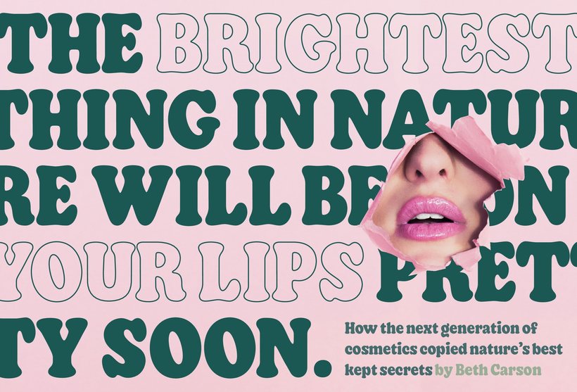
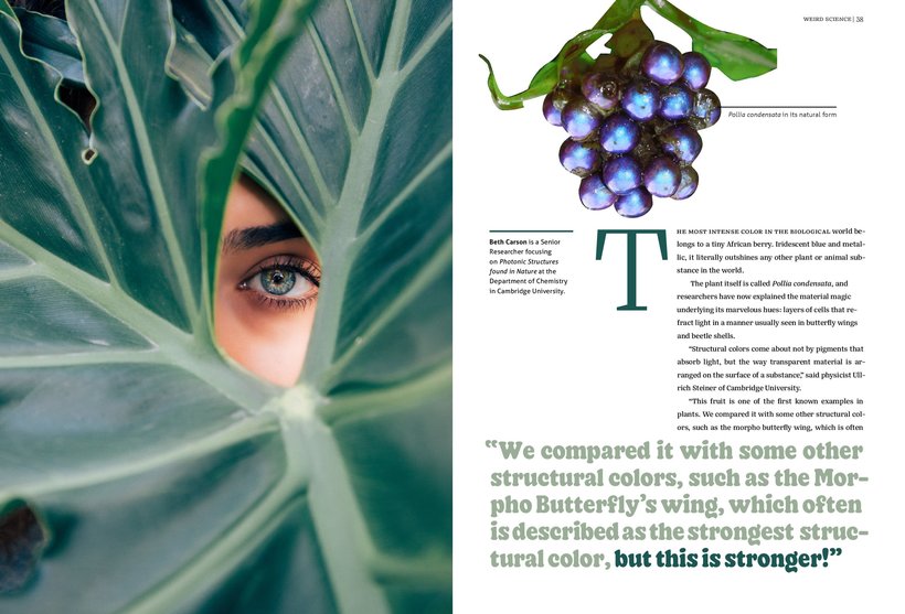
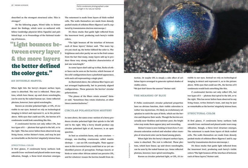
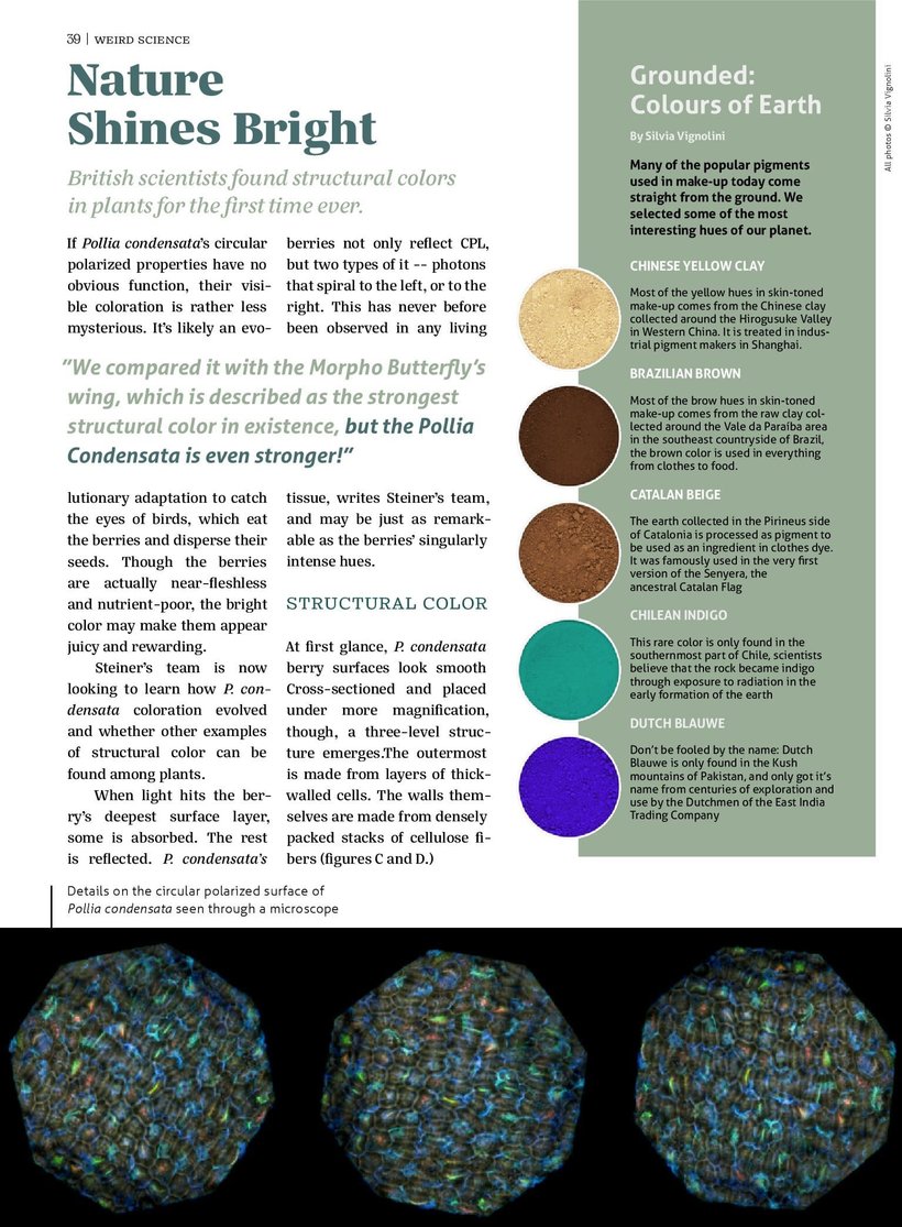
“I hope you learned and had fun with the course, I had a lot of fun preparing everything. More than anything, I hope I have sparked a greater interest in this passionate universe that is typography, and that what you have learned will be very useful in your future projects, in addition to your final course project. Little by little we saw the concepts, approaches and bases that we need to know to work with sources. I showed how I usually work and told some secrets of the profession. Now is a good time to remember the process I followed to apply this knowledge to the design of a magazine. But don't forget that by experimenting a lot you will get better results, and you don't need to create a magazine with the same theme as mine! Target your work The first thing we have to do is define a briefing. Think carefully about who will read your magazine, its subject, size, periodicity and everything else that helps it to become more tangible, more real. These are the things that will guide you when it comes to work. Check the internet With a brief in hand you need material. Find a text that interests you and images to follow. I always get images on Unsplash. It’s also time to download more fonts legally if you haven’t already done so, increase your typographic arsenal! Another thing that helps me a lot is knowing examples of good magazines, I love the selection on Fonts In Use. The flowing text With the material in your hands, you can start experimenting. Flowing text is the basis of the layout, so better start with it. Try sizes and between the lines seeking the comfort of the reader, try to stick to the tone of voice you set in your brief. Experimenting is the key Try a lot to not regret it later. Did you use a Sans? Would a Serifada look cool? It is always important not to stick to your first choice. Comparing a column with two or three paragraphs composed of different families will help you to see if your choice is right. Increase your team With the flowing text defined you can allow yourself to have more expressive sources for the highlighted paragraphs and for the opening of the article. Which family will play well with your text family and make a pair that makes sense to your reader and the content? Always experimenting, of course! Attention to the functionality In the smallest elements like the booms and captions, prioritize performance within your typographic families. Choose fonts that work in these sizes, after all this content must be readable. And whenever you can, test your choices by evaluating them on the real scale. If you can print, even better. Master of sources You can be confident that if you managed to compose these magazine pages, there will be no project with sources that you cannot master. Big or small, functional or expressive, there will be nothing that you cannot control. Show it to us When you are finished, upload your project in PDF format and in the forum we will talk about the result and see where you got it right and in what aspects we can still improve. On the other hand, if in addition to the Domestika community, you also want to share with everyone, you can post some photos on Instagram by checking @alvaroefe y @domestika . I hope you produce and share your future work here with everyone in the Domestika creative community. In addition, seeing the process of creating other people enables us to learn more and learn about other ways of thinking. Important: everyone is invited to give feedback on community work! I will pay attention to the messages and ask for patience if at some point it takes a while to respond, our work agenda is always in motion. :) And I leave here the result of my magazine for this course:
Partial transcription of the video
“We’ve now concluded the course. I hope you enjoyed it as much as I did and found it inspiring for selecting fonts in your future endeavors. Our final project was a magazine. but naturally. you can apply these skills to other projects as well. You can apply these techniques to various pieces. such as interfaces. packaging. book covers. posters. and logos. Let's revisit the steps I demonstrated to help you choose fonts with confidence. Remember. these skills are versatile and can enhance your design projects across different mediums. We started by searching in the right place. To demonstrate....”
This transcript is automatically generated, so it may contain mistakes.
Course summary for: Basics of Typography from A to Z
-
Category
Calligraphy & Typography -
Software
Adobe Illustrator, Adobe InDesign -
Areas
Art Direction, Editorial Design, Graphic Design, Typography, Web Design

Álvaro Franca
A course by Álvaro Franca
Álvaro Franca is a Brazilian graphic artist and an expert in typography and lettering who became fascinated with language at an early age. Álvaro holds a degree in Graphic and Industrial Design from the Rio de Janeiro State University and specialized in typography at EINA, the University School of Design and Art located in Barcelona, where he currently lives.
Since 2018. Álvaro has been working at Vasava, a multidisciplinary studio where he applies his mastery of font types to a wide range of projects, including animation, branding, editorial design, and lettering. He is also the co-founder of Naipe Foundry, a typography company that works with big-name clients like TV Globo, Sony Music and Descomplica.
- 99% positive reviews (158)
- 4,000 students
- 23 lessons (4h 58m)
- 19 additional resources (3 files)
- Online and at your own pace
- Available on the app
- Audio: Portuguese, German, English, Spanish (Latam), French, Indonesian, Italian, Dutch, Polish, Romanian, Turkish
- Spanish · English · Portuguese · German · French · Italian · Polish · Dutch · Turkish · Romanian · Indonesian
- Level: Beginner
- Unlimited access forever
Recommended software & tools for this course
Category
Areas

