Basics of Typography from A to Z
A course by Álvaro FrancaGraphic Designer and Lettering Artist
A course by Álvaro Franca, Graphic Designer and Lettering Artist

Discover the infinite possibilities of typography for conveying and enhancing your message
Choosing the right typography is a key step in defining your design’s tone of voice. That’s why typography specialist Álvaro Franca sees them as a source of infinite possibilities for conveying messages, whether as a designer in studio Vasava (Barcelona), or as co-founder of Naipe Foundry, where he collaborates with clients like TV Globo, Sony Music, and Descomplica.
In this course, Álvaro teaches you how to choose the right typography for big and small projects alike by covering everything from logos to magazine design. Dive into the history of typography and discover how to combine font families, sizes, and styles to create an effective and coherent piece. By the end of the course, you’ll know how to choose the perfect font for any design project you’re working on.
What will you learn in this online course?
23 lessons & 19 downloads
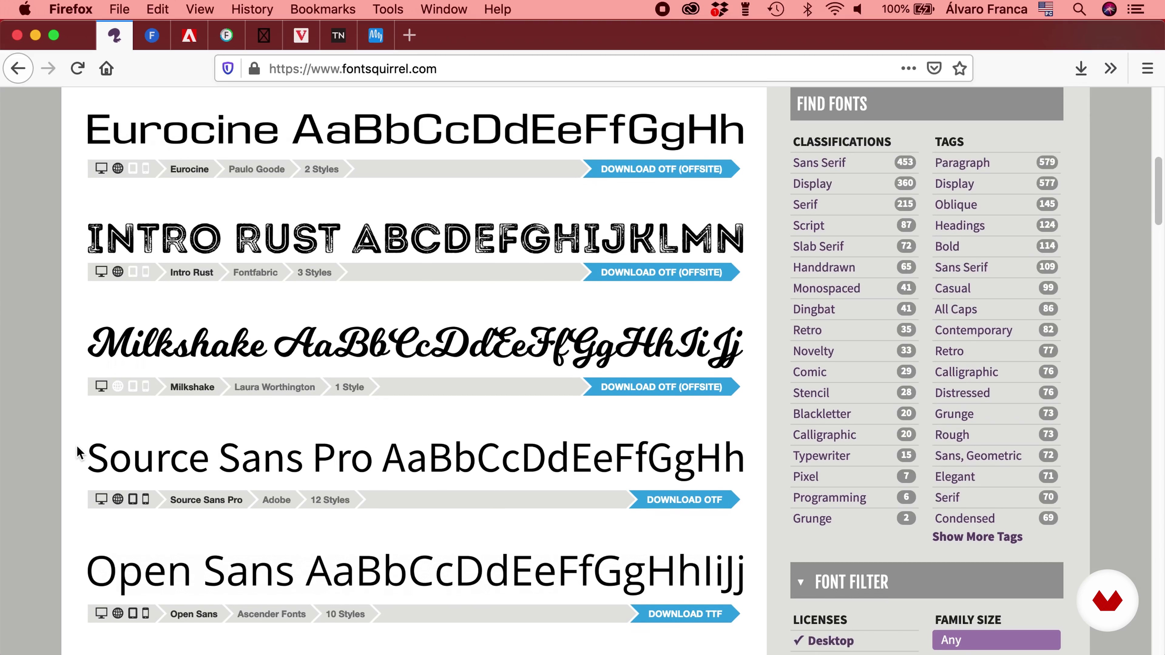
What will we do in the course?
1 minute, 38 seconds
Find fonts
12 minutes, 40 seconds
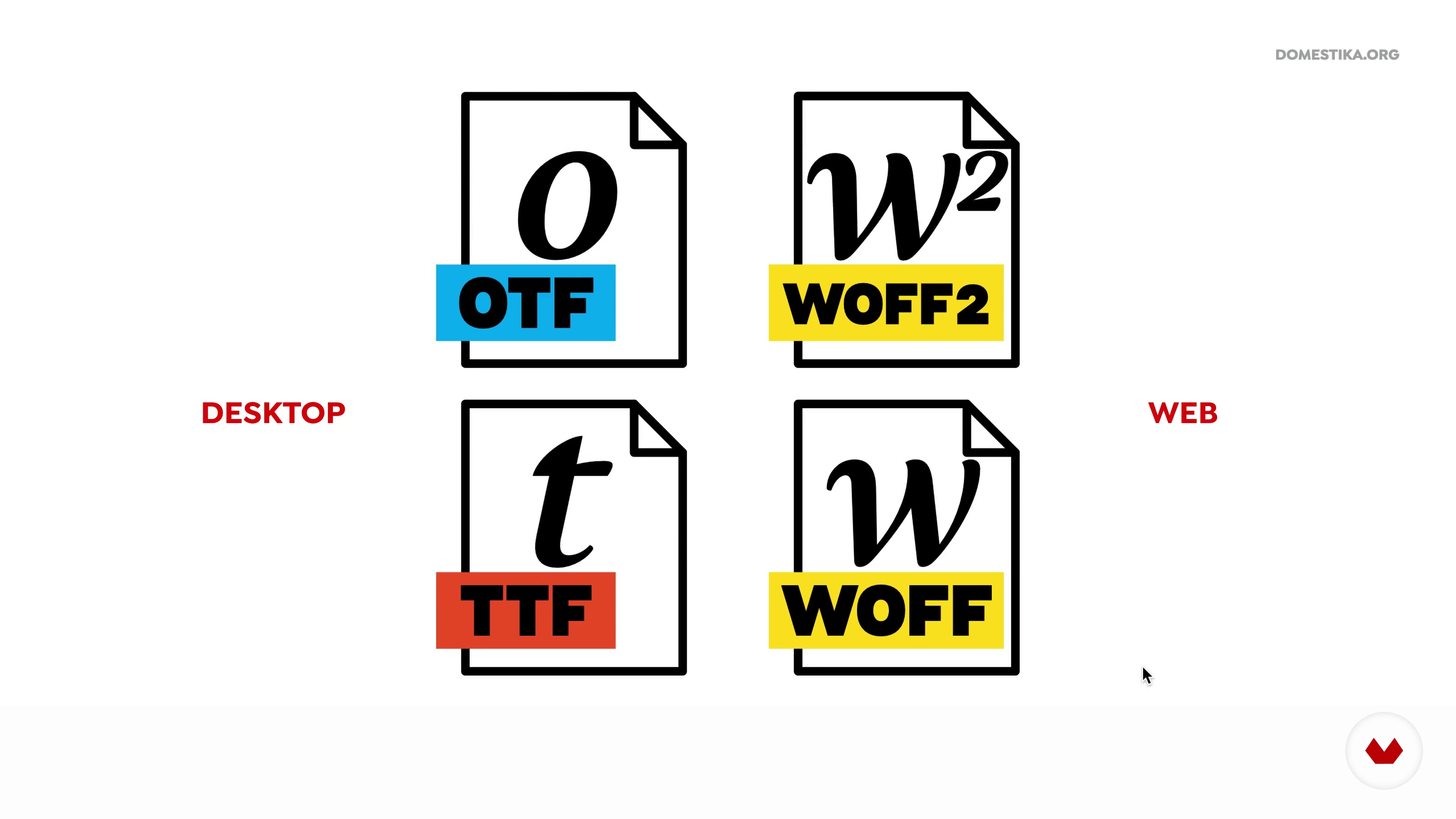
Font formats
15 minutes, 11 seconds
Licenses
10 minutes, 55 seconds
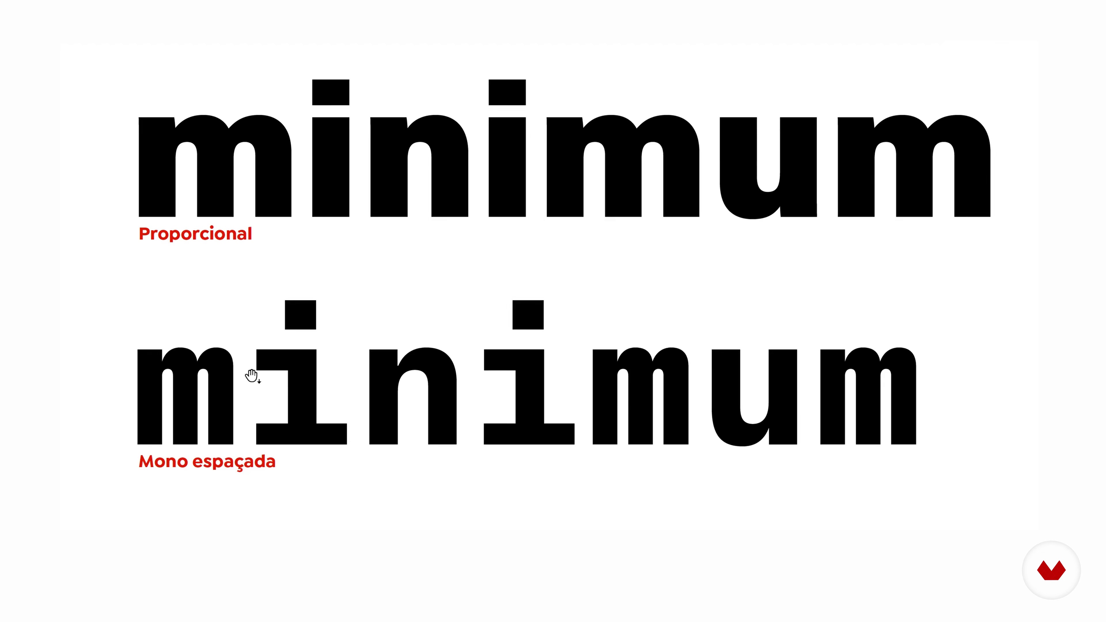
To the letter: typographic vocabulary 1
10 minutes, 37 seconds
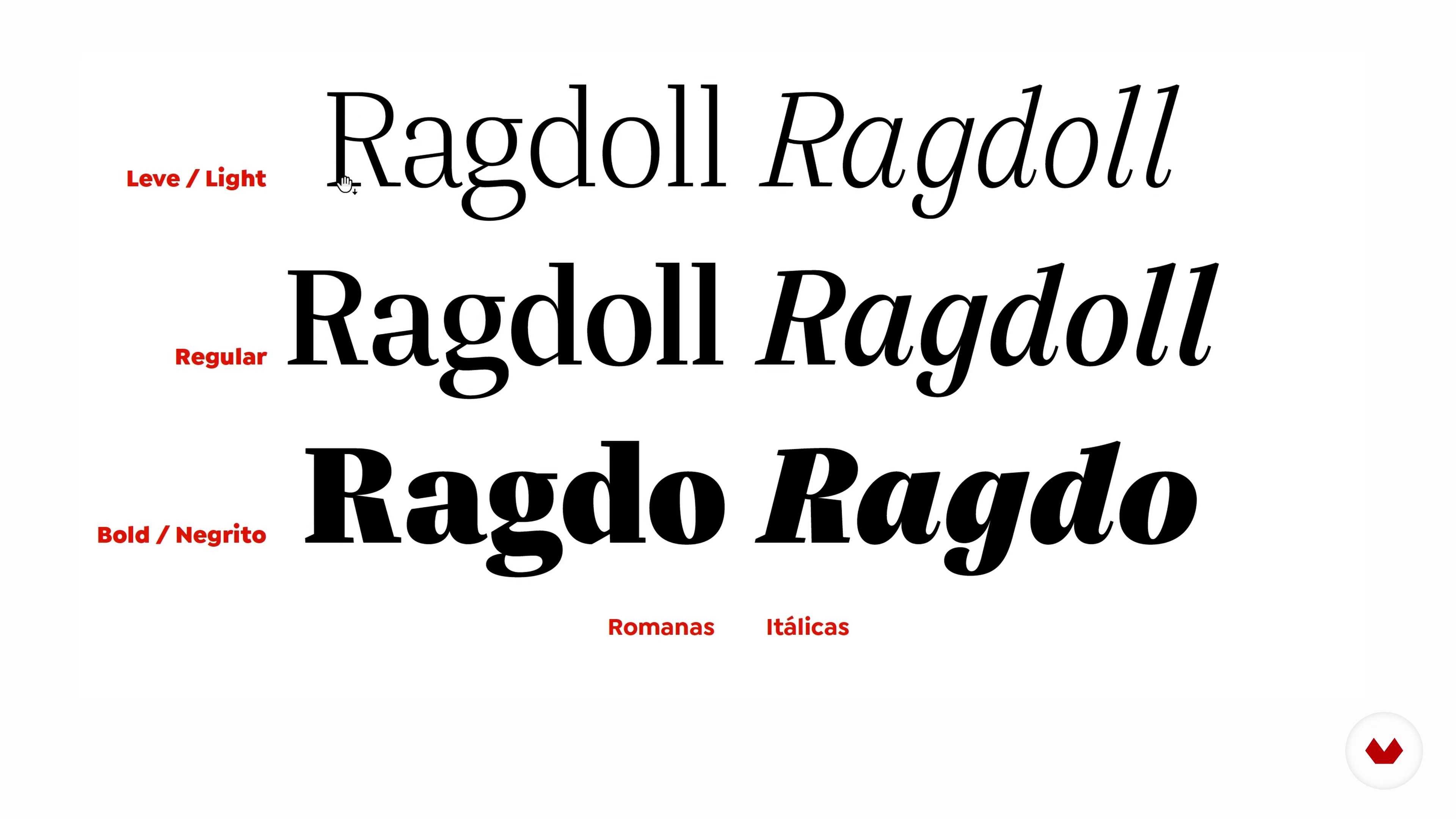
To the letter: typographic vocabulary 2
11 minutes, 0 seconds
What's included in this course?
Start by getting to know Álvaro Franca, who will tell you about his experience in the design world, his biggest influences, and what inspires his work. Next, he gives you a rundown of the course content and explains the final project.
Then, jump right into the theory and start laying the groundwork for a typography project. Learn how to search for fonts and find materials without making any big investments. Discover what different font formats are used for and explore one of the most important concepts of working with typographies: use licenses.
Álvaro then explains why it’s important to have an in-depth knowledge of letters and each member of the typography family. Learn about the history of the Latin alphabet, discover the origin of upper and lowercase letters and why italics are slanted, and take a closer look at typographic hierarchy, a concept that dictates how to organize fonts to improve readability.
“The letters used throughout human history capture and reflect the essence of their time period.” This quote summarizes the history of typography and helps you understand how it influences design. Álvaro explains how to quickly and easily identify typography categories and shows you his approach to choosing typographies based on their shape and purpose. He also teaches you how to control the visual tone of your pieces.
To close out the course, learn how to combine different typography families and further explore typographic hierarchies as these two concepts are helpful for deciding on your project's typographic system. As a final note, Álvaro shares some tips for using InDesign on future typography projects.
Recommended software & tools for this course
What is this course's project?
Select a typography and use it to design a magazine.
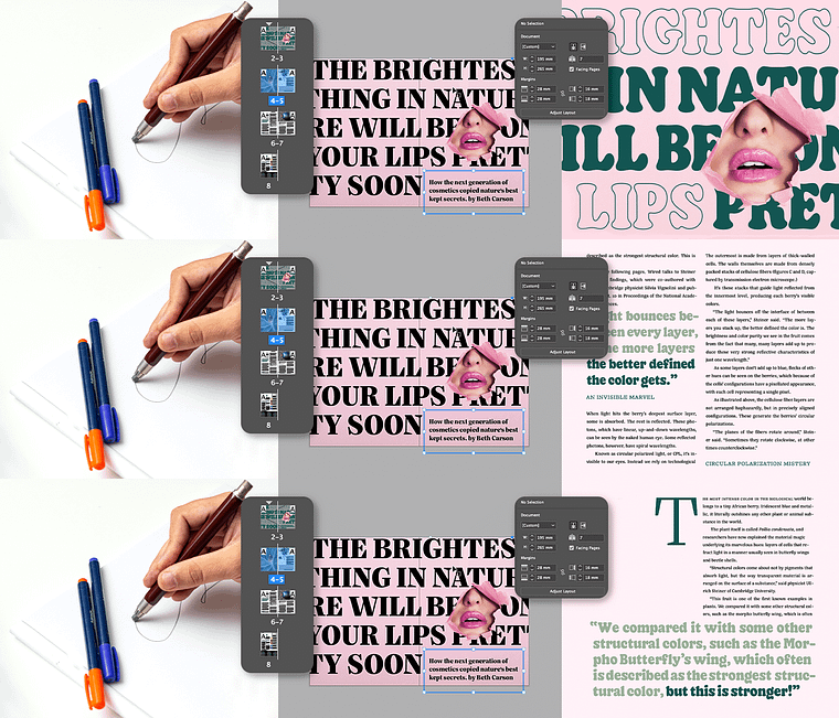
Projects by course students
Who is this online course for?
Designers and non-designers, with or without experience, who want to take their knowledge of typefaces to a new level. This course is also for anyone looking for a starting point in the world of typography.
Requirements and materials
No prior knowledge is necessary since the teacher explains each concept from the beginning.
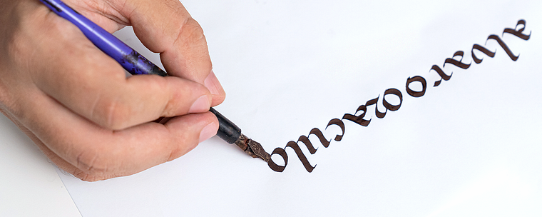
Reviews
- 3 months ago
Muy buen curso. Me gustó mucho y me resultó útil la información que comparte
- 4 months ago
Recien terminé el curso y estuvo increíble. Soy diseñador pero me faltaba fortalece mi conocimiento en tipografía y este curso dió en el objetivo.
Lo super recomiendo incluso si no tienes ningún conocimiento en tipografía, muy completo y super claro.
- 5 months ago
Very useful and inspiring course to learn typography
- 8 months ago
Curso excelente. Uma ótima introdução ao tema, que me apresentou tópicos que eu ainda não conhecia e que, com certeza, vou pesquisar mais.
- duzgulPLUS8 months ago
Very helpful to get a systematic understanding of typography and inspiring to study more.

Since 2018. Álvaro has been working at Vasava, a multidisciplinary studio where he applies his mastery of font types to a wide range of projects, including animation, branding, editorial design, and lettering. He is also the co-founder of Naipe Foundry, a typography company that works with big-name clients like TV Globo, Sony Music and Descomplica.
Content
- U1
Introduction
- Presentation
- Influences
- What will we do in the course?
- U2
Preparation
- Find fonts
- Font formats
- Licenses
- U3
Knowing the sources
- To the letter: typographic vocabulary 1
- To the letter: typographic vocabulary 2
- The Latin alphabet 1
- The Latin alphabet 2
- A fine-tuned group: hierarchy of text
- U4
History and typographic classification
- History of typography 1
- History of typography 2
- Typographic classification 1
- Typographic classification 2
- Form and function
- Typographic archetypes
- U5
Putting it into practice: selecting sources for a magazine
- Combining fonts 1
- Combining fonts 2
- Micro: the typographic detail 1
- Micro: the typographic detail 2
- Macro: the typographic system 1
- Macro: the typographic system 2
- FP
Final project
- Basics of Typography from A to Z
What to expect from a Domestika course
Learn at your own pace
Enjoy learning from home without a set schedule and with an easy-to-follow method. You set your own pace.
Learn from the best professionals
Learn valuable methods and techniques explained by top experts in the creative sector.
Meet expert teachers
Each expert teaches what they do best, with clear guidelines, true passion, and professional insight in every lesson.
Certificates
PLUSIf you're a Plus member, get a custom certificate signed by your teacher for every course. Share it on your portfolio, social media, or wherever you like.
Get front-row seats
Videos of the highest quality, so you don't miss a single detail. With unlimited access, you can watch them as many times as you need to perfect your technique.
Share knowledge and ideas
Ask questions, request feedback, or offer solutions. Share your learning experience with other students in the community who are as passionate about creativity as you are.
Connect with a global creative community
The community is home to millions of people from around the world who are curious and passionate about exploring and expressing their creativity.
Watch professionally produced courses
Domestika curates its teacher roster and produces every course in-house to ensure a high-quality online learning experience.
FAQs
This course is perfect for graphic designers, design students, creative professionals, and anyone eager to deepen their knowledge of typography, font creation, and typographic application in visual projects.
Prior experience isn’t required, but basic graphic design knowledge and familiarity with digital tools will help you get the most out of the intermediate content.
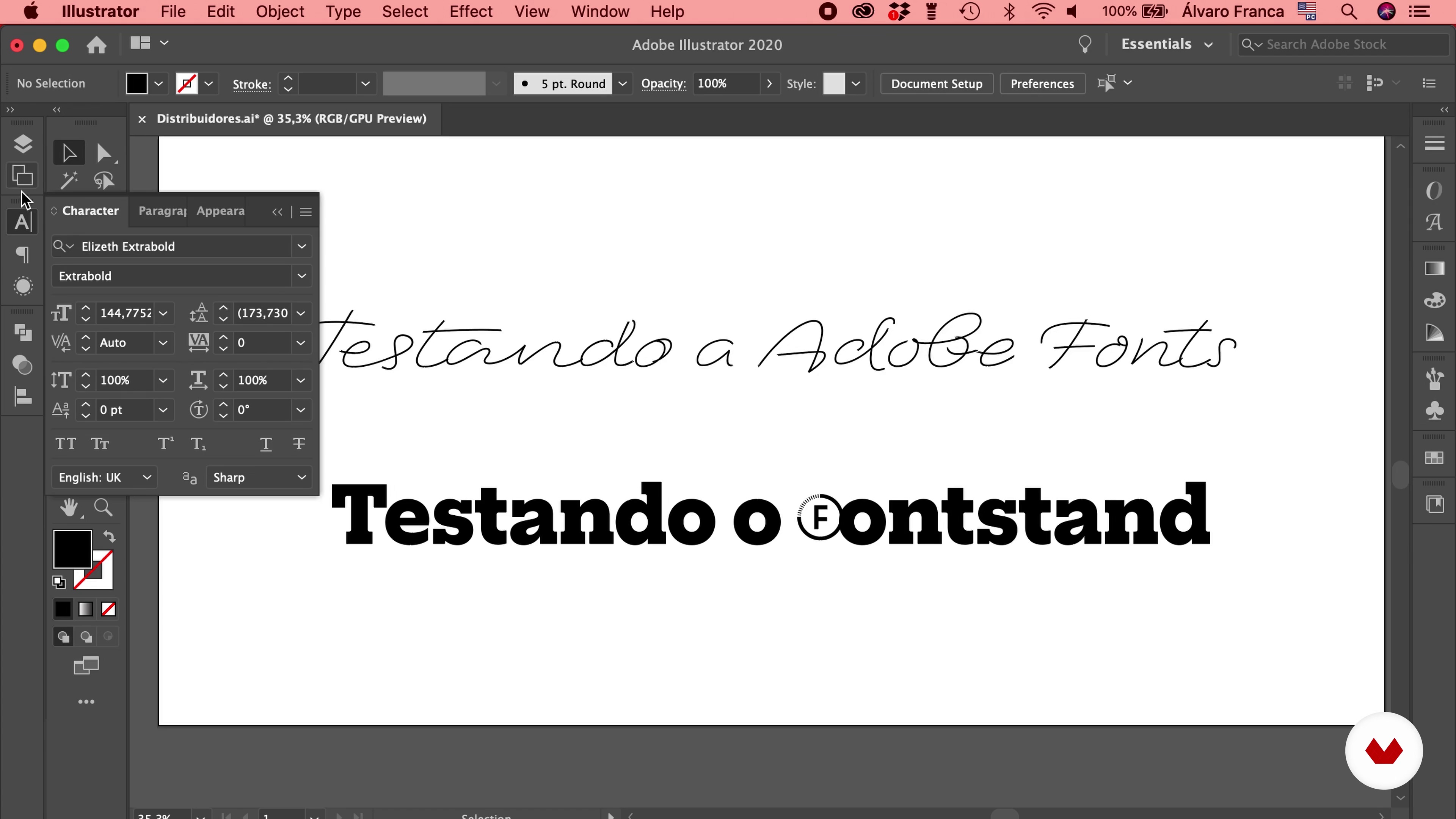
You’ll need a computer, internet access, design software like Adobe Illustrator or InDesign, plus tools for font testing and syncing such as FontStand and Adobe Fonts.
You’ll learn the historical and technical foundations of typography, font creation and analysis, selection criteria, licensing, typographic composition, plus strategies for portfolio building, networking, and project management.
The course covers typography history, font classification, visual composition, original font creation, licensing, font selection and pairing, market practices, and project analysis.
It presents technical and aesthetic criteria for font selection, combination, and hierarchy, with practical examples from editorial projects, logos, and posters.
Yes, the course guides you through creating original fonts, licensing details, sales strategies for businesses, and client distribution.