


How to Identify a Good Logo
Learn how to identify a good logo, with designer Sagi Haviv
Your logo is the first image people will associate with your brand. That is a lot to ask of one small graphic, but the greatest designs manage to communicate a company’s identity and ethos in an instant.
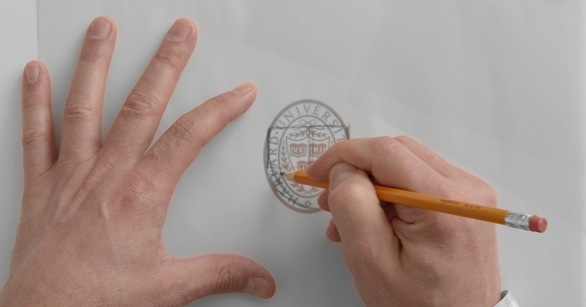
Few know this better than Sagi Haviv (@sagi), partner and designer at Chermayeff & Geismar & Haviv, who has developed more than 60 graphic identities, including those of the US Open, Harvard University Press, and National Geographic.
In this video, Sagi Haviv reviews different designs, highlighting and explaining their strengths and weaknesses so that you can better understand how to apply these lessons to your own work.
1. Simplicity
Finding simplicity is anything but simple, but when we try to do too much with a design it can produce something that confuses customers or is just plain ugly. Once you have your initial sketches, think of everything you can do to reduce your picture without compromising the message you want to send.

2. Legibility
You could use the most beautiful typography in the world, but if a passerby doesn’t know what it says, your logo is close to useless. A logo is supposed to say something, so make sure that those who see it can work out what that is.

3. Efficiency
Sagi’s favorite logo in the video above manages to evoke numerous associations while still maintaining a distinctive identity: we can see the initials of the company and two symbols that connect to the brand’s identity–a love heart, and a book–merged into one.

If you want to learn more about the basic principles of logo design as you develop your personal identity as a designer, check out Sagi Haviv's online course Logo Design: From Concept to Presentation.
You may also like:
- Typography Customization for Logo Design, a course by Monotypo Studio
- Creation of an Original Logo from Scratch, a course by Tatabi Studio
- Typography and Branding: Design an Iconic Logo, a course by Quique Ollervides


0 comments