


These 7 Colors Will Trend in 2022 According to the Experts
Seven major paint brands announce their color trend predictions for the coming year
With only a few weeks of 2021 left to go, the biggest design brands have been releasing their 2022 color trend predictions. Seven of the world’s major paint brands, all leading interior design players, have already announced their top colors for 2022—and interestingly, their picks converge.
Benjamin Moore, PPG, Sherwin Williams, Glidden Paint, and Behr, have all chosen greens while Graham and Brown and Dulux predict a good year for blues. And keeping with this palette, the Pantone Color of the Year 2022 has been announced: a unique shade of blue with a violet undertone called Very Peri, that can work with both blues and greens in analogous color palettes.

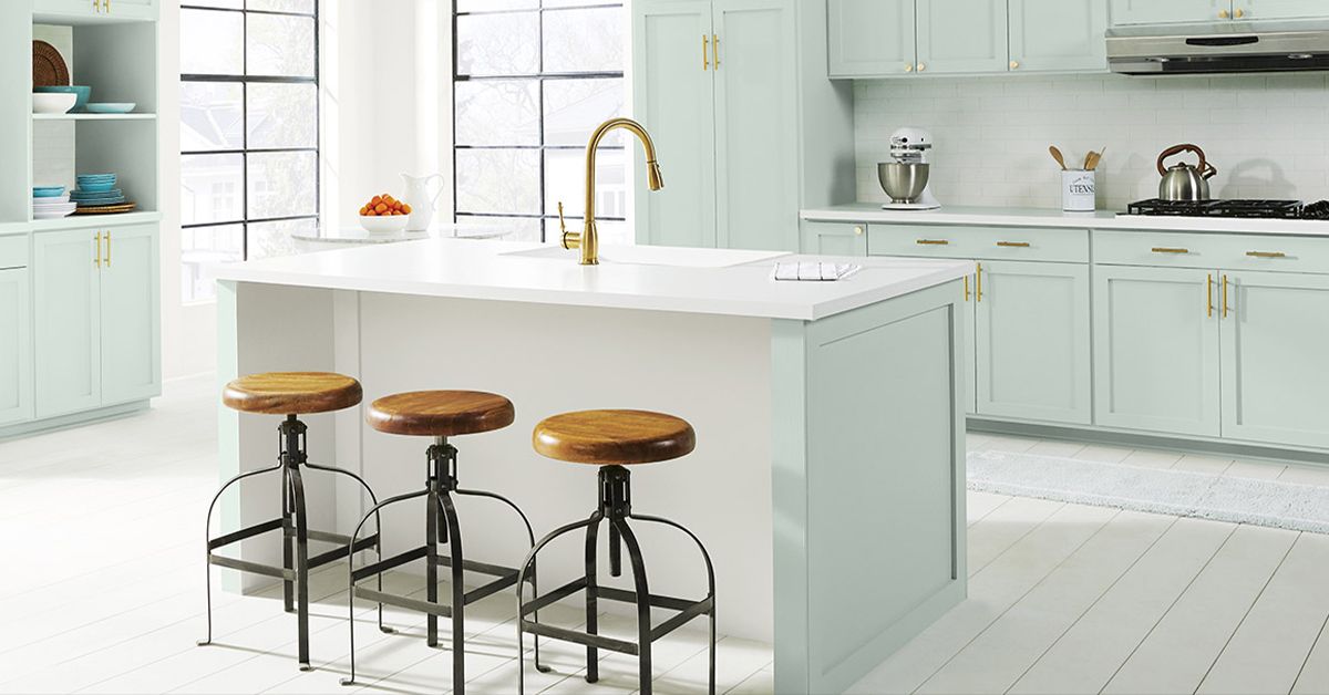
1. October Mist
New York firm Benjamin Moore has been working in the color industry for 132 years. It chose greeny shade October Mist as its star 2022 color from among its existing 3,550-shade catalog. Benjamin Moore poetically describes the "gently shaded sage" as a color that "quietly anchors a space, while encouraging individual expression."

The company also announced that, like all its products, October Mist uses environmentally friendly dyes that don’t damage painters’ respiratory systems.
2. Olive Sprig
An elegant grayish-green that makes you think of the earth, PPG has named versatile and flexible shade Olive Sprig as its 2022 color of the year. From its Pittsburgh HQ, the 135-year-old firm announced it will make the color available in all seventy countries where it operates.

PPG believes this olive is symbolic of rebirth, evoking nature’s power for recovery. As they say, it "emulates the feeling of soothing aloe vera or a fragrant plant—brightening any space with organic liveliness."
3. Evergreen Fog
Sherwin Williams chose Evergreen Fog as its color of 2022. An adaptable and calming shade that's halfway between green and gray—with a touch of blue for added gravitas—its simple sophistication is a way of bringing nature into urban spaces.

Sherwin Williams launched its first shade in 1866 when brothers Henry Sherwin and Edward Williams founded the company in Cleveland, Ohio. Ever since they have continued to decorate the world with their colors through 130 points of distribution.
4. Guacamole
“We have taken our green- and guac-loving affinity to a whole new level," Glidden Paint announced in an official press release about their 2022 color. Glidden is a bold young subdivision of PPG (which also explains the freshness behind their choice).

This is the buzziest green on the list. Like the others, it emphasizes the idea of bringing green energy inside and aims to invigorate homes after such a long confinement. It also harks back to the much-loved Pre-Hispanic Mexican food associated with good times.
5. Breezeway
Chosen by US paint firm Behr, they say this calm green was inspired by beaches with a calm tide, gentle sun, and relaxing breeze as its inspiration.

Invoking feelings of fresh air and gentle enjoyment, the brand recommends combining Breezeway with white, gray, and natural wood shades to create relaxed and harmonious environments. Based in Santa Ana, California, Behr operates in the United States, Canada, China, Chile, and Mexico.
6. Breathe
Unlike the other brands on this list so far, British firm Graham and Brown chose a blue as its color for 2022. However, the international wall design group (with over seventy years of experience in the game) is still following similar themes with product descriptions that mention fresh air and a need to reset the mood.

“Breathe is a soothing mid blue, perfect for creating calm and peaceful spaces which is exactly what we all need for the year ahead. Dark enough to add color and depth but light enough to remain refreshing,” explains Graham and Brown. They recommend the tone for use anywhere in the house, combined with crisp whites and cool grays for an "airy" feel. Alternatively, they suggest pairing it with deeper blues for a moodier atmosphere.
7. Bright Skies
Dulux started out selling its products exclusively to design experts, then in 1950, it began commercializing designs directly to the general public. Also on the blue path, for 2022 the company has chosen the light and airy Bright Skies. The shade is said to capture feelings of optimism and the desire for a new start.

“Right now, people want to feel revitalized and enjoy the freedoms that are returning to them, to look out and bring in new ideas,” commented Marianne Shillingford, the brand’s creative director said in an interview with specialist design magazine, Dezeen.
And now, there is yet another color to add to this mix. Pantone describes Very Peri, its Color of the Year 2022, as invigorating to our creativity, and a representation of the desire to reinvent in a changing world. If you want to deep dive into this daring hue, check out this post.
To learn more about the meaning of color and the importance of choosing the right shade for your home, don’t miss Shari Francis’s course, Interior Design Fundamentals: Mastering Color and Texture. A Brooklyn-based designer, Shari who creates visually striking interior spaces for residential, commercial and hospitality projects, Shari teaches you how to create original designs through color composition and textured finishes.
English version by @studiogaunt.
This article was updated on December 14 to reflect the announcement of Pantone's Color of the Year 2022.
You may also like:
- Seeing the Same Color Everywhere? Why It May Be the Next Pantone
- Colorize Translates Words into Colors
-Interior Design Tutorial: How to Choose Your Color Palette
- African-Inspired Interior Design: Explore Color and Pattern, course by Eva Sonaike


1 comment
laurettastokes89
these color will make the room modern and elegant. I think it's royal and amazing jigsaw puzzle