Seeing the Same Color Everywhere? It May Be the Next Pantone
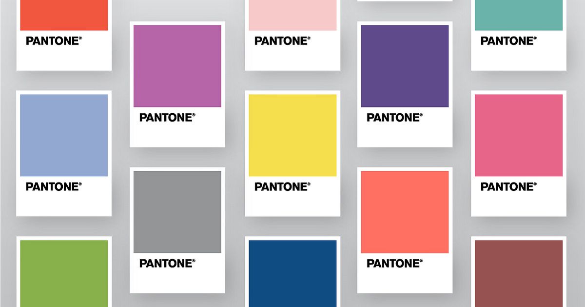
Pantone's Color of the Year doesn't only set the trends, it's influenced by them too
Have you ever noticed how certain colors start appearing with increasing regularity? Maybe you start seeing coral appearing in fashion, next in makeup, and then on walls, phones, furniture, films, and posters. And then a year or two later, it becomes Color of the Year, as chosen by the global authority on color, Pantone.
Every December, the design world holds its breath as the Pantone Color Institute gets ready to announce the Color of the Year. So how do they select it?
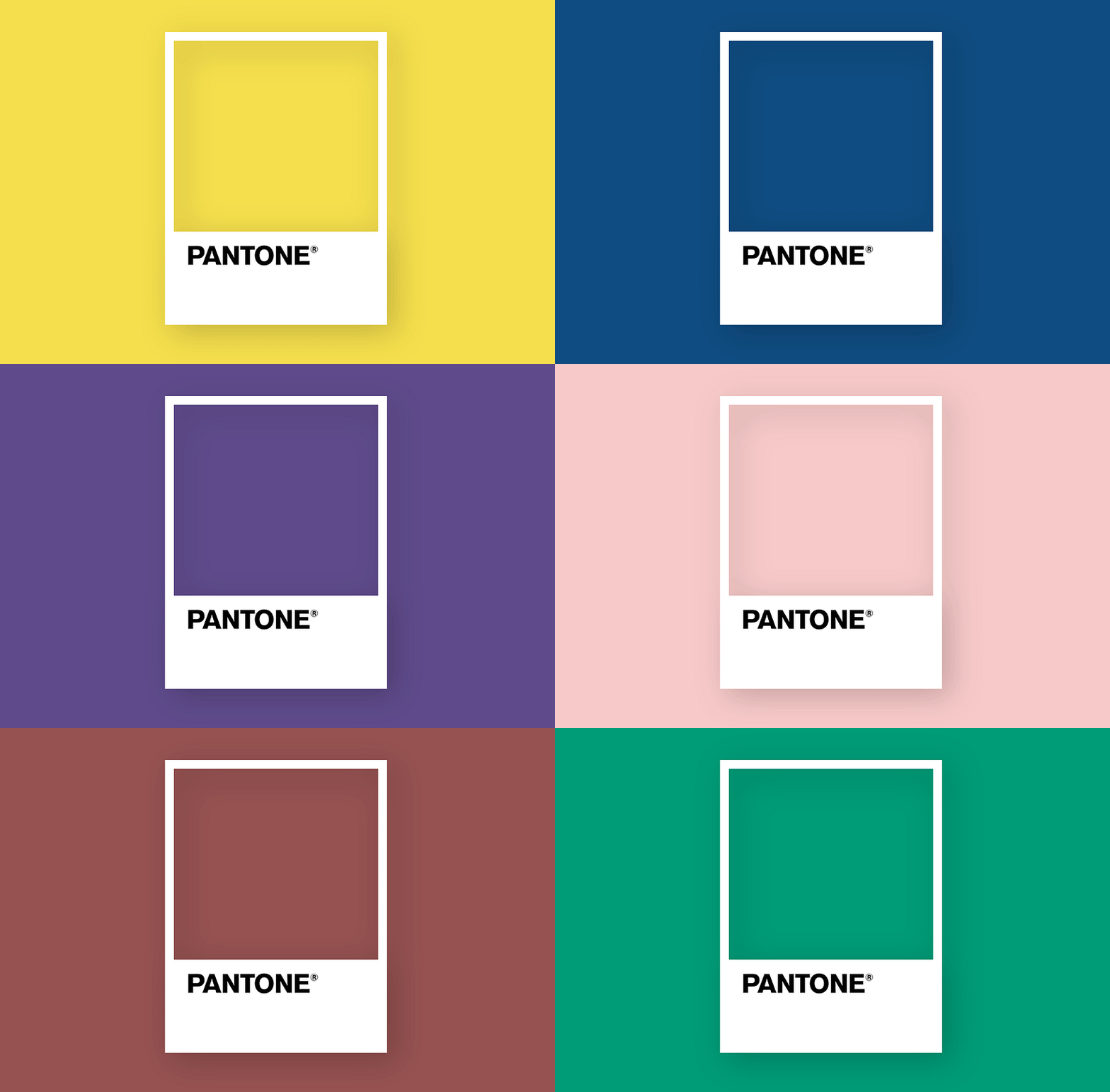
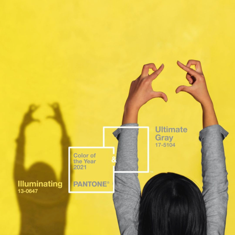
The color should be a reflection of the global mood. For example, Pantone (unusually) picked two colors for 2021: Illuminating Yellow and Ultimate Gray. The two together were meant to symbolize strength and optimism during difficult times.
But Pantone’s yearly selection is also based on extensive research into colors that have begun cropping up in daily life. You can find out more about how Pantone selects Color of the Year here.
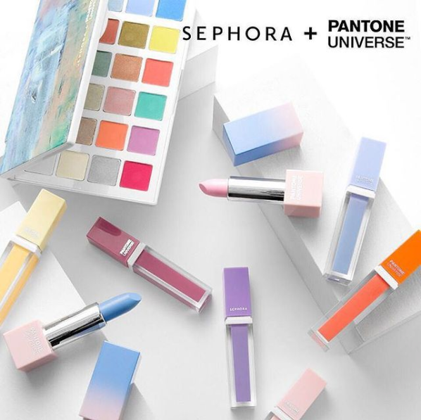
In an attempt to be “on-trend,” many brands use Pantone Color of the Year as a marketing tool, like makeup brand Sephora and tea brand Tealeaves, for example. But let's have a look at the times when brands, designers, filmmakers, and creators in general, were ahead of the trend and may have influenced Pantone’s color selection.
By looking at certain colors that have begun popping up over the past few years, you may even be able to guess next year’s Pantone.
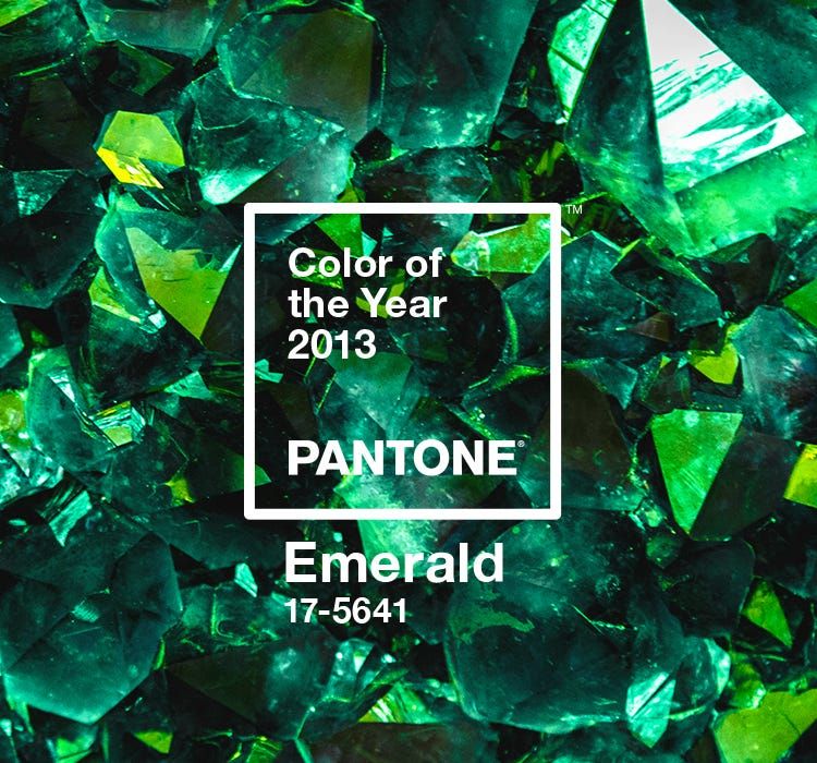
2013: Emerald Green
Back in 2013, Pantone said that Emerald Green “enhances our sense of well-being” and promotes “balance and harmony”. They also noted that the color is perceived as “sophisticated and luxurious.”
So sophisticated and luxurious, that it appeared draped over four of Hollywood’s creme-de-la-creme during the 2011 Golden Globes ceremony: Angelina Jolie, Catherine Zeta-Jones, Mila Kunis, and Elizabeth Moss.
2016: Rose Quartz and Serenity
Pantone surprised the world when they picked two colors, rather than one, in 2016. This combination represents “mindfulness and well-being” in the face of a fast-paced, stress-filled world. It was around this time of course that the concepts of mindfulness and wellbeing were really gathering pace.
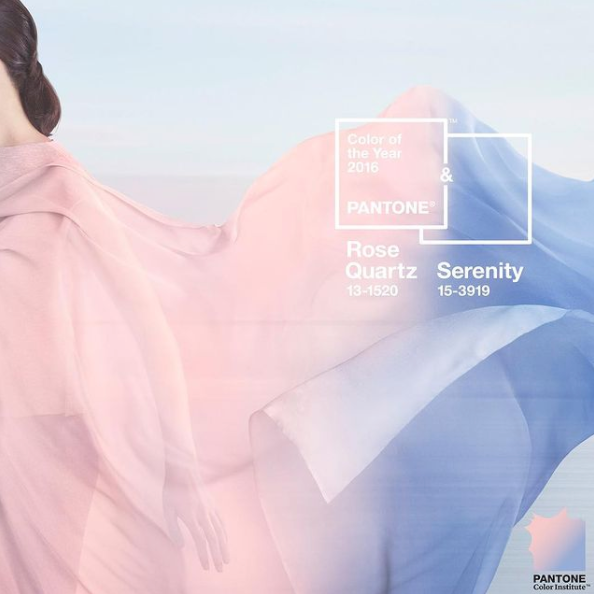
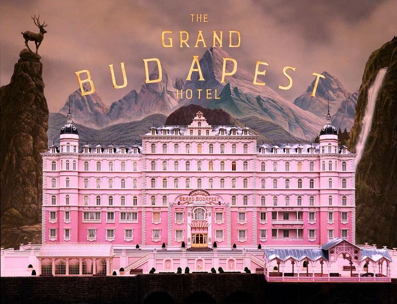
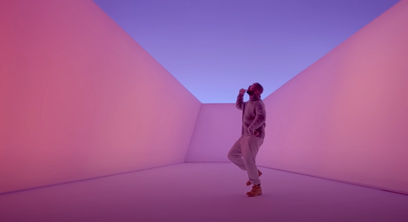
But the quartz-y pink in particular had already been coloring the years that came before. Just look at Wes Anderson’s The Grand Budapest Hotel from 2014, the entire film bathed in a pinky glow. Drake's 2015 single "Hotline Bling" also featured the color prominently.
2018: Ultra Violet
“Complex and contemplative,” Ultra Violet was the color that Pantone felt best expressed 2018. The color should suggest the “intrigue of what lies ahead, and the discoveries beyond where we are now.”
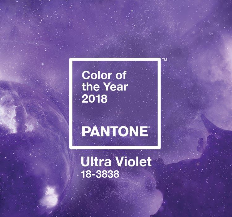
And it just so happens that around that time, technology was really taking over the global conversation. Instagram and Twitch were flourishing—both of whose logos contain swathes of violet.

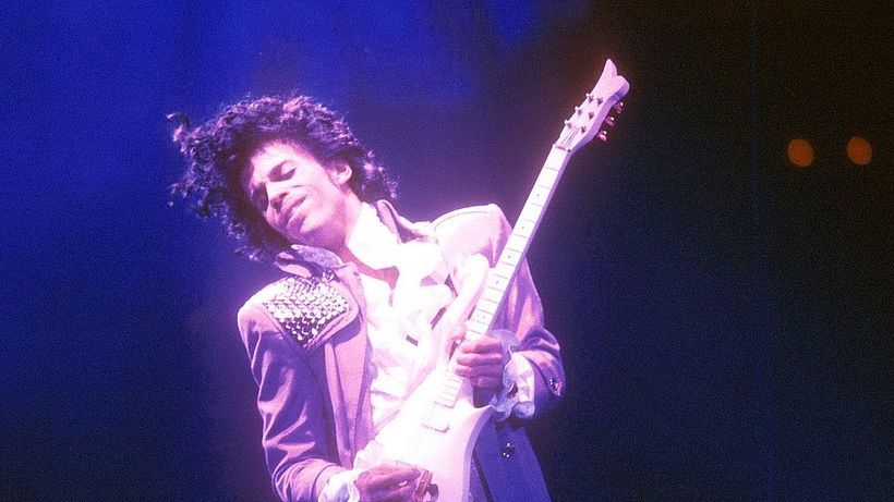
And let’s not forget 2016, dubbed the "year that everyone died", including a singer who we can only associate with purple: Prince. As well as creating a special shade of purple in memory of the pop icon in the summer of 2017 (Love Symbol), Pantone also hinted that Ultra Violet was in part a tribute to Prince and his late contemporaries:
"Enigmatic purples have also long been symbolic of counterculture, unconventionality, and artistic brilliance. Musical icons Prince, David Bowie, and Jimi Hendrix brought shades of Ultra Violet to the forefront of western pop culture as personal expressions of individuality."
2021: Illuminating Yellow and Ultimate Gray
According to Pantone, the Illuminating Yellow and Ultimate Grey duo they selected to define 2021 were “practical and rock solid but at the same time warming and optimistic” and fostered “strength and positivity”.
And if there was one mobile app that rocketed in popularity during the pandemic in 2020—so much so that it achieved a spot in the news due to staff burnout—it was the online dating app Bumble.

Has any particular color been catching your eye recently? Tell us which color you think will make Pantone Color of the Year in the comments.
You may also like:
- 6 Interesting Facts About Color Theory
- 20 Years of Pantone Color of the Year
- Design Tutorial: How to Use a Pantone Guide for Successful Printing
- Composition and Color for Creative Illustration, course by Marcos Chin





0 comments