Work Out Your Instagram Color Palette

This tool will show you which colors you use the most on your Instagram profile
Color can be a window to your personality and an essential tool to create visual harmony. Use it correctly, and you'll be able to convey emotions and messages in a much clearer fashion.
It doesn't matter if your Instagram account is personal, professional, or you are representing a brand: if you take color seriously, you need to explore Color Kuler, a service that analyzes the most prominent colors in the images you post on your feed, giving you a good idea of what palette represents you, and greater control over what your profile looks like.
Try this tool, discover the colors your followers associate with you, and compare it with others.
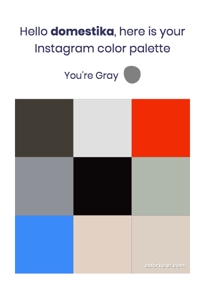
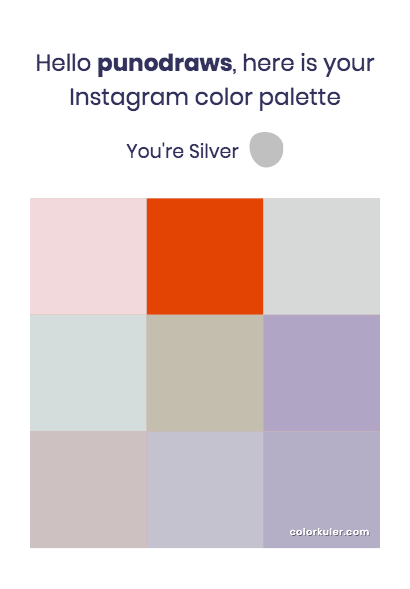
It is extremely easy. Just enter the username of the Instagram account you want to analyze. The application will make a calculation based on the images of that profile and return a grid with the nine shades that are more used, which you can download in PNG format.
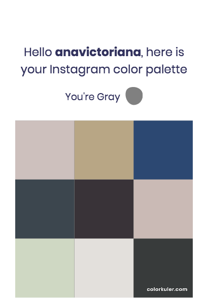
Why would you like to know the color palette of your Instagram profile?
Being aware of color will help you project the personality of your personal or professional account effectively and give uniformity to your publications.
It is also a great inspirational tool: analyze the accounts you love and discover what sets them apart from a chromatic perspective.
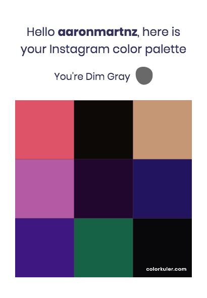
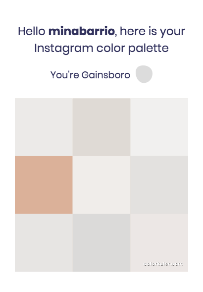
The only restriction that Color Kuler has is that it cannot analyze private accounts. We have analyzed the profiles of some of Domestika's teachers. What is your favorite color palette?
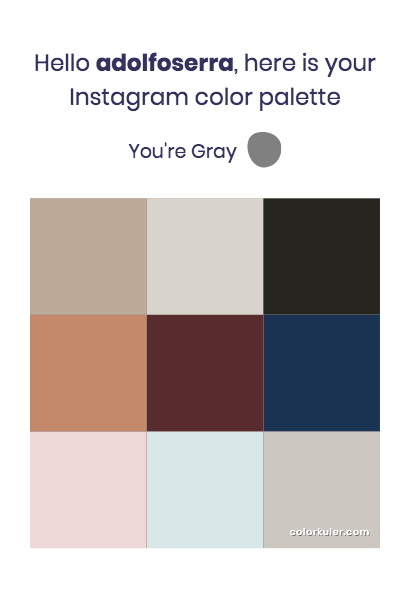
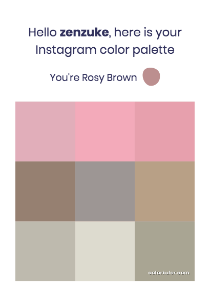
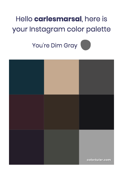
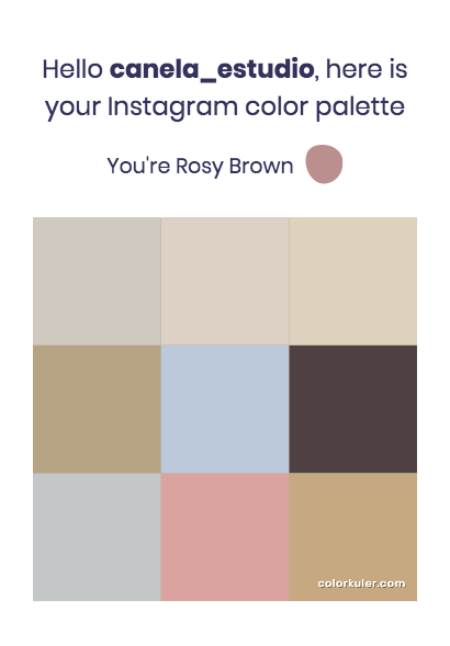

Do you find similarities in the color patterns of your favorite Instagram accounts and any of our selections? Take the test and let us know in the comments.
English version by @angeljimenez
You may also like:
- 5 Free Resources to Create Color Palettes
- 5 Creative Ideas For Promoting Your Work
- What Is Color Theory?


0 comments