5 Colors to Help Rediscover Optimism and Adventure in 2022
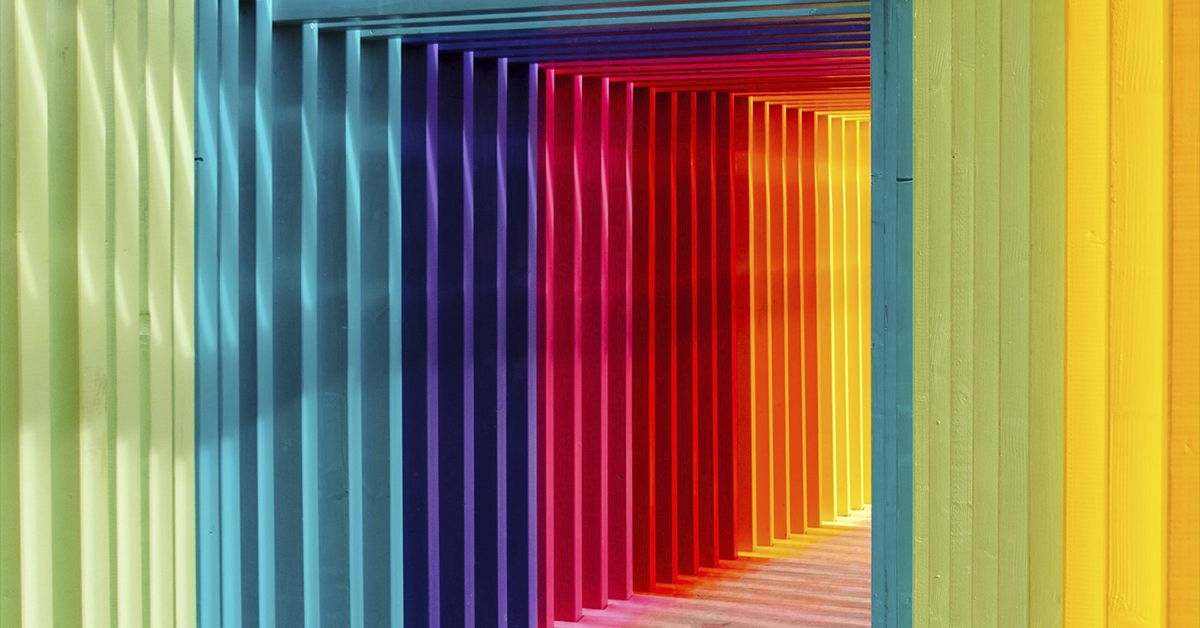
Pantone and Canva explore color trends that could help us reach a "new normal"
During the final stretch of 2021, as many countries around the world slowly worked toward a "new normal", this translated into a search for experiences that reflect feelings of fun, balance, and the sense of adventure associated with our pre-pandemic lives.
Some colors appear to help with this transition, as notable trends continued to crop up in clothing, decor, makeup, and aesthetics—and it seems that these colors are here to stay through 2022.
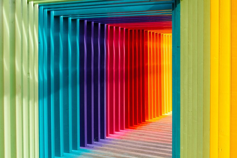
Using color psychology studies, design sites Canva and Pantone analyzed certain colors and their emotional impact on us. Drawing insights from their findings, here are five colors that could help us reach our new normal.
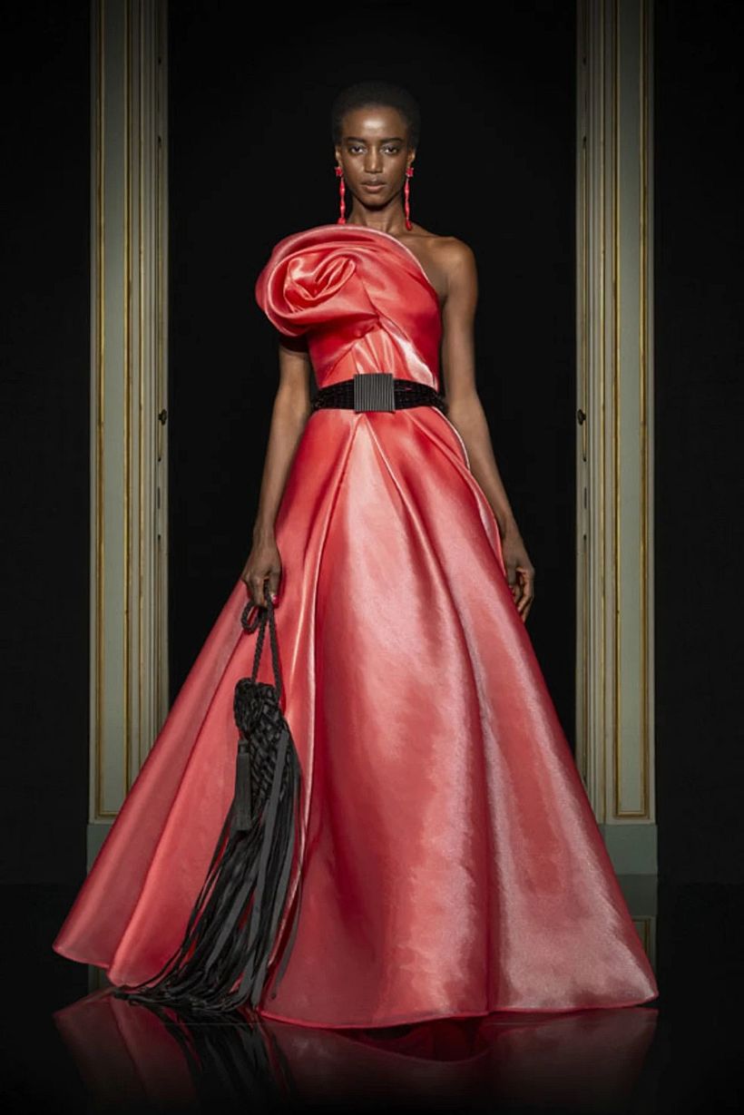
Coral: feminine boldness
Coral has long been seen as an exotic color, however, it became more broadly popular as new shades were developed and used in everyday life. Living Coral, as Pantone calls it, was named Color of the Year in 2019 and is far from leaving the scene anytime soon. In its darker hues, it appears much less connected to the sea and much more related to the sky, specifically to the sunsets we so missed during the lockdowns.
Effects and uses: Although Canva explains that this tone is still a bold choice for brands that wish to be timeless, it does turn out to be a perfect color to create refreshing accents and express a certain boldness and femininity. A close variation of this color that also became very popular recently is Marigold, a not so vivid orange but still effective to convey a vibrant spirit.

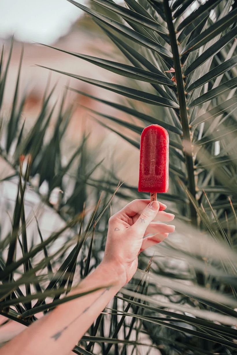
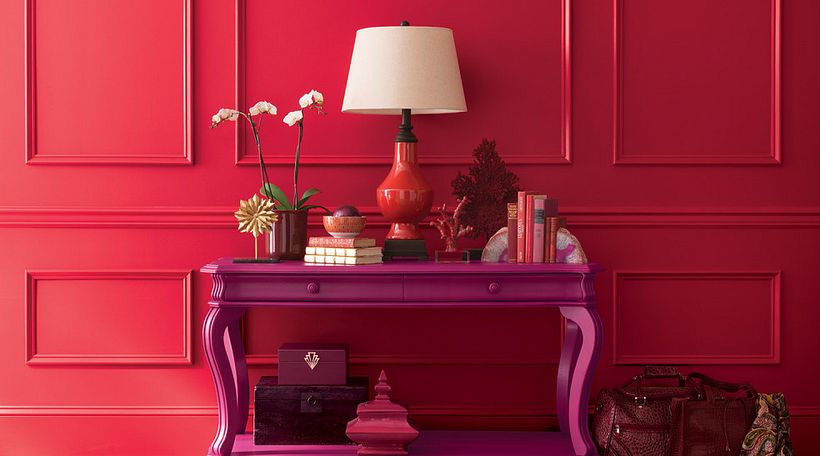
Raspberry: energetic and extroverted
As Canva puts it, "It's impossible not to think of a summer day when you see this vibrant color." Adding a bit of summer heat to cooler months, the vivid pink can also be seen in autumn-winter clothing lines presented by brands in the northern hemisphere, and in decorative elements. Pantone calls the color Raspberry Sorbet, and it's represented by the Canva tool as an invitation to a bright, fun, and vibrant experience.
Effects and uses: No longer exclusively associated with femininity and fun, today Raspberry is also considered an elegant, unisex color—especially in its darker shades. Color experts recommend it for use even in sophisticated environments. Canva also adds that "It’s a great choice for bold beauty and fashion brands who want to make an unforgettable first impression."
Cerulean: freedom and futurism
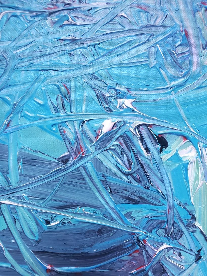
Cerulean was poised to take center stage in 2021 according to color predictions, and it did precisely that. Canva says it could even be considered the new gray. Another shade that looks to the sky, this time one of a clear summer day or the color of the stars on a cold night.
Considering the enormous amount of time we spent indoors during recent years, this color is a celebration of the great outdoors. It also has a slight grayish tinge, which adds a touch of mystery and, in certain artistic frameworks, can also be considered a futuristic color in art and design.
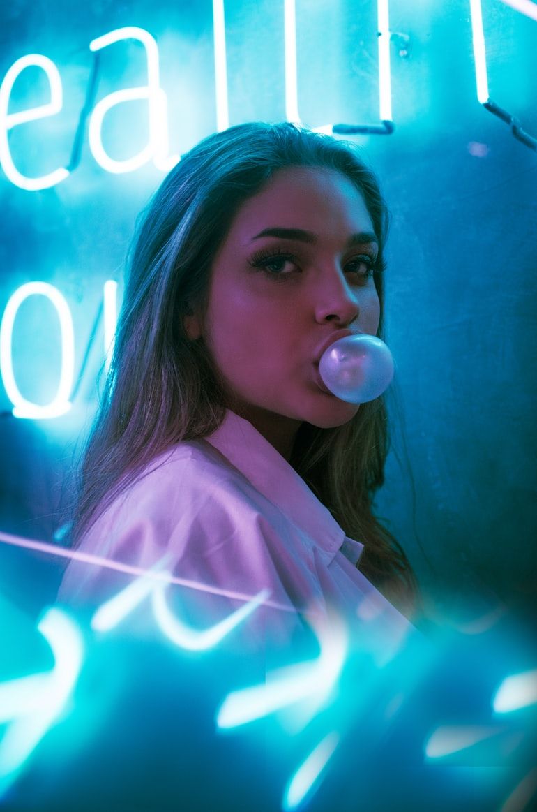
Effects and uses: According to the Canva site, the color's versatility makes it a good choice for almost all branding visuals, from corporate identity to logos. It also works for a wide range of industries, from healthcare to finance. What's also interesting is, in its brightest expressions, it's associated with a pop and festive aesthetic that's been popular on Instagram—especially through the use of filters and neon effects.
Purple: richness and depth
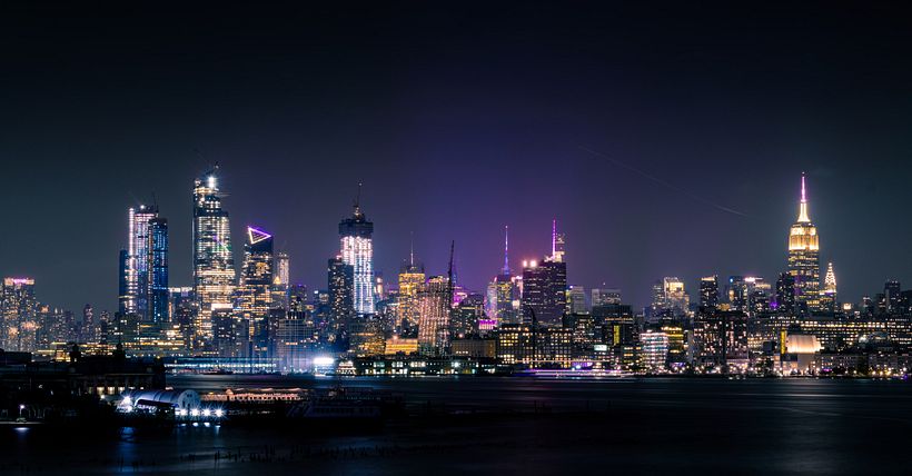
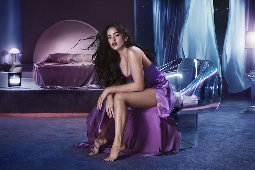
Purple has made a significant comeback in design and shows no signs of slowing down. Pantone's prediction for 2021, specifically on its shade Amethyst Orchard, put the spotlight on its similarity to violet but with added richness, maturity, and depth. This color is one of the most kinesthetic and mysterious.
We can also see the continued popularity of purpley tones with Pantone's Color of the Year for 2022: Very Peri. The rich periwinkle blue hue with violet-red undertones was created especially to capture the "transformative times" we're living in.
Effects and uses: Purple, according to Canva, draws a line between regal elegance and floral femininity, which makes it ideal for brands with a more exclusive or upscale feel. It also works well in event graphics that look back to nightlife revival, the mystery of the night, and the esoteric.
Yellow: enlightening and fun
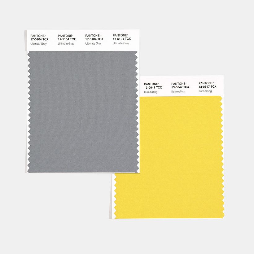
Pantone had already predicted the importance of yellow for 2021, choosing it as one of its two Colors of the Year. However, it wasn't just any yellow the color institute chose, but PANTONE 13-0647 Illuminating, which it defined as the promise of a sunny day after a dark 2020. The shade was paired with Ultimate Grey—the contrasting colors together were described as: “practical and rock solid but at the same time warming and optimistic.”
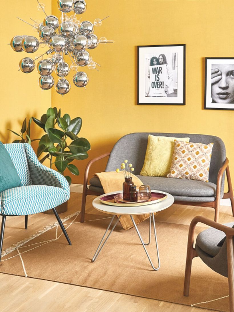
Effects and uses: This yellow is not frivolous or fleeting, nor is it childish. The sunny color invokes strength, positivity, and a celebration of life, and invites us to make up for lost time out and about. For this reason, the tone is especially popular for festivities and designs associated with happy occasions and celebrations.
How to maximize success when choosing colors for your projects
Choosing a color palette is one of the most important decisions in any design project. The color you choose will have a huge impact on the result, so knowing how to put these elements harmoniously together is key to success. Use the following resources to inspire your designs and work with confidence:
Interior Design Tutorial: How to Choose Your Color Palette
In this tutorial, interior expert Vasso Asfi (@studiolav) shares some basic principles and tips for choosing your color palette, minimizing risk as much as possible. The logic can also be applied to other types of design projects.
Inspirational tips: Choosing Colors and Materials for an Interior Design Project
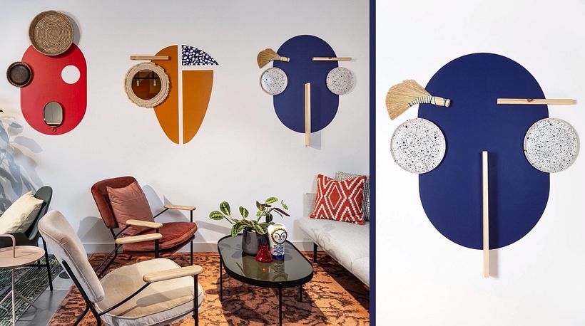
For Loukas Angelou and Vasso Asfi, founders of STUDIOLAV studio (@studiolav), interior design has the power to stimulate a person's mood, get their creative potential flowing, and impact well-being—which is why they focus on creating emotional connections between people, objects, and their environment. For this, the choice of color is fundamental. To get you started, they share tips for how to do it in this artcile.
To find more insights into the colors shared through this article, check out online reports by Canva here and Pantone here (in Spanish only).
And, if you want to delve deeper into the meaning and use of colors, take a look at Domestika's online color theory courses.
English version by @acesarato.
You may also be interested in:
- 5 Interior Design Trends for 2022
- These 7 Colors Will Trend in 2022 According to the Experts
- 8 Interior Design Styles to Inspire Your Home Decor
- Design Tutorial: How to Use a Pantone Guide for Successful Printing
- African-Inspired Interior Design: Explore Color and Pattern, a course by Eva Sonaike


0 comments