


@isaque_criscuolo
20 Years of Pantone Color of the Year
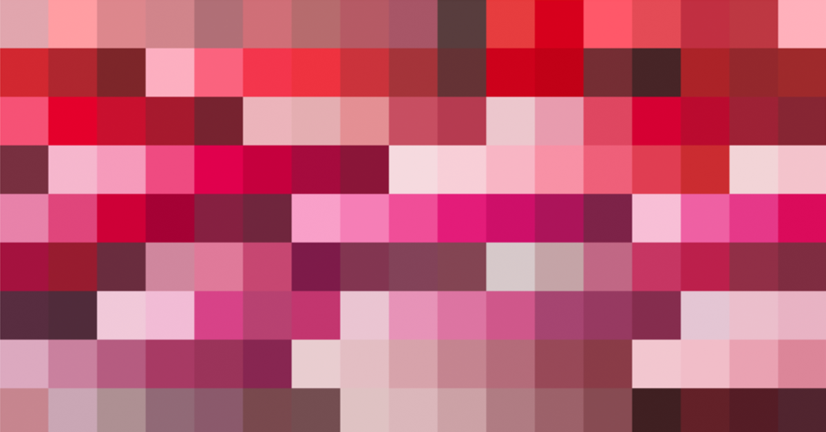
Over the past two decades, Pantone has chosen 22 colors of the year based on trends, research, and analysis
Imagine a world in which creatives were unable to guarantee how the final color of a print, fabric, product, or poster would turn out. Imagine a world in which, whenever you printed a copy of a design, the color was always different. Sounds scary, right? Well, that's exactly what the world was like until the arrival of Pantone.
This unpredictable way of working was transformed in 1963, when Lawrence Herbert, Pantone's founder, created a system for identifying, combining, and communicating colors. Today, the Pantone Matching System is considered the international standard.
The PMS is quite simply a color manual that opens out like a fan. Creative professionals use it on a daily basis to ensure that all the colors they use in their projects are universally understood. You’ve probably come across one of these catalogs of different colors.

Pantone Color of the Year is revealed every December. Not only does it predict what is to come, the color of the moment will define a new wave of consumer goods. It drives the creation of a range of new products, such as clothing, utensils, and much more.
"Pantone Color of the Year is, above all, a great source of inspiration and influences the development of different types of products and content. In addition, it has an immense power of drive and create trends, especially in the worlds of fashion and design," says illustrator and founder of the #artequefloresce movement, Luli Reis (@lulireis).
2020 marked Pantone Color of the Year’s 20-year anniversary. While we wait to discover the color for 2021, today we’re looking back on the last 20 editions of Pantone Color of the Year and the 22 colors that have been chosen over the past two decades.

2000: Cerulean
The color of the millennium, cerulean was thought to represent a search for tranquility and satisfaction during the period of uncertainty that we found ourselves in at the turn of the decade.

2001: Fuchsia Rose
The core values of this shade of pink are passion, intensity, and emotion.

2002: True Red
Compassion, power, and love marked the year following the September 11th attacks in the USA. This color embodies the uncertainty of the time and people’s desire for greater connection.

2003: Aqua Sky
This soft blue channels lightness and serenity. Over the years, blues are often repeated by Pantone.

2004: Tiger Lily
This orange shade evokes joy and feels exotic, like the flower it was inspired by and named after: the tiger lily. A mix of traditional orange with touches of red and yellow. It communicates feelings of passion and hope.

2005: Blue Turquoise
Continuing with the nature theme of the previous year, this shade of blue represents the color of the sea and light and calm sensations.

2006: Sand Dollar
Much to people’s surprise, 2006 saw Pantone select a neutral color, embracing the contemporary trend of giving what’s natural and organic more value. This color is also associated with the desert, natural environments, and a concern for the global economy. This year, Sand Dollar took the worlds of fashion and interior design by storm.

2007: Chili Pepper
This deep red is about expressing oneself, courage, and sophistication. It channels an adventurous spirit and cultural diversity. For Pantone, this shade also symbolizes a moment of change as people started to express themselves more freely and vibrantly.

2008: Blue Iris
This shade finds a balance between blue and violet. It stirs up mystery and excitement. It is also a color that aims to make an increasingly complex world more safe.

2009: Mimosa
Following the 2008 economic crash, this vibrant, optimistic and cheerful yellow represents the feeling that the world needed to get back up. It also evokes enlightenment, imagination, and innovation.

2010: Turquoise
The purpose of this color is to create the feeling of being in nature or on vacation, and help you find inspiration and comfort, far away from everyday life. It is also a color that heals and transmits ideas of faith, truth, the sky, and fantasy.

2011: Honeysuckle
Daring. Trust. Vitality. It is a color that awakens courage in a world that demands courage. Honeysuckle is a color to be injected into your routine, invigorating everything that it touches.

2012: Tangerine Tango
Vibrant and full of energy, this color conjures up sunsets, sophistication, seduction, and drama. People, especially those in the industry, generally pay more attention to orange–it makes things more visible and lit up.

2013: Emerald Green
Hedging their bets on a completely different color, yet with similarly vibrant values, Emerald Green arrived to improve well-being and bring balance.

2014: Radiant Orchid
Radiant Orchid was chosen because it represented pleasure, warmth, friendliness, and the ability to awaken creativity.

2015: Marsala
With this color, Pantone drew attention to a period marked by a search for sophistication, versatility, and comfort.

2016: Rose Quartz and Serenity
This is one of the most significant years on the list as it was the first time that Pantone chose two colors for one year. Rose Quartz evokes kindness, comfort and influenced the Millennial Pink phenomenon years later. Serenity transmits, like many other tones chosen by Pantone, tranquility. Both colors represented the growing feeling that there should be no barriers between genders.

2017: Greenery
Greenery represents a search to connect with nature, away from the many technological devices that pervade modern life. For Pantone, society was having a powerful and surprisinging reaction to feeling overwhelmed.

2018: Ultra Violet
Mystery, drama, and imagination define this color, which represents the immensity of the universe and the ideas of the contemporary world. It is also a tribute to all that is mystical.

2019: Living Coral
Referencing 2012’s Color of the Year, Tangerine Tango, Living Coral had a big influence on interior design and the world of fashion. Its vibrant and soft tone symbolizes the innate search for joy and the need for optimism.

2020: Classic Blue
To celebrate the arrival of a new decade, Pantone selected Classic Blue as it inspires calm, confidence, and connectivity, as well as a search for solidity. Blue is a timeless, simple, and resistant color associated with tranquility.
Which is your favorite?
English version by @eloiseedgington.
You may also like:
–Let The Bets Begin: 7 Colors That Could Become the 2021 Pantone Color of The Year
–Interior Design Tutorial: How to Choose Your Color Palette
–5 Free Resources to Create Color Palettes


0 comments