


@isaque_criscuolo
Discover the Colors That Will Trend and Triumph in 2021
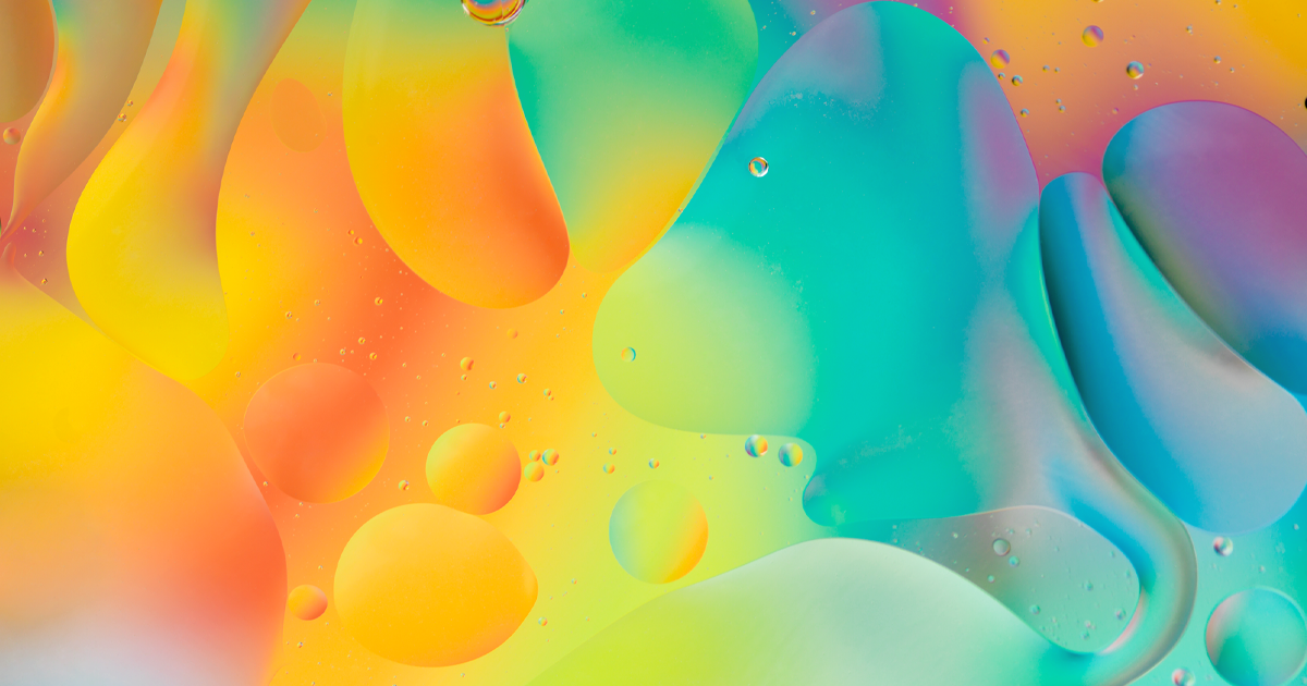
We analyze the main color trends in fashion, decoration, and design so you can use them in your projects
For Eva Heller, author of the book The Psychology of Colors, colors - and how we perceive them - change according to context. This is how we connect colors with experiences, languages, thoughts, feelings, and times.
For this very reason, brands, designers, artists, and specialists regularly focus on the color trends of the year or the season, since these will be the colors that will express the feelings and emotions of the moment and will reach the largest number of people.

In a conversation with Domestika, the interior designer and color specialist Miriam Alía (@miriamalia), who teaches the Color applied to interior design course, affirms that the tones of the year 2021 will be “warm and neutral, to create an atmosphere of comfort and warmth ”.
The specialist adds that “the trend in terms of shades will be marked by the need to create a feeling of well-being in our homes, with shades such as beige, gray, touches of black, and many shades of white. If I had to bet on a touch of color, I would opt for orange and yellowish or for shades of terracotta orange ”.
With this in mind, we have collected the main color trends for 2021 in fashion, decoration, and design. Check them out!
Pantone: Colors of the Year 2021
For 2021, Pantone has opted for two colors: PANTONE 17-5104 Ultimate Gray and PANTONE 13-0647 Illuminating. This union, which presents for the first time a neutral tone - gray - is according to Pantone "a story of colors that encapsulate deeper feelings and that, when put together, offer us the promise of something happy and friendly".

Pantone Fashion Colors
The Pantone Color Institute, recognized for researching and publishing the main color trends in the world of fashion, has defined two palettes with 15 colors each for spring and summer 2021. These are the highlights that will influence designers in New York and London.
New York Spring / Summer 2021 Palette


This palette was created to inspire and convey ingenuity and inventiveness.

Considered as more neutral colors, they have a strong presence to give more versatility and freedom of choice.
London Spring / Summer 2021 Palette


The floral tones, inspired by spring gardens, convey lightness with functionality and flexibility.

Coloro + WGSN Colors
Coloro - a color consultancy for the creative industry - is, together with WGSN, the world's largest trend research agency. Both have come together to define the most important colors of the year in areas such as design, fashion, decoration, and product creation. Check them out!
Good Gray
This shade of gray has been chosen for its neutrality and versatility against the more vibrant colors that also define the year. Also, it is in keeping with a minimalist trend and can be used alone.

Lemon Sherbet
This yellowish tone symbolizes the optimism of a sunny day while causing a calming effect. It is also an excellent alternative in all genres and categories of products.

Oxy Fire
This shade of red is the pulsating color of the year, used to fill you with energy and cause changes in your mood.

AI. Aqua
Following the trend for blue tones from previous years, this color will be widely used thanks to its versatility - it works in both summer and winter - and its ability to increase concentration.

Quiet Wave
This color inspires optimism and a connection to the future, technology, and nature. Also, it's perfect as an aid in mental preparation.

Shutterstock: color trends in 2021
One of the largest image banks in the world, used daily by thousands of creatives, has gathered data from the most downloaded images of 2020 to determine this year's color trends and sentiments. Do not miss it!
Set Sail Champagne (# FAEBD7)
The Sail Champagne Set is a natural color that can be used in any palette and combination, especially with earthy tones, browns, taupe, and greens.

Fortuna Gold (# DAA520)
This complex dark yellow shade can be paired with shades of blue or even Set Sail Champagne. It's a dramatic color that should be paired with other rich colors or other jewel tones, like amethyst purple, and turquoise.

Tidewater Green (# 2F4F4F)
Tidewater Green is a hybrid color made up of blue and green that is complemented by another hybrid color: orange-red. It can be used in lighter and brighter palettes combined with lavender or sage green.

What is your favorite color?
If you liked this list, don't miss Domestika's online color theory courses.
English version by @inuin.
You may also be interested in:
- 10 Free Color Palette Websites To Achieve Harmony And Contrast.
- What Is the Color Wheel?
- Work Out Your Instagram Color Palette.


0 comments