@harry_davies
10 Tips to Keep in Mind When Designing an Icon

Art director Hermes Mazali gives us his tips for designing any icon you can imagine
Knowing how to create effective icons is a task that requires several skills: among them, the ability to synthesize, graphic design and, above all, curiosity about the client we are working with and a deep understanding of the values and graphic approach of their brand.
Hermes Mazali (@hmazali), art director with an extensive background in icon design, has synthesized everything he knows into 10 essential points to keep in mind if you want to devote yourself to this discipline. We share them below:
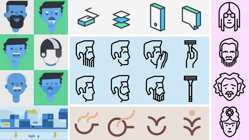
1. Explore before starting
It is important to first collect ideas that inspire you, or discover trends that you would like to follow. The important thing is to stay motivated and find the right style that you feel comfortable working in.
2. Avoid literalism
Each icon has a reference (the object or concept it refers to). When you have to design an icon, avoid obvious or literal references. Use rhetorical techniques or concept maps to associate creative ideas with your references.

3. Understand functionality
An icon's typology is based on the design in which it will be applied. Creating icons for an App is not the same as creating icons for a magazine or infographic. Using the wrong icon typology can communicate an unwanted message or not fulfill its function.
4. Choose your style
Decide which style you would like to apply to your icons and whether the style chosen conveys what you want to communicate. There are several types of icons: flat design, outline, filled, isometric... You can choose the one you want, or even merge styles!
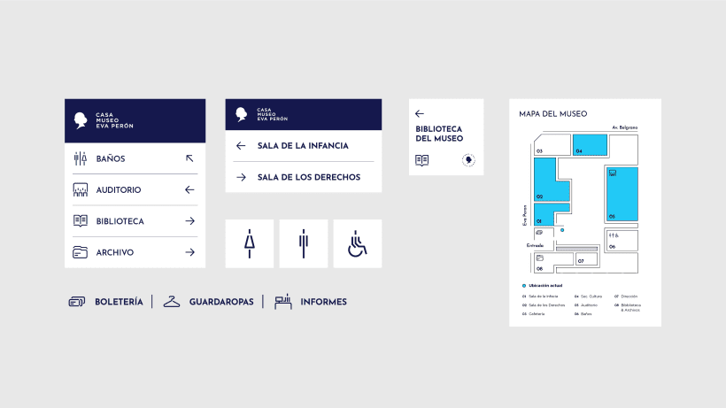
5. Work with a grid
The grid is a fundamental tool for designing your icons with precision. Working with a grid allows you to understand the proportions of the icon, make decisions and systematize your design.
6. Uses basic shapes
Geometry is fundamental to the construction of your designs. Use the circle, triangle and square as the base of your icons to give them shape and style.
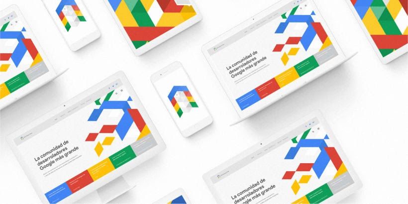
7. Control simplicity
Design with a certain level of detail: the icons should be easily recognizable in all sizes. Avoid complexity and don't add more than 2 or 3 objects to your icons.
8. Be consistent
In an icon set, it is very important that all icons are consistent with each other. Respect the same style decisions on the icons. The thickness of the line, the distance between the elements, the angles and finishes must be the same throughout the set.
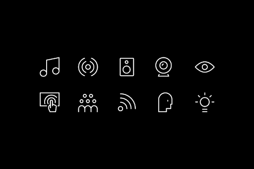
9. Rules are made to be broken
Create your own rules so that your icons maintain a unique style. To be consistent, you must respect your own rules, but in some very particular situations you may have to ignore them.
10. Done is better than perfect!
If you've never designed iconography, don't let perfection stop you from finishing your icons. Share your work to get feedback and criticism from your colleagues. You will gradually accumulate knowledge and experience to evolve towards your "perfection".

If you liked these tips, you can enter the world of icon design with Hermes Mazali in their online course 'Introduction to Icon Design', where you can learn the process and techniques for carrying out any iconographic branding assignment.
You may also be interested in:
- Design of Pictograms, a course by Romualdo Faura
- Brand Design with Grids, a course by Christian Pacheco
- 2D and 3D Corporate Identity, a course by Cruz Novillo and Pepe Cruz


0 comments