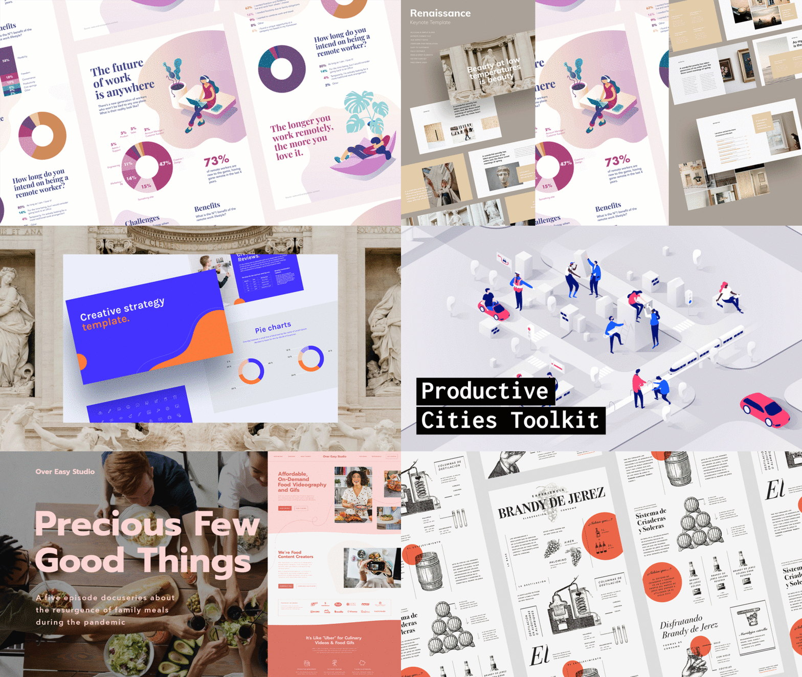
7 Dos and Don'ts for High Impact Presentations

Katya Kovalenko helps boost our presentations and projects with visual examples
Katya Kovalenko (@katyakovalenko) is a presentation and data designer based in Barcelona. After working for advertising and communications agencies for ten years, she founded her own business, dedicated to helping small and medium-sized businesses convert their ideas into real brands around the world.
Her work combines data analysis with aesthetics, as well as good practices in the use of data to build stories from visual resources. For her, this is the basis for building effective presentations.Today, she shares these design-related lessons that will help you create your own powerful materials to show the world your projects.

Don’t overdo it with text
Make sure your presentations are as visual as possible, especially if you’re going to be presenting them in person. Your audience can then listen to you while you emphasize your point with your presentation.
If you are sending the material by email, you should include more supporting text but still make sure that it’s only crucial information.


Don’t use bad sources
Always stick to standard legible typographies, like sans serif, so that reading your work is simple and easy.


Don’t put all your information on one slide
While it might seem like a good idea to shorten a presentation by putting as much information as possible on each slide, it’s always better to use one slide for each key idea. Instead of reducing the number of slides, synthesize your text.


Avoid bullet points
Katya recommends avoiding them at all costs. For her, it’s better to use icons or illustrations that represent ideas or concepts.


Don’t use too many charts and graphs
Although they can help you present information clearly in specific cases, it’s always better to try and substitute them for metaphors or figures that communicate the same thing better..


Don’t use the first image you find online
Use specific searches with filters that ensure you find high-resolution images that are not the same old pictures other people have used thousands of times.


Don’t use slides from other presentations
Maintain a coherent tone, with the same image style, typography, and layout in each slide.


If you want to learn to create clear narratives and design high impact presentations, sign up to the Domestika course Principles of Presentation Design in which Katya will share the processes she uses with her clients, such as her personal methods for organizing information and professional design tips.
English version by @harry_davies.
You may also like:
- 5 Apps You Maybe Haven’t Heard of for Making Creative Presentations
- Keynote Tutorial: How to Create Basic Effects & Transitions
- How to Improve Your Creative Portfolio


0 comments