


Do’s and Don’ts When Choosing a Corporate Typeface
The team at Bauertypes share some basic thoughts about the use of typeface for brand identity
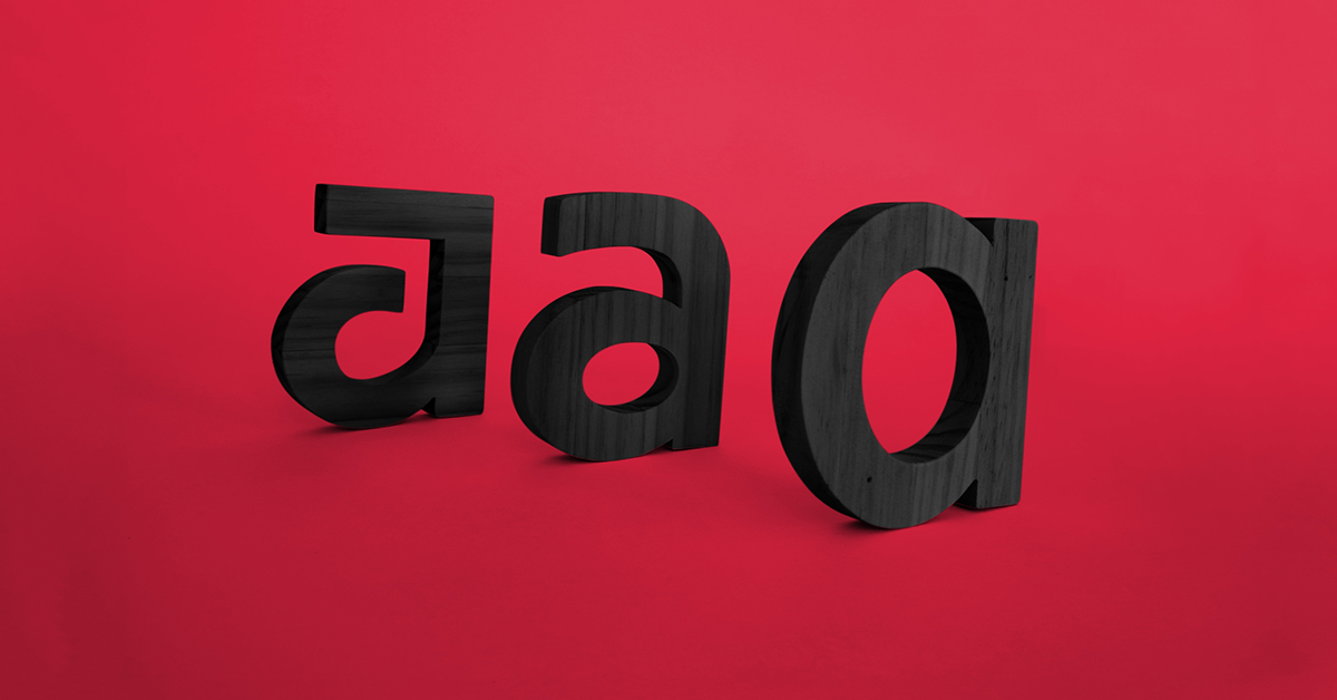
Typography is an essential element in all design projects. It is one of the critical aspects to consider when building a brand's visual identity, on the same level as their name, logo, and color palette.

Benefits of using a corporate typeface
As pointed out by graphic design studio Bauertypes (@bauertypes), whose team specializes in branding and identity, a good corporate typeface increases the impact of words and improves the design's quality.
Selecting and applying a corporate typeface provides the following advantages for the brand:
- It reinforces the image
- It transmits values and character
- It consolidates its public image
- It sets it apart from the rest of the market
- It saves decision time when designing

Natalia Weber Antón and Laura Sensio from Bauertypes tell us some of the things we need to consider when choosing a typeface for a brand:
DOs
1) Make sure that the typeface communicates the identity of the brand and reflects its core values. For instance, if the brand's core values are integrity and trust, it would be advisable to choose a formal and classic typeface, rather than a novelty or quirky one.
2) Investigate the existing options before choosing the corporate type. You could either use an existing typeface, modify an existing one, or create a new custom-made typeface for your brand.

3) Some of the criteria that help you choose a typeface are legibility, quality, and the ability to be adapted for mobile devices. It's useful to have a secondary typeface that complements the principal one which you can use for body text.
4) Apply the brand typeface to all the design items to create consistency in the brand identity. Remember that the written aspect of a brand is like its metaphorical voice, and must always be communicated accurately and effectively.

DON’TS
1) Do not use different fonts for the corporate typeface to those selected for the design. Doing so sends mixed messages to the recipients or consumers of the brand, which can be confusing. The same is valid for the type used for the company's internal communications.
2) Do not allow someone who is not a design expert to decide on corporate typeface. It is best to rely on someone who has an awareness of the different types of fonts that exist to select the best possible typeface for your brand.

3) If you have to purchase a typeface, verify what variations are available. Check the list of typographic variations to ensure they include all characters and punctuations of other languages. Do not buy without trying and testing all available styles. If you commission a new or modified typeface, make sure it will include all the elements you will need.
4) If you are going to design the identity of a brand, do not take for granted that the client knows how to apply and use typography. Supply them with a user manual, templates, and instructions for all different uses. If you are the client, ask the project designer for these instructions.
If you want to learn more from Bauertypes, sign up to their course Corporate Typography, and learn to choose the best typeface to create an effective brand identity.
You may be interested in:
- 7 Lettering and Calligraphy Artists That Will Inspire You.
- Typographic Anatomy: the Different Parts of a Letter.
- What Is A Brand Identity Manual And What Should It Include?


0 comments