


How the ‘Joker’ Logo Was Made
Discover the analog process behind the logo and initial titles of the film everyone has been talking about
With more than 700 million dollars raised worldwide, and a critical reception that has tilted heavily towards positive, there is no doubt that 'Joker', the biopic of the famous Batman villain–starring Joaquin Phoenix and directed by Todd Phillips–was one of the most important titles of 2019.
A successful film is, almost always, the result of tens or hundreds of artists' work, creatives who give the most in their particular areas of knowledge: from direction to photography, from production design to hairdressing and costumes, 'Joker' is a particularly rich film from a creative standpoint, and this also shows in its logo.
It's a logo that evokes the analog and tangible spirit of the film, and that, surprisingly, was not created digitally but using old techniques: with blocks of wood loaded with ink. A powerful creative decision whose author, designer and animator Chad Danieley, has explained in detail on a reddit post.

Danieley, who works in a studio specialized in the creation of trailers, starts by explaining that he is usually involved animation, but when asked if he wanted to design the logo, he could not resist. "It was the smoothest approval process I've had in my entire life," he says.
Asked about his approach to analog aesthetics, the designer explains that he always tries to give texture and include old fonts in his designs, although "What’s funny is that logo was the first one I did but I forgot to submit it thinking it needed to be more 'professional'." Instead, Danieley presented another twelve logos, but his creative director, searching his folders, found the original and presented it. "Todd Phillips loved it and went out of his way to make sure it stayed as it is and was not redone digitally,'' he concludes.
The creation of the 'Joker' logo
Danieley scanned all the letters separately, importing them to his computer in PNG format and then converted them to SVG, a typographic format that allowed him to preserve all the texture and transparency of the originals. The result is an organic typography, which almost seems tangible, and a return to traditional printing methods that connect beautifully with the vintage aesthetics of the film.
Oh! And although Danieley created the letters by hand, he also explains that the Champion Featherweight typeface is quite close... just in case someone wants to emulate this aesthetic in one of their projects digitally.

How the initial titles of the film came to be
The initial title of the film does not feature the same logo, using another Gothic Typeface instead. It retains the analog texture, nonetheless, because the process used to insert it on the frame was also an old one: filming the physical letters, printed on a transparent sheet, over the film and adding the result digitally to the final movie.
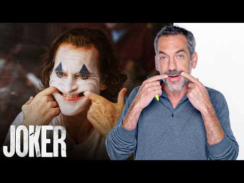
In the following video, the director of 'Joker' describes the initial scene of the film, devoting part of the end of this explanation to the process of creating the initial title:
What is your impression? Do you think that the commitment to traditional printing methods is aligned with the intentions and aesthetics of the film? Do you have any experience creating typefaces this way?
You may also like:
- Logotype, Isotype, Imagotype, Isologotype, Symbol: Do You Know The Difference?
- 10 Tips for Designing Icons


0 comments