10 Tips for Designing Icons
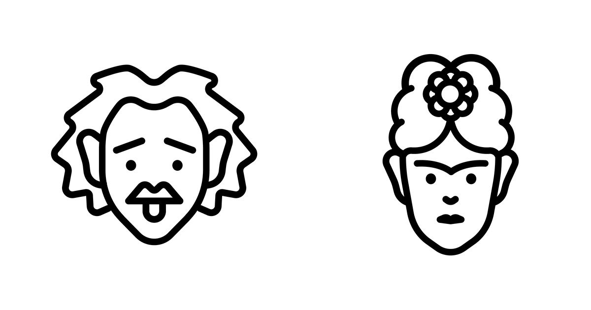
Art director Hermes Mazali shares his tips for designing any icon imaginable
Creating icons that work well requires a number of skills: the ability to condense and summarize information, a flair for graphic design, an interest in the client you’re working for and an in-depth knowledge of the values and visual identity of their brand.
Hermes Mazali (@hmazali)–an art director who has ample experience in icon design–has summed up his expertise in 10 essential points for you to bear in mind if you want to follow in his footsteps:
1. Investigate before you begin
It’s important to gather ideas that inspire you, or discover trends that you would like to follow. The key is to be active and find a suitable style that you feel comfortable using.
2. Avoid literal representations
Each icon will have a reference (the object or concept that it represents). When designing an icon, avoid literal or obvious representations. Use rhetorical devices or concept maps to find creative ways to communicate the information.

3. Understand the purpose
The typology you use will depend on where your icon will appear. Creating icons for an app, a magazine, or an infographic, are not the same. Using the wrong icon typology could communicate the wrong message or mean it doesn’t fulfill its purpose.
4. Choose a style
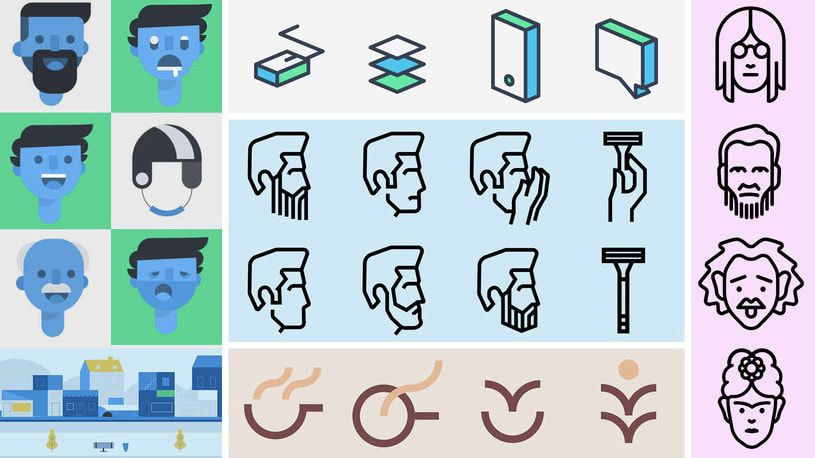
Decide on which style you would like to apply to your icons and whether that style communicates the right message. There are several icon typologies, such as flat design, outline, filled, and isometric. You can choose whichever you want, or you could mix them up.
5. Work with a grid
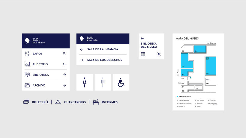
The grid is an essential tool when it comes to designing icons accurately. Working with a grid helps you to understand proportions, make decisions and structure your design.
6. Use simple shapes
Geometry is key when building your design. Use circles, triangles and squares for the foundations of your design to give it shape and style.
7. Stick to simplicity
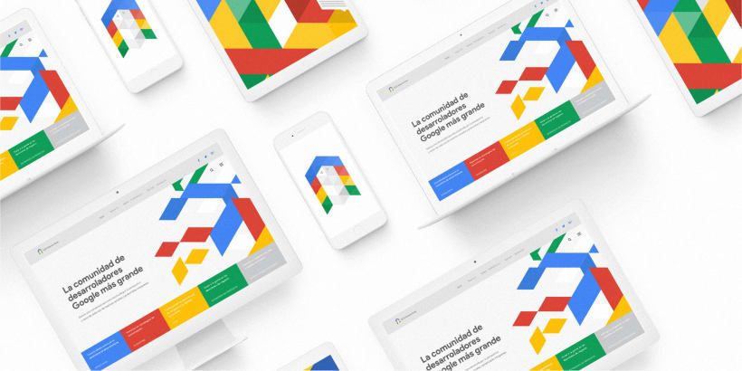
Apply a certain level of detail to your design–your icons should be easy to recognize, whatever their size. Avoid making your design too complex and don’t use more than two or three objects for your icons.
8. Be consistent
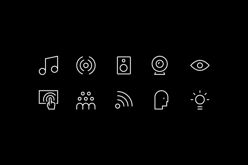
When it comes to icons that make up a system, overall coherence is essential. Stick to the same style decisions for each icon. The line thickness, the distance between the elements, the angles and the final touches should be consistent throughout.
9. Rules are there to be broken
Make your own rules to ensure that your icons have their own style. For consistency, you should respect your own rules, however, in certain situations you might want to overlook them.
10. Finished is better than perfect!
If this is your first time designing icons, don’t let being a perfectionist stop you from finishing them. Share your work with your friends and colleagues to get their feedback. Bit by bit, you will acquire knowledge and experience that will help you to evolve and help your designs reach “perfection”.
If you have found these tips useful, you can dive into the world of icon design by taking Hermes Mazali’s online course, Introduction to Icon Design. You will learn about the processes and techniques required for any branding project involving icon design.
You may also be interested in:
- 5 Key Branding Trends From 2019
- How to Create Basic Patterns in Photoshop
- Illustration Tutorial: The Color Wheel


0 comments