Josef Albers & Color Instrumentation
Exploring Josef Albers' intricate color exercises from "Interaction of Color" challenges comprehension. Unveiling the depth and interpretation behind these exercises clarifies their significance.
In my course "Color Theory: Exploration & Application", we study and practice two of the color illusion exercises invented by Josef Albers and described in his classic book Interaction of Color. The first exercise—make 3 colors look like 2—teaches us about the relativity of color. And in the second—transparency and space illusion—we learn how colors on a 2-dimensional surface can appear to emerge and recede.
In Interaction of Color, Albers presents these two color exercises front and center—he clearly considers them foundational in the study of color.
But Interaction of Color contains many excellent lesser-known color exercises and assignments that are also important in a study of color. One of my favorites is called The Masters — color instrumentation.
In Albers’ own words
Anyone who has actually tried to read Interaction of Color knows how difficult it is to comprehend what Albers is saying. His writing is poetic and personal but often opaque. And The Masters — color instrumentation is one of the more challenging texts in the book! I’ve read it many times and I still find myself re-reading each line several times.
Here’s an excerpt from The Masters — color instrumentation, reproduced to match the format of the original typesetting in Interaction of Color:
“To honor the masters creatively is to compete with their attitude
rather than with their results, to follow an artistic understanding
of tradition — that is, to create, not to revive.
Therefore, in our study of the masters — both past and present —
there is, beyond mere retrospection and above verbal analysis,
recreating by re-performing
their selection and presentation of color,
their seeing and reading of color —
in other words, their giving a meaning to color.
With such studies we submit to formulations of the past
in order to provoke further comparisons
of different attitudes, temperaments, mentalities, and personalities —
all for the sake of continued self-criticism and self-evaluation,
This proclaims creative action ahead of prospective reaction.”
Whew—that’s definitely a challenge to read and understand! Imagine the difficult task of an instructor (me) trying to figure out what he’s saying, and then explaining it in simple but inspiring words to a group of first-year design students!
Luckily, Interaction of Color is illustrated with beautiful examples of the exercises and assignments that help readers comprehend the meaning of Albers’ words.
Interpreting Albers: the assignment brief
After many reads and re-reads and observations of his examples, a lot of contemplation, and many presentations of the assignment to my students at SVA, I’m hopeful that my interpretation of Albers’ color instrumentation experiment is what he intended.
So here, in my own much less poetic words: the assignment brief for Albers’ color experiment The Masters — color instrumentation.
First, what does Albers mean by color instrumentation?
In his own words, he defines it as a painting’s palette and color relatedness. The study of color relativity is a common thread throughout Interaction of Color, and for Albers, this assignment is “another means of learning to develop a sensitive and critical eye for color relatedness.”
For me, the word instrumentation is a familiar musical term that refers to the arrangement of music for certain musical instruments. A song can be played on a piano, or on a guitar, or with both instruments at once, and sound similar but different in each case. Same song, different instrumentation.
This idea can be applied to visual art, and specifically to a study of color. We can think of color instrumentation as the arrangement and interaction of colors in a composition, with consideration for the medium used to make it.
The process
Begin by choosing a painting, ideally one that is famously recognizable. Find a good reproduction of that painting—the best images are usually found in museum catalogs and their websites.
Now, use fragments of colored paper to create your own interpretation of that painting. The colored paper fragments can be found and cut from printed materials—magazines, old books, packaging. You can also use colored paint swatches (freely available at stores that sell house paint) and any other printed paper—wallpaper, gift wrapping paper, origami paper, construction paper. The pieces of colored paper can be cut, torn, or folded.
Albers encouraged his students to change the light and temperature of the colors, to neglect details in the paintings, to work in a free and personal way.
So, give yourself permission to interpret your chosen painting in your own way. Pay attention to the color instrumentation in the original composition, and let it inspire and inform your decisions.
The takeaway: an eye for color
The goal of this assignment is to make a unique work of art, based on careful observation and study of the painting’s color instrumentation—the arrangement and interaction of its colors, reinterpreted in the medium of cut paper.
And like all the experiments in Interaction of Color, the takeaway is what Albers calls an eye for color—an enhanced awareness of how color can be used in art and design.
Interaction of Color concludes with a section called Commentary, in which Albers adds his closing thoughts on his experiments. In his comments on The Masters — color instrumentation, Albers summarizes the assignment this way:
“These studies are not copies in the usual understanding of replicas. As Van Gogh copied Daumier, for instance, and Cézanne copied Italian masters, in a free personal manner and mainly to clarify one or another particular viewpoint, so these transformations into colored paper are not repetitious duplications. They purposely neglect many details and even may appear in changed keys of light and temperature. They are consciously condensed records of personal notation of a painting’s color instrumentation, or, in usual terms, of its palette and color relatedness.”
I love that last sentence—it’s classic Albers: consciously condensed records of personal notation. 🖤
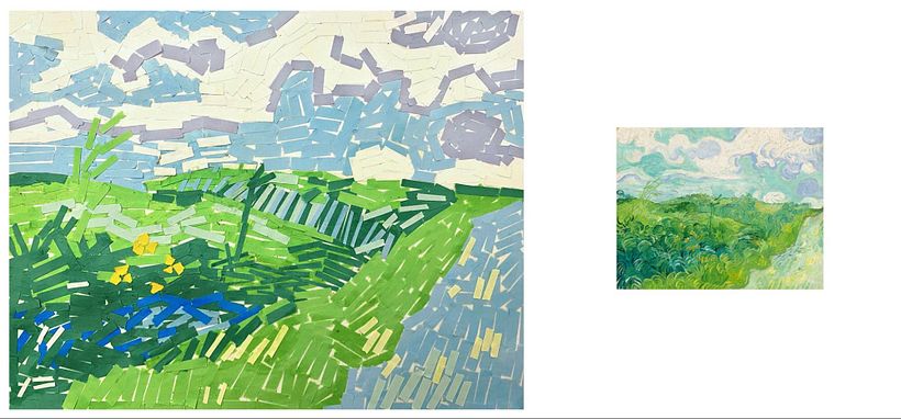
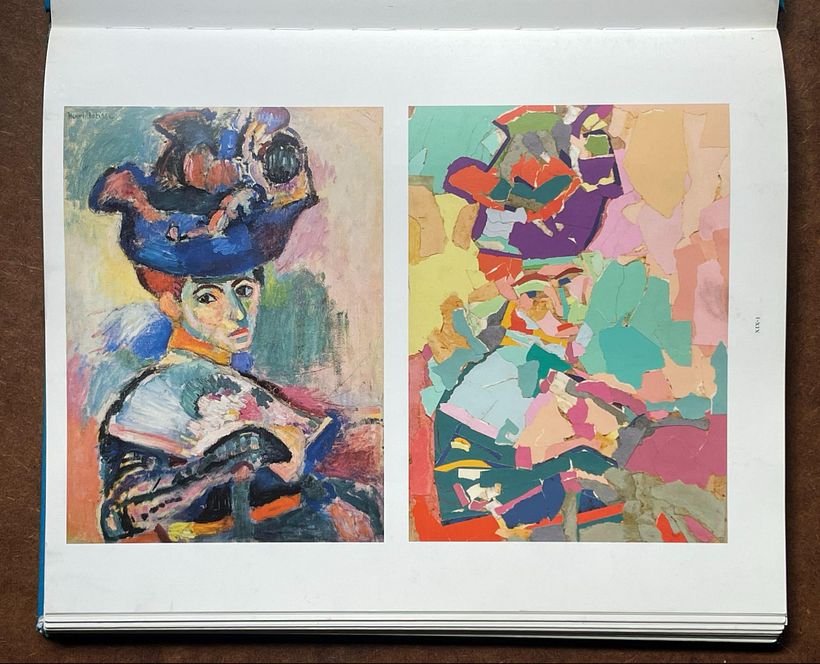
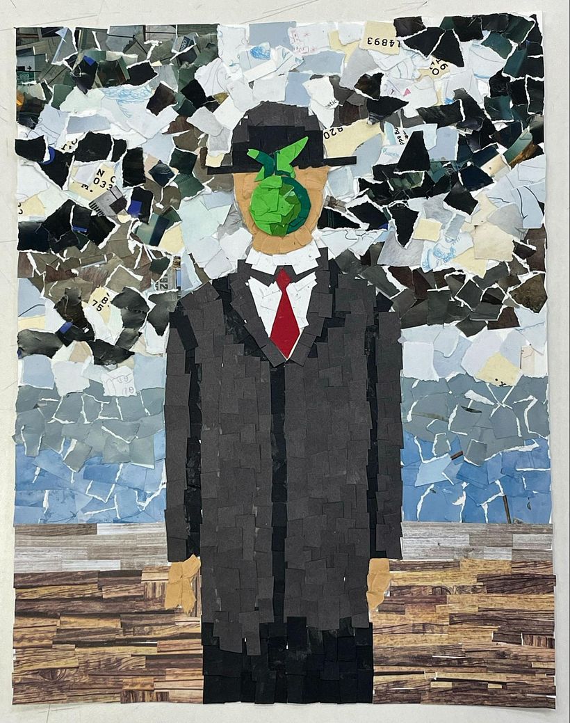
Here are a few examples of the color instrumentation assignment, created by students in my design classes at SVA.
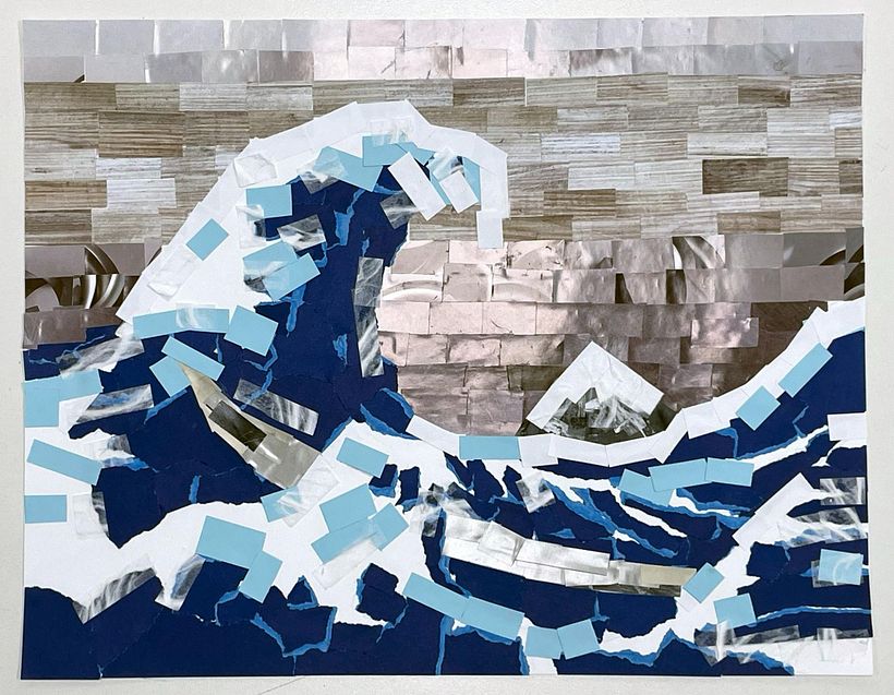
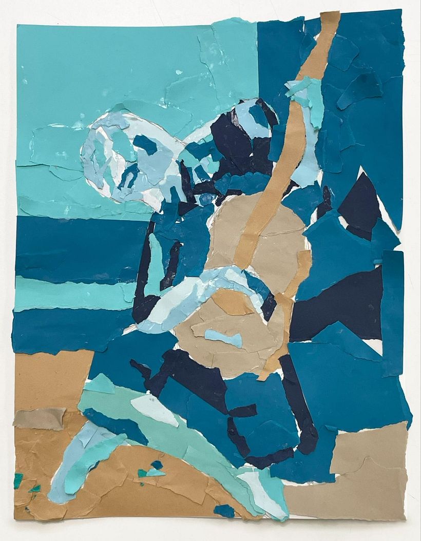
If you want to learn more about color theory in graphic design, I Invite you to be part of my course "Color Theory: Exploration & Application".


0 comments