


The Stories Behind 7 of the Most Iconic Olympic Mascots
Popular, baffling, or despised: we take a look at the most memorable Olympic mascots
Pictograms, logo designs, advertising copy, and the world-famous Olympic rings: these are just a few examples of the pieces that make up the corporate identity of the Summer Olympic Games.
Every four years, each host city creates a series of visual and graphic components to be reproduced throughout the month-long multi-sport event.

However, there is one particular item from the Olympic brand that everyone has an opinion about: the mascot. Both loved and hated, Olympic mascots have divided opinion over the decades. In this post, we look back at some of the most iconic characters.
1. Shuss, the first animated character
We begin by traveling back to the 1968 Grenoble Winter Games to meet the first mascot to ever appear at the Olympics. His name is Shuss, he has a red ball for a head, a blue lightning bolt leg, and rides skis on one foot. Shuss was designed over one night by cheerleader Aline Lafargue. He became the ancestor of all the Olympic mascots that would follow.

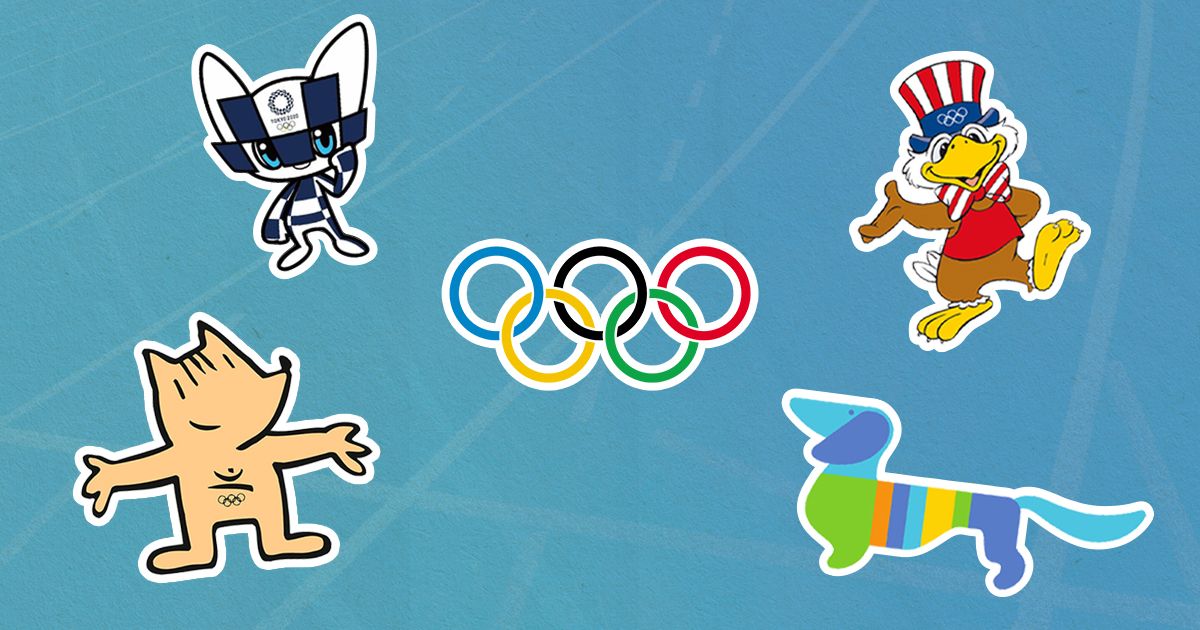
2. Waldi, the first official mascot for the Summer Olympics
The first official mascot of the Summer Olympics was Waldi, a dachshund created by graphic designer Elena Winschermann for the 1972 Munich Olympics.
Winschermann was working as part of the team led by designer Otl Achter, who was responsible for the graphic identity of the Games that year.

Waldi had a light blue head and tail. Their body was covered in vertical stripes, three of which were the same colors as three of the Olympic rings.
Red and black were omitted from the design due to their association with the Nazi party flag.

3. Misha, the most popular Olympic mascot
We had to wait until Moscow 1980 before an Olympic mascot became a popular brand: we’re referring to Misha, the brown bear.
Still loved to this day, souvenirs featuring Misha the bear continue to be sold in Moscow.

In the early years, it was customary to design a mascot based on an animal or character that was considered representative of the host city or country. However, when it came to choosing which animal Misha would be, a poll was conducted by the television program V mire zhivotnykh (Animal World) and the newspaper Sovetski Sport. The vast majority of the more than 45,000 responses voted in favor of the brown bear. Once the animal had been decided, organizers held a competition inviting people to submit designs.
The winning entry was designed by Viktor Chizhikov. The creator explained in an interview with The Wall Street Journal that it didn't take long to come up with the bear's smiling face and robust body, but it took months to transform her into an Olympian. In the end, Chizhikov turned Misha into an athlete by giving her a weightlifter's belt, the buckle of which featured the Olympic rings.
4. Sam, a patriotic mascot created by Disney
In 1984, it was the USA's turn to host the Olympic Games in the city of Los Angeles. Bob Moore, a legendary artist for Disney, designed a bald eagle named Sam. The mascot bore a strong resemblance to well-known characters that had been created by the animation studio up until then. Sam wears a hat and bow tie featuring the colors of the American flag.

You may be interested to learn that, before Sam was an eagle, the team considered designing another bear, seeing as the grizzly is a symbol of California. However, in the end, they discarded this option because it would be too similar to the Moscow Games' Misha the bear. Moore's team then worked on animated versions of different animals and plants, from snakes and bison to orange trees and palm trees. Eventually, they opted for a bald eagle, which is the national bird of the United States.
It’s not just the choice of colors and bird that makes Sam a very patriotic design, his name also alludes to another icon of American culture: the famous Uncle Sam. His wings were also drawn to function as arms and his feathers as fingers, making it easier to apply the design to different illustrations adorning items such as T-shirts, mugs, and pins.
5. Cobi, the most profitable mascot
If there’s a mascot that succeeded in competing with Misha in terms of popularity, it is Cobi. Cobi was the official mascot for the 1992 Barcelona Olympic Games, designed by the legendary illustrator and designer Javier Mariscal.
When designing Cobi, Mariscal decided to move away from an athletic body image or the idea of an unreachable hero, opting for a friendly and familiar design that everyone would be able to relate to.

"Ideally, you should always try to draw your design as clean and fast as possible. A mascot has to be iconic, have a unique identity so that you see it and in a second you say 'Oh look, that is the Barcelona 92 mascot'," the designer adds.
"I think it's good that Cobi participated in every sport, even if he took part in a way that the majority of people would do," explains Mariscal in this video from our Domestika Maestros series.

6. The baffling Izzy, for Atlanta 96
Izzy, the Atlanta 96 mascot, is considered one of the biggest flops in the history of Olympic Games mascots. At the time, she was dubbed the first Olympic mascot to have been designed on a computer.
However, Izzy didn’t live up to expectations and was widely criticized. That said, the mascot that had been created before Izzy was much worse.

The original mascot was first presented during the closing ceremony for the Barcelona 92 Olympic Games, and was called 'Whatizit'. The negative response led the Atlanta 96 organization to ask its creator, John Ryan, to redesign the mascot. Ryan added stars to their eyes, gave the mascot stronger legs, a full mouth (whereas before they only had lips), a red nose, and a new name (Izzy).
Still, Izzy received a lot of criticism. "It was very effective for kids, we got a lot of interesting flak from adults," its creator recounted years later in this interview with the BBC.
"Journalists were ripping the mascot and making it stand for everything that was wrong with the city, even potholes. It was a bad reaction and a lot of bad blood," he added.
7. The mascot for this year's Tokyo Games
Designed by illustrator Ryo Taniguchi, the latest mascot, Miraitowa, is blue and white like the Tokyo 2021 Games logo. She has a strong sense of justice, is very athletic, and can move anywhere in a flash. Her name is formed by the union of two Japanese words Mirai (future) and Towa (eternity).

What did you make of these designs? Which is your favorite mascot? You can leave your opinion in the comments below and tell us if there are any others you would add to the list. You can also take a look at the design and branding and identity Domestika courses we have available.
English version by @eloiseedgington.
You may also like:
- The Story of Logos I: Learn About the First-ever Logo
- Who Created the Iconic Yellow Smiley Face?
- 7 Masters of Graphic Design Share Their Industry-insider Secrets
- Design and Illustration of Incredible Characters, a course by Christian Michel


0 comments