Adobe InDesign Tutorial: 4 Basic Tips to Create a Magazine Cover
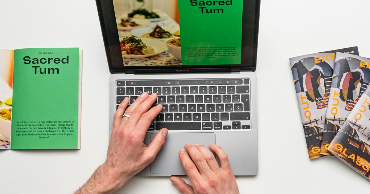
Learn how to create a successful editorial cover from scratch using InDesign, by Friendhood Studio
The front cover of your magazine is the first thing an audience sees, so it’s important to make it stand out for all the right reasons. After all, a good cover can mean the difference between your target customer choosing your magazine or picking another one off the shelf.
Award-winning designers Alex Reece and Isabella Bunnell are the creative partnership behind Friendhood (@friendhood), a brand and design studio that specializes in helping brands function strategically and connect with their audiences. Together, they have worked with multiple brands in different sectors, bringing their work to life to create positive impact.
In this tutorial, they share 4 simple tips to help you create a magazine cover that sells. All you’ll need is Adobe InDesign installed on your computer.
4 Basic Tips to Create an Editorial Cover
1. Select Your Masthead
Your masthead is your logo and is usually the largest element on your front cover. It lets your audience know what your magazine is all about, so it’s important to get it right.
Reece and Bunnell’s first piece of advice is to choose a font that reflects the look and feel of your magazine.

2. Use Strong Imagery
Whether it’s a photograph or an illustration, your image should always reflect the magazine’s content. Choose a striking image and have fun playing around with it, cropping it, and creating a clear focal point to draw the eye.
Finally, make sure your image establishes an emotional connection with your audience. You want it to be memorable and eye-catching enough that it makes them want to buy the magazine.
3. Play with Typography
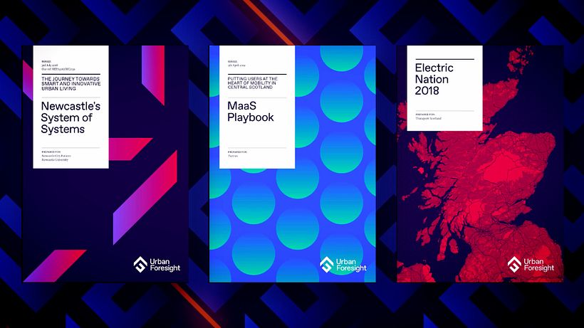
Your cover will likely feature a combination of main article and cover lines, which are texts that summarize the articles inside the magazine. The lead article line summarizes the most important and prominent article, so it should be in a larger size than the others, and perhaps even in a different font.
Reece and Bunnell say that the aim is to create a visual hierarchy where cover lines are smaller in order to achieve a balanced composition.

4. Remember the Details
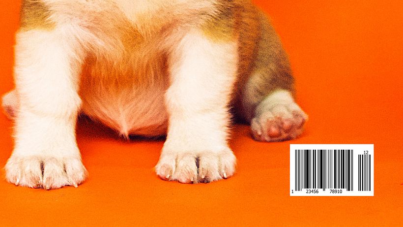
Finishing touches such as the barcode, website link, issue number, and date really do matter. And don’t forget the price! This should go on the outside cover of your magazine and be written in a small font but still be readable.
Did you enjoy this tutorial? If you'd like to learn more about the fundamentals for designing editorial pieces for books, magazines, newspapers, and online publications, check out Friendhood Studio’s online course Editorial Design 101.
You may also like:
- 10 Free Graphic Design Tutorials for Professionals
- Photoshop, Illustrator, or InDesign: Which is Best for Your Projects?
- InDesign Tutorial: Menus and Windows for Beginners
- Art Direction for Creative Visual Branding
- Compositional Techniques for Graphic Design




0 comments