@harry_davies
What Are Spot (or Solid) Colors?
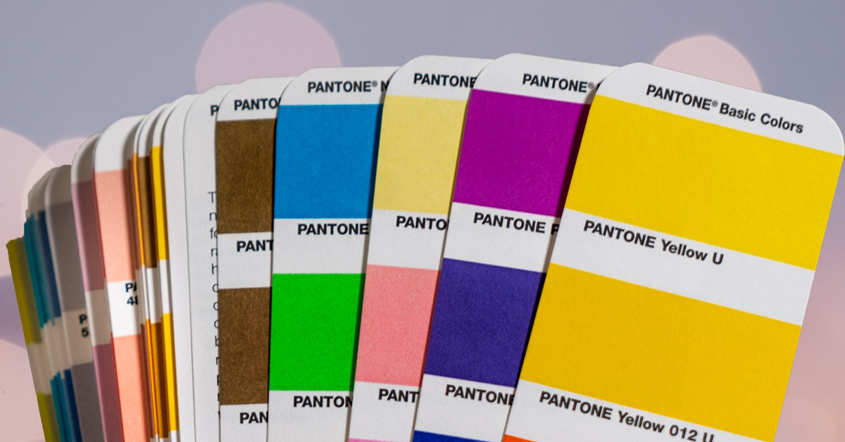
Two design professionals explain what spot colors are and when and how to use them
Both Chack Robles (@chackrobles) and John Naranjo (@jonaranjo) have spent over two decades in the worlds of advertising and editorials, respectively: this means they are experts in the world of printing. Throughout their careers, they’ve been able to work with spot colors on numerous occasions and are the perfect people to clear up any doubts over what spot or Pantone colors are and when to use them.
What is a spot color?
As John Naranjo tells us, colors, depending on their origin, can be differentiated into light colors—which are those derived from the decomposition of light and which, in screens and devices, compose light into RGB values—and pigment colors, created from the chemical mixture of pigments to create a color. Spot colors belong to this second group.
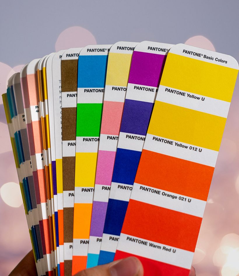
Spot colors, also known as solid colors, "are used to select special colors that can be applied in a single run without the need to combine selection or offset colors (Cyan, Magenta, Yellow and Black) or four-color process", clarifies Chack Robles. The Pantone system, made up of flat colors, has managed to interpret multiple colors by mixing basic pigments. With it, says Naranjo, "you can achieve colors that are out of range and cannot be represented digitally, such as metallic colors, pastel colors, etc."
When do we use spot colors?
Spot colors are made for any specific type of project, but both designers agree: in the world of corporate identity, if we want to achieve homogeneity and have greater control of the finish and color in printing, regardless of the medium or medium on which we are going to share our design, it is highly recommended to use Pantone colors.
John Naranjo also stresses the importance of using spot colors when we want the printed piece to attract attention thanks to its special finishes (it’s not for nothing that they are also known as "special inks"). Furthermore, he considers that "working with spot colors shows a high level of knowledge of a basic visual communication tool such as color. Its use means, on the part of the creator, a high level of knowledge in the technical part of reproduction, and handling of the symbolic and interpretive parts."
However, "when we talk about unique pieces of art or sketches, pieces that will not have reprints, illustrations, or anything digital, we will always be guided by the RGB combination," says Robles.

How do you add or indicate in the design that you need to work with a spot color?
The main design programs have built-in color libraries that allow you to choose and indicate the exact Pantone or spot color you want to incorporate into your design. "If you already have a special color generated and approved that you have created from a CMYK, you have to change the color to Spot Color, which in the color palettes appears as a box with a circle in the middle," explains Chack Robles.
As John Naranjo reminds us, this does not mean that we can dispense with printed guides to know how the final print will look. And, in fact, when we are going to devote ourselves to print design, "it is advisable to have knowledge of pre-press and color selection to achieve the desired color effects.
What should we keep in mind when working with spot colors?
For Chack Robles, the most important thing when working with spot colors is "to have a Pantone guide, preferably the Coated one, so that both your client and you can have the reference in plain ink and its four-color version and you can assign a color that works for both printing formats. Working with spot colors is synonymous with quality since there are no possible variations, it has to be made identical to the Pantone guide".
Choosing to print Pantones instead of the four-color process also has repercussions on your budget: working with flat colors usually increases costs. However, Chack Robles believes that "if you are going to use 3 spot colors (in terms of cost and quality), it will be better to work in four-color process, but if we talk about 4 spot colors from now on, the cost will be higher than working in selection and the files will also become more complex to work with since, unfortunately, there are many people who do not know how to do manual color separation".
We must also take into account that there are printers that cannot handle spot colors (although having a reference could calibrate and match the color, as Robles points out), and delivery times can be delayed.
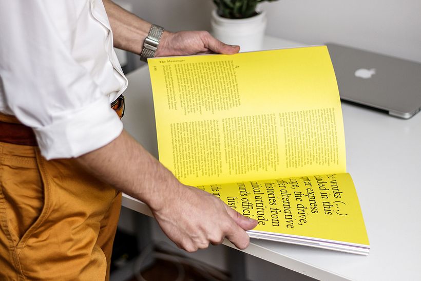
Finally, John Naranjo draws attention to the type of paper and finishes: "applying a laminate, whether matte or gloss, on a special ink can distort the color. You also have to take into account the drying times and the behavior of the ink over time; special inks usually change drastically when exposed to prolonged sunlight (as happens with the exposure of the spine of a book to the sun in a library, the color of the spine will change and that of the cover, which is not exposed, will not)".

Chack Robles teaches the course Final Art: Preparation of Files for Printing in which he explains everything you need to adapt your designs for production in different print media. John Naranjo, in the course Design and Production of an Editorial Project, teaches the process of creating a book from start to finish.
English version by @harry_davies.
You may also like:
- 5 Screen Printing Artist That Will Inspire You
- How to Create an Illustration with Parallax Effect
- Photoshop Tutorial: How to Enhance a Scanned Illustration




0 comments