


8 inspirational examples of typographic design
Get to know the typographic fonts designed by the Domestika community
Essentially, typographic design is a creative discipline that is geared towards the design of complex typographic systems. In other words, it’s not only about the aesthetic value of the letters of the alphabet, but also about the way letters interact to form words; the measurements of each letter and how it creates uniformity in the eye of the reader; the inclusion of punctuation marks, numbers, special characters; and much more.
With this in mind, we want to profile eight designers from the Domestika community who have created their own typographic fonts, either through their work as typography professionals or through a course project during their first attempts at font design.
To learn more about each font and project, click on the title in red. You will see more images and details of the creative process behind them!
Maciza, by Oscar Guerrero Cañizares (@sumotype)
This is a typographic reinterpretation of printed type in a 21st-century book. It takes inspiration from the classic Garamond typefaces with a contemporary interpretation, and they are characterized by their classic personality, humanist structure and proportions, and a weight that is adapted to the functions of the text.
This typography is exclusively designed for students of the course Digital reinterpretation of classic typography, who can use it free of charge.


Auto Display, by Brígida Lourenço Guerreiro (@brigida_guerreiro)
This is a project developed in the KOBU Agency. The font reveals its charismatic personality with a balance between the geometric and the humanistic. It is recommended for websites, magazines, and short titles.


Pliego, by Juanjo López (@juanjez)
This typography is designed for comfortable reading in long texts, with humanist proportions, a uniform texture, and calligraphy details that are visible only with big sizes, which gives them a contemporary touch. It is available on Juanjo’s website and on sites like FontSpring or MyFonts.
Learn more about his work in the course Design a digital font from A to Z.


Bauzahlen Font, by Miguel Ángel Hernández (@avance)
This is a font constructed solely from circles, triangles, and rectangles, influenced strongly by Bauhaus, the work of Cassandre, and geometric rationalism. It meets the standards of Latin Plus and offers discretionary ligatures, among other resources. It’s available via Gumroad.


Signum, by Fernando Ibarra (@fernandoi)
This is a system of capital letters, designed from modules. It is designed for short texts and is distinguished by its elegant style.
The project is derived from the course Basic principles of typographic design.


Laca, by Joana Correia (@joana_correiatype)
This font verges on sans serif, inspired by the retro soap packets of Portugal. It is available in different sizes and in true italics, which can be adjusted to each project. It can be found on MyFonts, as well as its text-based version Laca Text.


Dance Floor]Dance Floor, by Damián Guerrero Cortés (@damnguerrero)
This font of 64 styles mixes geometric patterns with distinct typographic styles. It is designed for maximalist compositions and allows the use of false ligatures. It is available on sites such as MyFonts, Crella, and Creative Market.


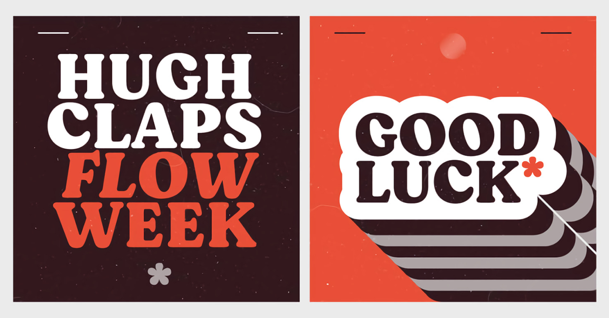
Moranga, by Latinotype (@latinotype)
With a design by Sofia Mohr, this is a series of contemporary fonts with a retro style and a boundless personality. It takes inspiration from the shapes, elements, and fonts popular in the 70s. Included are five sizes, italics, and more than 400 characters.
The font is available from Latinotype’s site, and if you want to learn more about their work, don’t miss the course Basic principles of typographic design.


Don’t forget to share your projects with the community!
English version by @garethplatt49.
You may also be interested in:
- Type Illustration: Transform Your Inspiration.
- Creative Tools: The Brush Pen.
- Learn the Basics of Script Lettering.


0 comentarios