Type Illustration: Transform Your Inspiration

How to transform your reference images into graphics for your next type illustration project
Type illustration has existed for centuries: woodcut initials are some of the earliest examples, which can be found in medieval books and old bibles. Some are so detailed that they are like small stand-alone works of art.
Combining type and illustration is a powerful tool that can captivate our attention and convey a message. It can transform the meaning of a word because not only are you reading it, you are seeing it. “As soon as you start to illustrate a word, you give it some special kind of feeling,” says Birgit Palma (@birgitpalma), a Barcelona-based artist specializing in illustration and lettering. “You can make the word stronger, but you can also destroy the word, depending on the type of illustration you use.” Illustrated type can send subliminal messages that convey an impactful meaning.

Birgit, originally from Austria, has worked with major clients, including Adidas, Adobe, Diesel, Hyundai, and Coca-Cola. Here she talks about taking inspiration from reference images and transforming them into fresh ideas, which you can then convert into graphic material to be incorporated into your text.
Creating a mood board
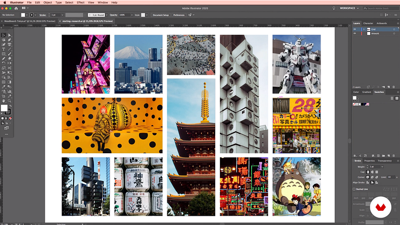
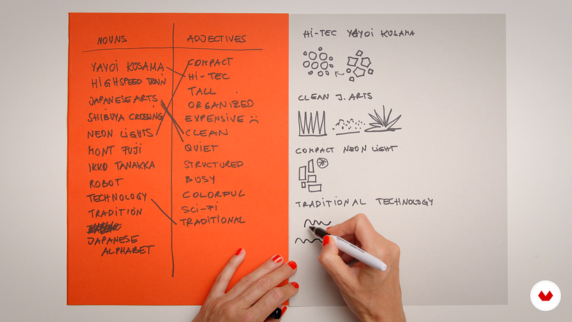
Birgit uses the exercise of creating an illustrated modular type for a city as an example. After choosing a city (in her case, Tokyo), Birgit creates a mood board filled with reference images–including tourist attractions (Mount Fuji and the bullet train) to art photography and the work of Japanese designers. Next, Birgit creates two lists: one of nouns related to the city, another of adjectives. These lists help her define the essence of the city, with the adjectives conjuring up the city’s emotion. Birgit then chooses a noun from the list to combine it with one of her adjectives, and creates a quick sketch for each combination.
Don’t take reference images too literally!
Birgit then thinks about how to reinterpret these ideas and make them more abstract, and therefore, more unique. Birgit shares Picasso’s lithograph series, “The Bull,” in which the artist tests how far he can go, getting rid of details, making his interpretations of a bull more and more abstract. "When carrying out this process, you have to ask yourself, how much of the original reference image are you prepared to give away in your own interpretation of it? Home much of the shapes do you need to express the idea of the reference image but in a different, playful way?” asks Birgit.

Capture emotion
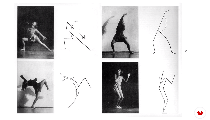
Birgit then examines a study by Kandinsky, in which the artist creates a pure abstraction of the movements a dancer makes in a series of photographs. He breaks the movement down into simple lines and circles. You can see this method being applied in other examples of his work. “He was trying to add the emotion of the dancers onto an artwork. And that’s exactly what I want you to do,” says Birgit. “Instead of taking them too literally, think about the emotion, the essence, which is a layer below. Try to reproduce that.”
Only keep the most important details!
You can get rid of details and colors. Simplify the image. Once you have got rid of all the necessary information, you can start playing around with shapes and colors.
Dismantle the structure into simple pieces
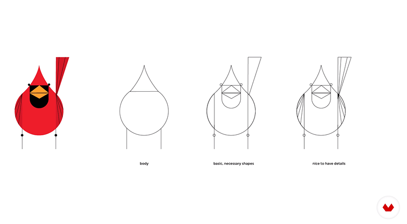
Charley Harper creates a lot of animal drawings. In a study of his work, Birgit shows how he starts off with a body shape, and then adds the crucial details that makes the animal identifiable, before finishing off with some decorative detail. However, this last step isn’t necessary.

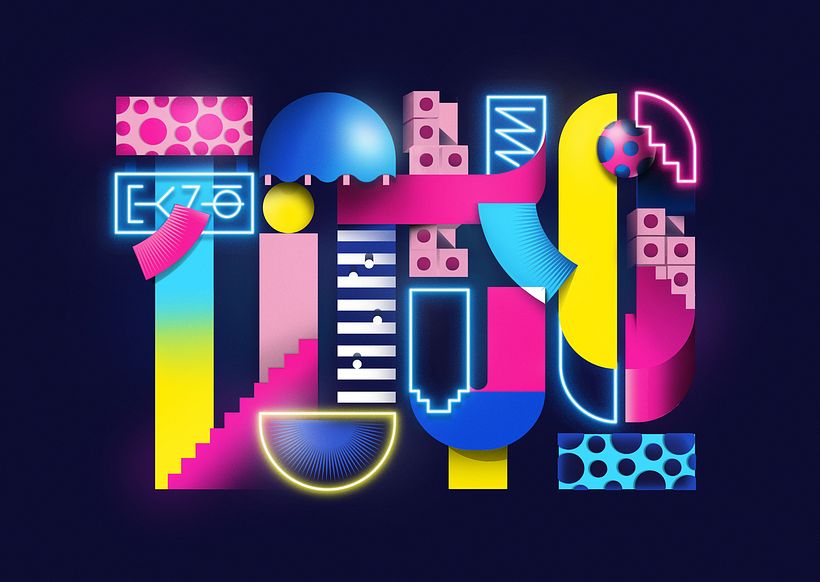
If you are interested in learning how to add depth and meaning to words using shapes, color, and volume, sign up to Birgit’s Domestika course, Illustrated Digital Lettering.
You may also like:
–What Is Calligraphy and What Is Lettering?
–Calligraphy Tutorial: Basic Brush Pen Strokes
–The Story of Logos I: Learn About the First-ever Logo


0 comments