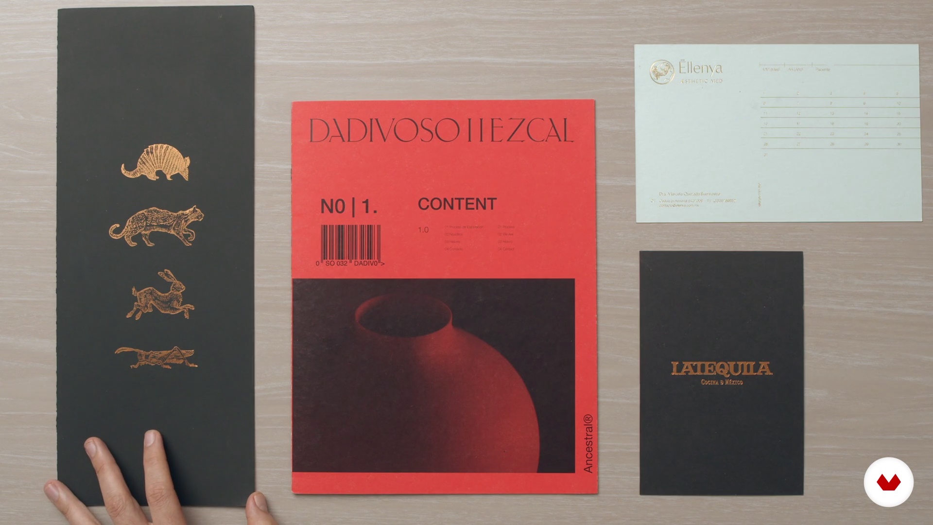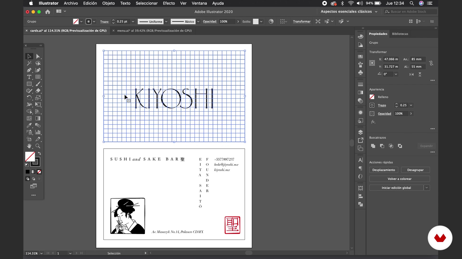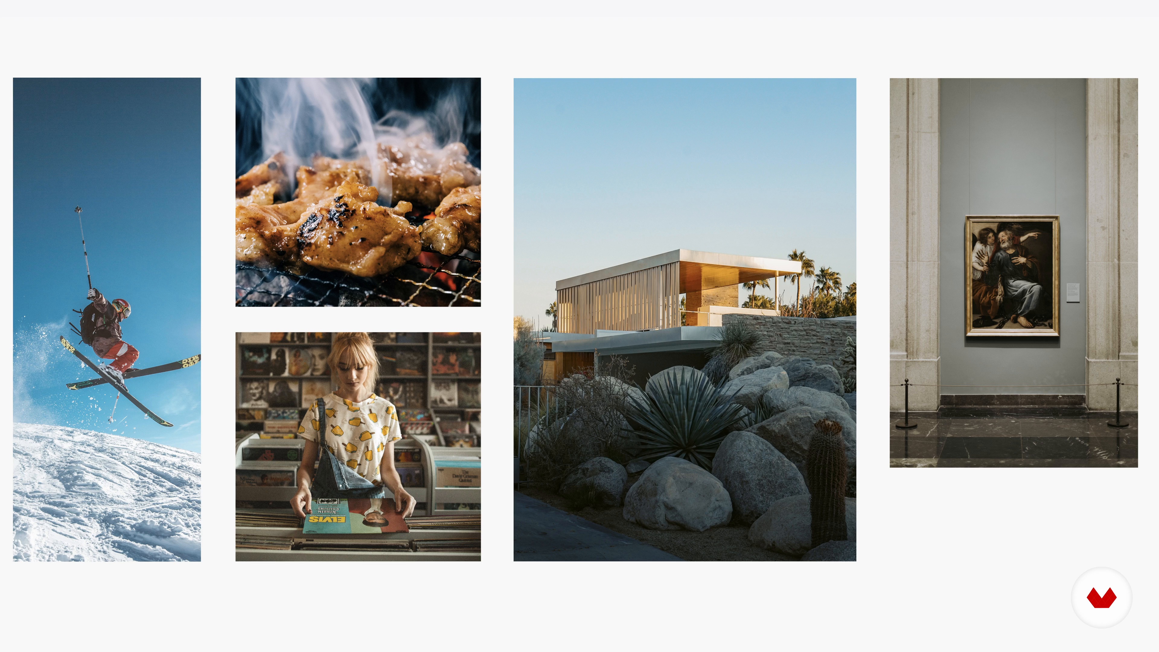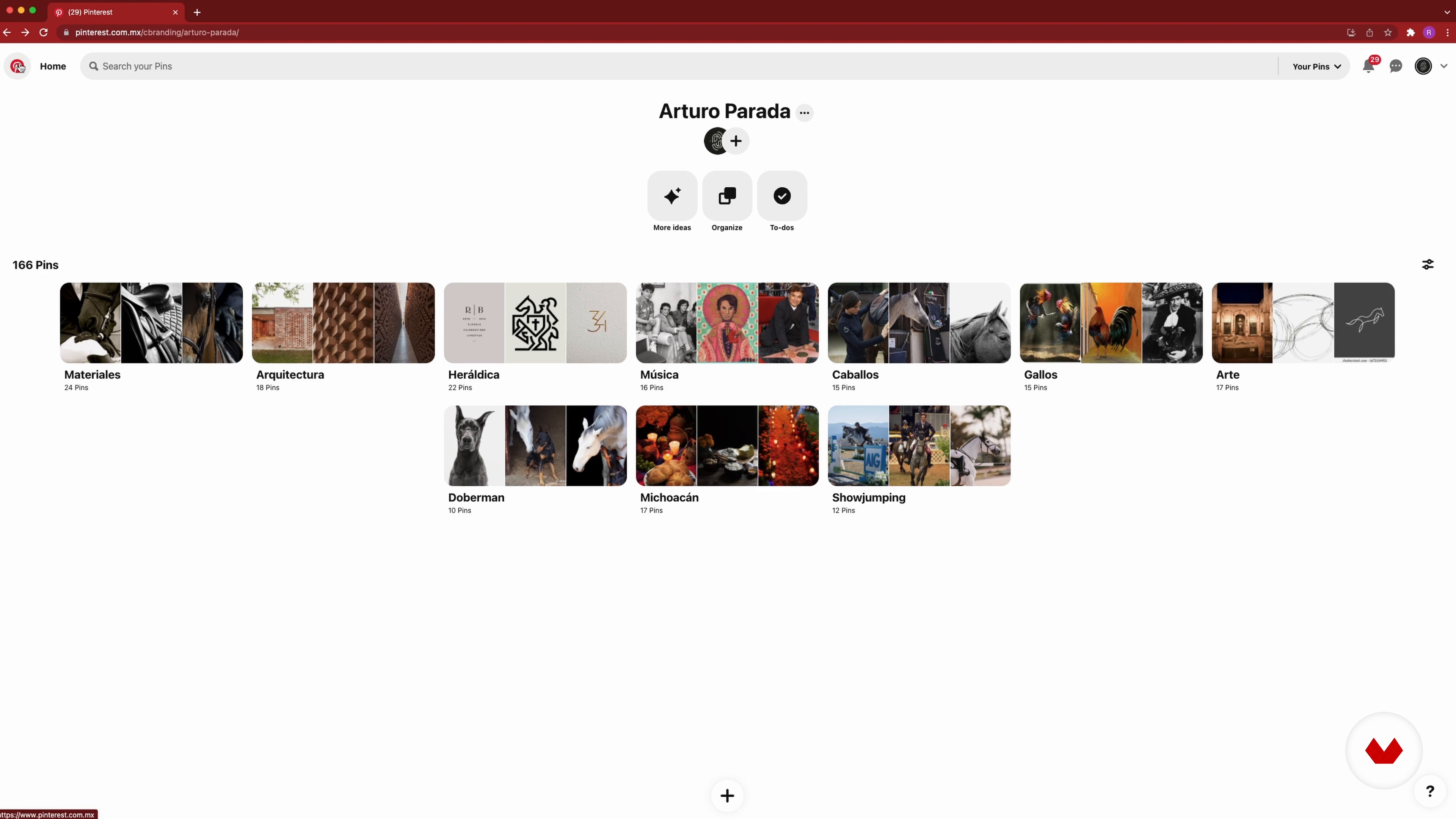

Immerse yourself in the fascinating world of typographic logo design with a specialization that will take you from the basics to creating visual identities that tell powerful stories. Guided by five design masters, you'll learn to conceptualize and create logos that capture the essence of a brand, connecting emotionally with its audience. Develop a unique and authentic style while exploring typography and graphic synthesis. Discover how details can transform a logo into a memorable symbol that endures over time.
With this specialization, you'll master advanced typographic customization and visual adaptation techniques, taking everything to a narrative level where brands come alive. Experiment with minimalism and storytelling to build identities that are not only aesthetically pleasing but also communicate a profound message. Upon completion, you'll have the tools to create logos that not only represent a brand but also tell a story, thanks to the shared expertise of Migue Martí, Rubén Ferlo, Elias Mule, Daniel Barba López, and Rodrigo Suárez Araiza.
1Introduction
Designing a logo is about translating a brand's soul into an image that speaks for itself. You'll explore its history, from classic icons to digital identities, and learn how to create memorable symbols that convey emotion, narrative, and visual authenticity.
1m
2Influences | Migue Martí
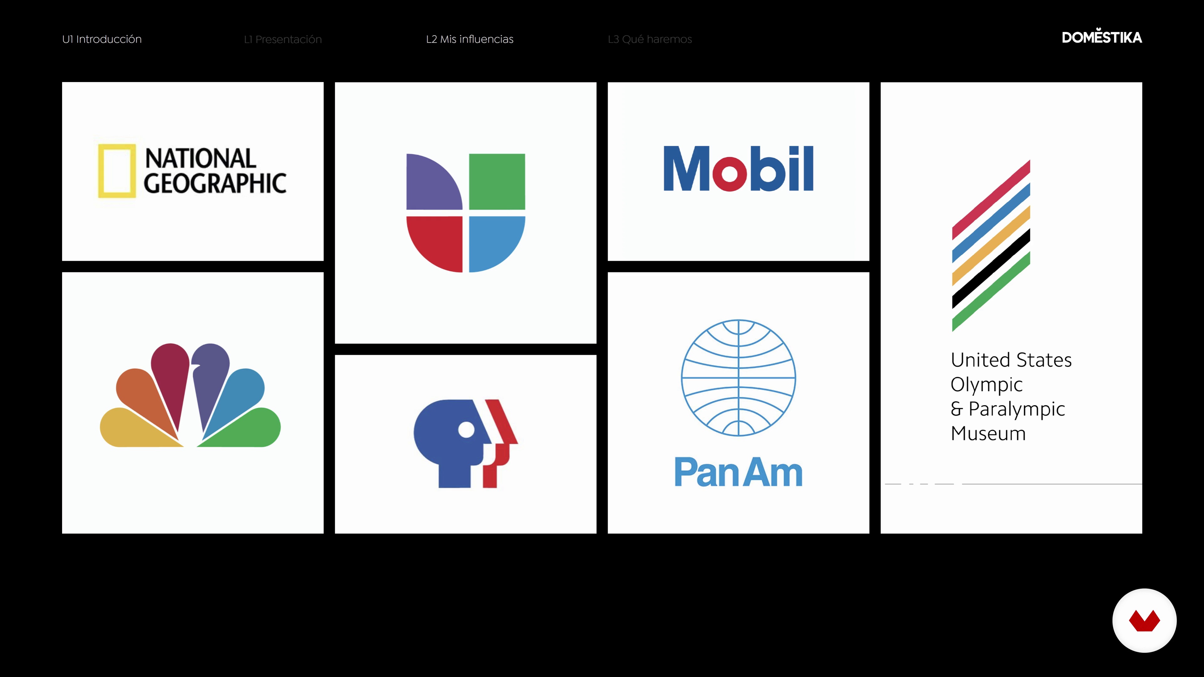
In this lesson, I'll show you my main references when designing. I'll show you some of my favorite figures, internationally renowned studies, and the most interesting sources to consult for logo design.
6m
3Influences | Rubén Ferlo
In this lesson, I'll talk about my greatest influences, from architecture to graphic design. I'll tell you about artists like Mies van der Rohe and John Pawson, as well as designers like Dieter Rams, Milton Glaser, and Pepe Cruz Novillo, among others, and how they've influenced my work.
6m
4Influences | Elias Mule
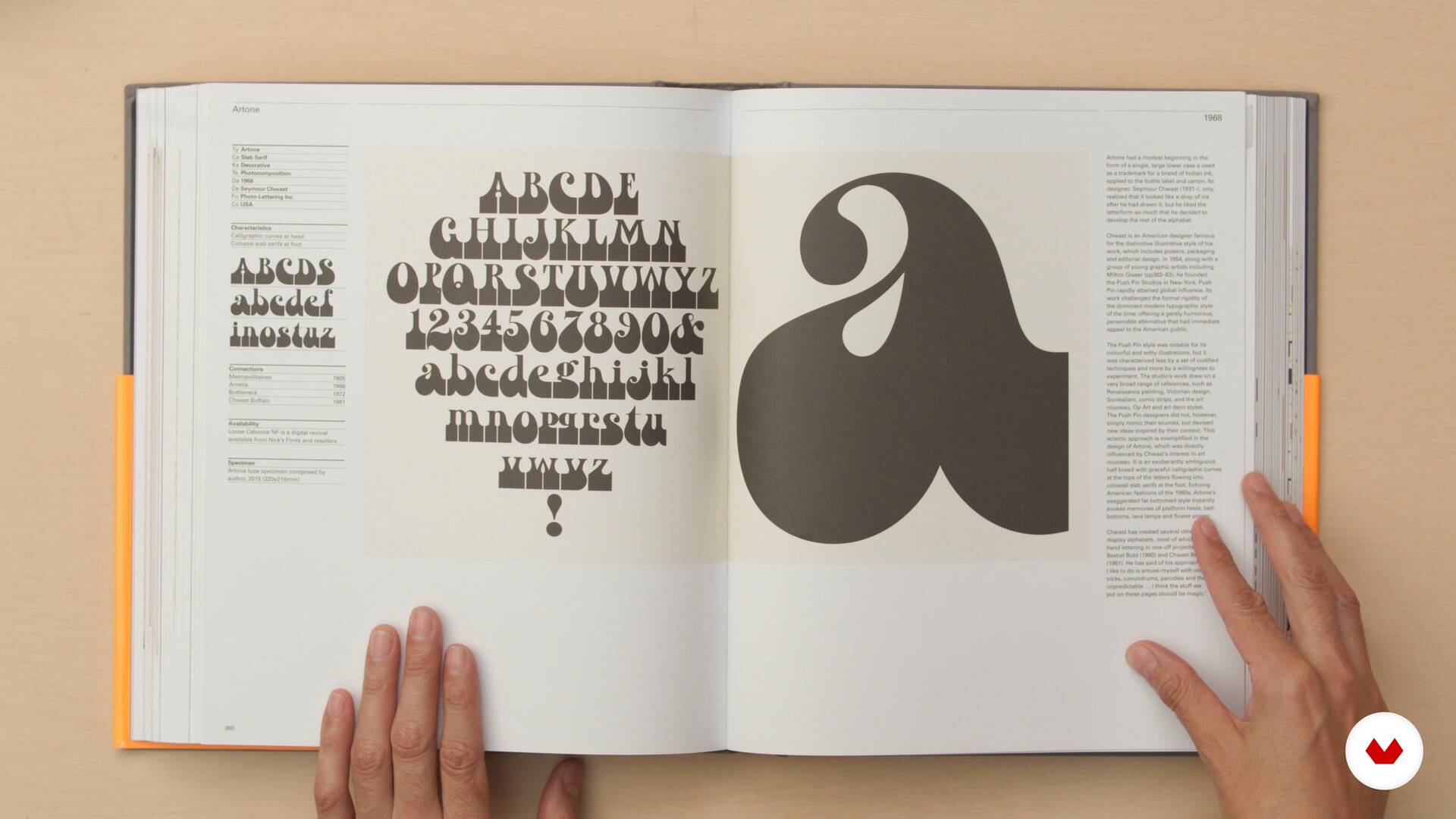
Get to know those I consider great influences, sources of inspiration, and learning. I'll also mention some books that have helped me on my journey through typography.
4m
5Influences | Monotypo Studio
Now, I'll give you an overview of my graphic influences, going through their history and how they've impacted my professional career.
9m
6Influences | Rodrigo Suárez Araiza
Now I'll briefly share with you some of the professional role models who have influenced my career in one way or another.
9m
4What is a logo
In this lesson, I'll explain the different types of logos and explore their characteristics.
14m
5Characteristics of a good logo
In this lesson, I'll show you what I believe are the key characteristics you should achieve when designing a quality logo. If your logo meets these qualities, your result will be much more interesting.
15m
6Commissioning and analysis
In this lesson, I'll show you how to approach a project to get off to a good start. If you do these initial phases well, your design will be a guaranteed success.
11m
7The research: creating a mood board
In this lesson, I'll show you the keys to researching the aesthetic uses of your environment and your competition. I'll teach you how to conduct research to find the best references for your project.
19m
8The conceptualization
In this lesson I'll explain how I manage the conceptual aspect when starting a project. You'll see what concepts are for, and I'll show you how to . All of this will help you create a solid foundation for your project.
8m
9Sketching
In this lesson, I'll show you how I typically sketch. Here, you'll work on the different concepts selected in the previous lesson to create your desired logo.
20m
10Typography 1
In this lesson, I'll show you how I choose a typeface for a logo. You'll learn about the different families and variants. Finally, you'll learn how to make the right typeface.
14m
11Typography 2
We continue to explore how to choose the ideal typeface for our logo and discover the distinct characteristics of each.
11m
12The composition
In this lesson, I'll teach you how to create a balanced logo proposal. We'll cover the basic rules and regulations for successfully constructing a final logo.
20m
13Color 1
In this lesson, I'll show you how I manage color in a logo design. This is one of the aspects that will most influence the identity of our design.
12m
14Color 2
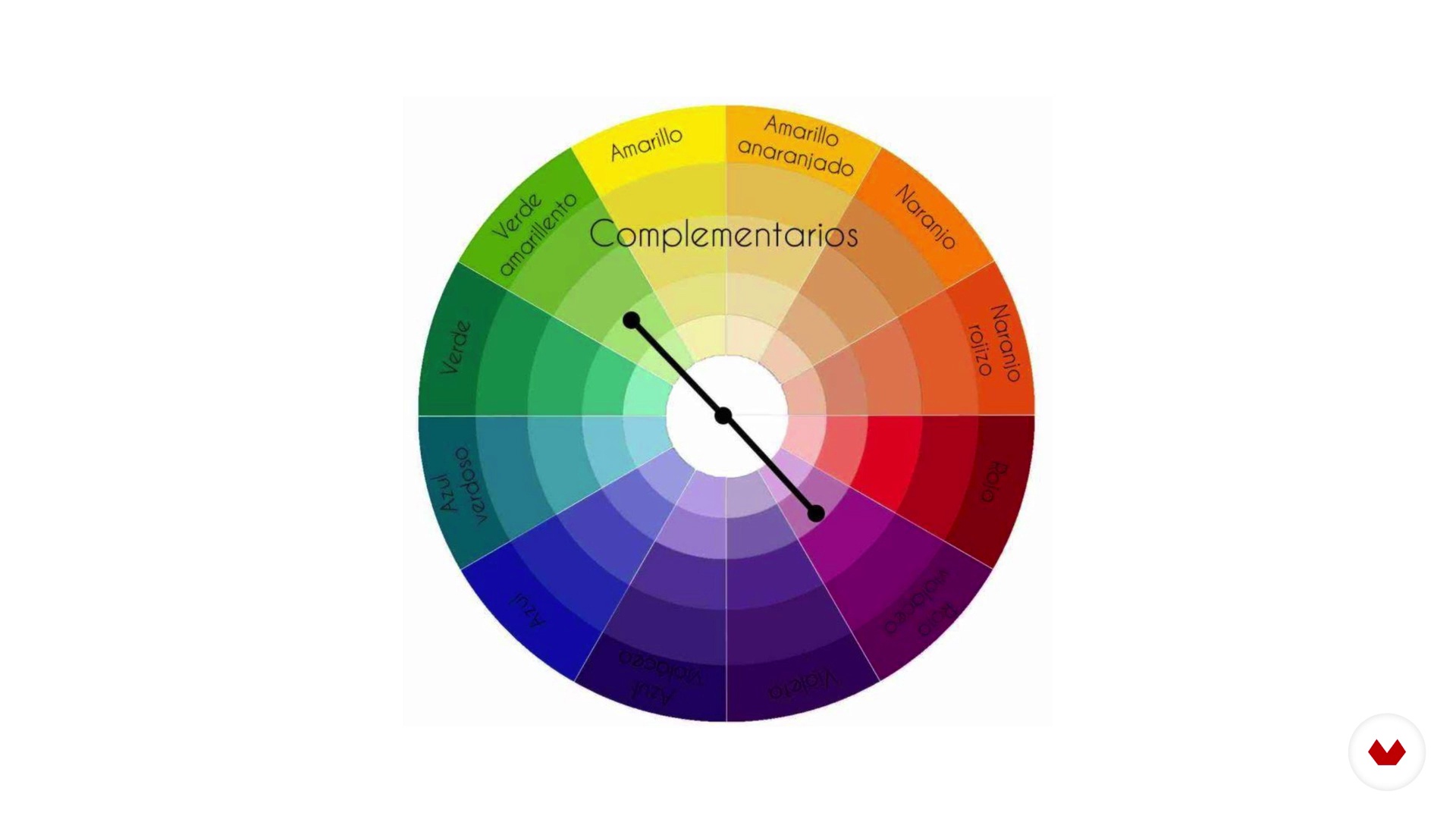
We're continuing to delve deeper into the qualities of color in logo design. I'll show you how I use color combinations.
11m
15How to save and export
Once you have your design, I'll show you how to save and export your work so you have everything at hand or can deliver it correctly to our client.
10m
16Logo application
In this lesson, I'll show you how to approach the different applications of our design. This step will help you see how our work works on cards, envelopes, folders, or social media. I'll explain what is and see how to use them.
9m
17Logo presentation
In this final lesson, we'll look at how to present a design to a client. This is a very important moment; we can't miss anything!
9m
4Brands
In this lesson I'll talk about what is, what a brand is, whether "brand image" is the same as "brand identity," and what visual and verbal identity are. After defining these concepts, I'll tell you about a brand that, in my opinion does good .
8m
5The logotype
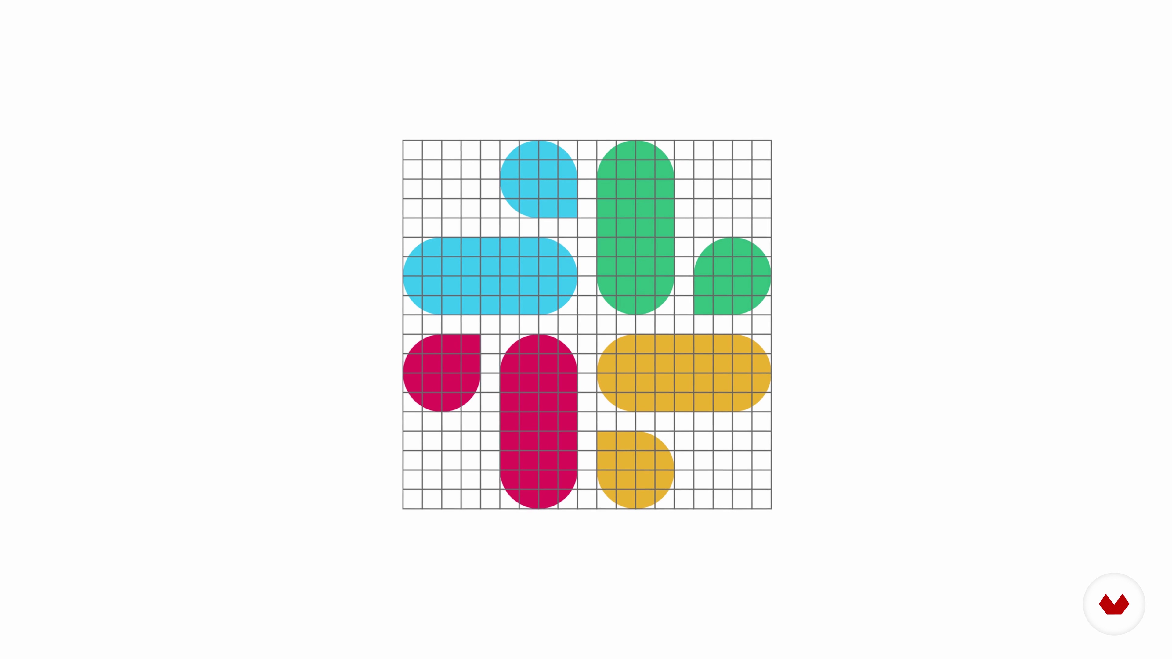
In this lesson, I'll talk about logos and their typology. But not only that, I'll also talk about the grid and the , which I use to build many of my designs.
10m
6The graphic synthesis
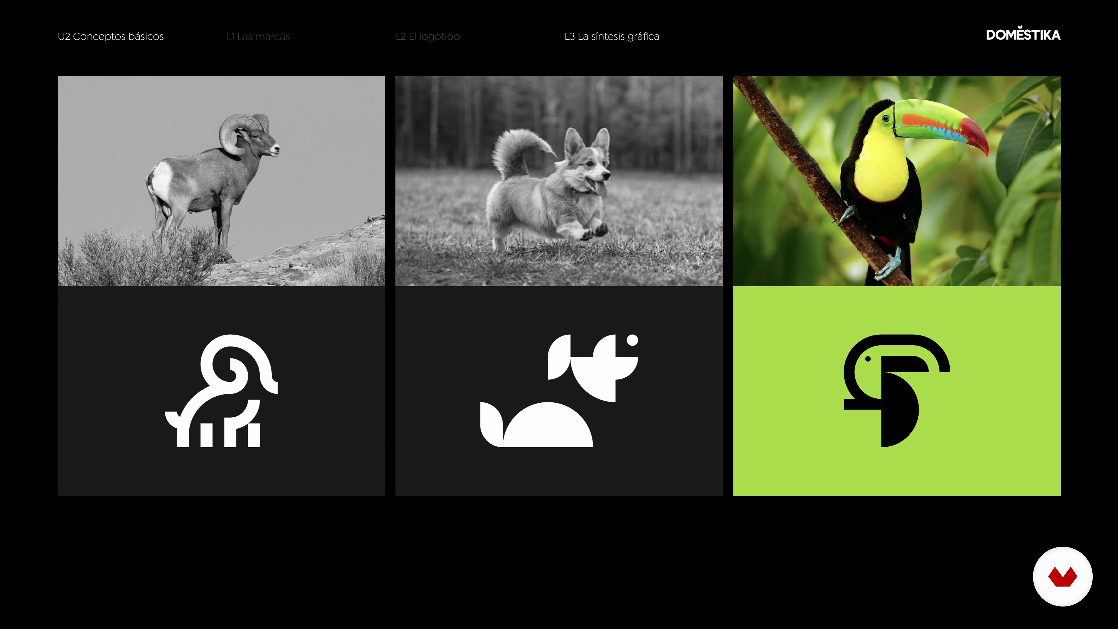
In this lesson, I'll talk about graphic synthesis, its typology, and morphology. I'll explain the process and discuss some problems you might encounter. By the end of this lesson, you'll be able to apply graphic synthesis to your course project.
8m
7The commission
In this lesson, I'll talk about commissioning; it all starts with the commission. I'll explain the stages you must go through before you can start working on your project.
3m
8The conceptualization
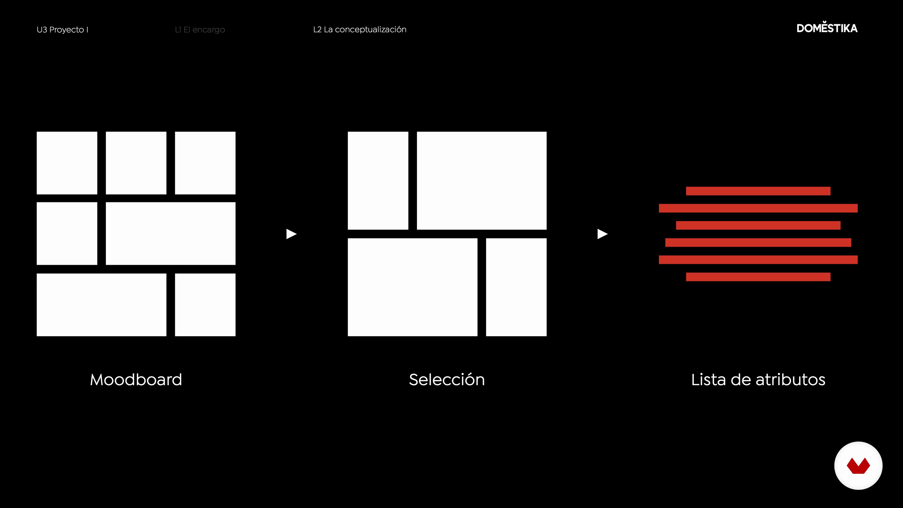
In this lesson, we'll define the basic ideas that will be used to structure the graphic message and that will, in turn, guide our design decisions. We'll generate a list of attributes to expand on the initial concept and define everything.
10m
9The sketch
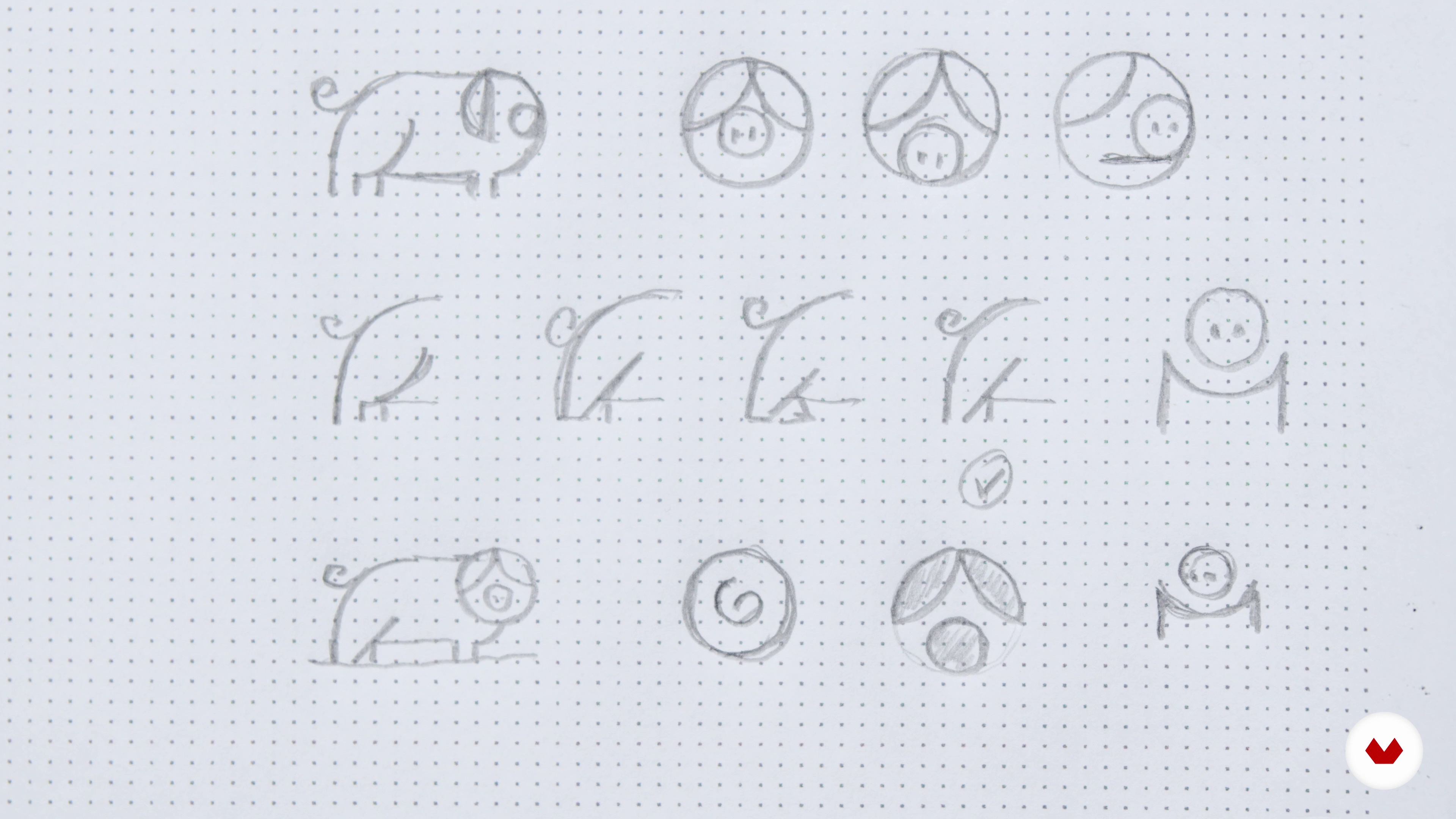
With our mood and list of attributes in front of , we're inspired and know which ones we want to represent. This phase is a great way to explore concepts, and while it's possible to create sketches on the computer, it's not as quick as sketching on paper. If you're just starting out, I recommend using a pen so you can't go back, as a great idea can often emerge from a mistake. That said, let's sketch!
3m
10Vectorization
After the sketching phase, you can sit down at your computer and vectorize your sketches. I'll show you how I do it and give you some tips along the way. Remember that in this part of the design process, we'll sometimes have to go back to the previous phase until we find the perfect proposal. I'll also give you some tips for visually adjusting or correcting your design if necessary.
18m
11Typography
Now that we have our animal ready, it's time to choose the font that will go with it. In this lesson, we'll review typographic classification and tell you what you need to keep in mind when choosing the most appropriate one for your project. I'll also give you some tips for making adjustments if necessary and explain how you can adapt or adjust the typography to the symbol.
8m
12The color
It's time to add color. As with typography, you should be careful when choosing it and opt for colors that best match both your audience and your brand values.
13m
13Final logo
We're now ready to build our logo. In this lesson, I'll show you what I keep in mind when creating it.
10m
14Graphic resources: applications
I've already prepared my logo, and it's time to apply it to different elements that I'll add to the final presentation. To do this I'll select some that are related to the brand and apply my logo to them.
9m
15Presentation of the logo to the client
The end of the course is here. In this final lesson, I'll teach you how to put together an attractive and functional presentation using the elements we've generated throughout the course. https://assets1.domestika.org/course-images/000/012/981/12981-big.jpg
5m
4The guy is enough!
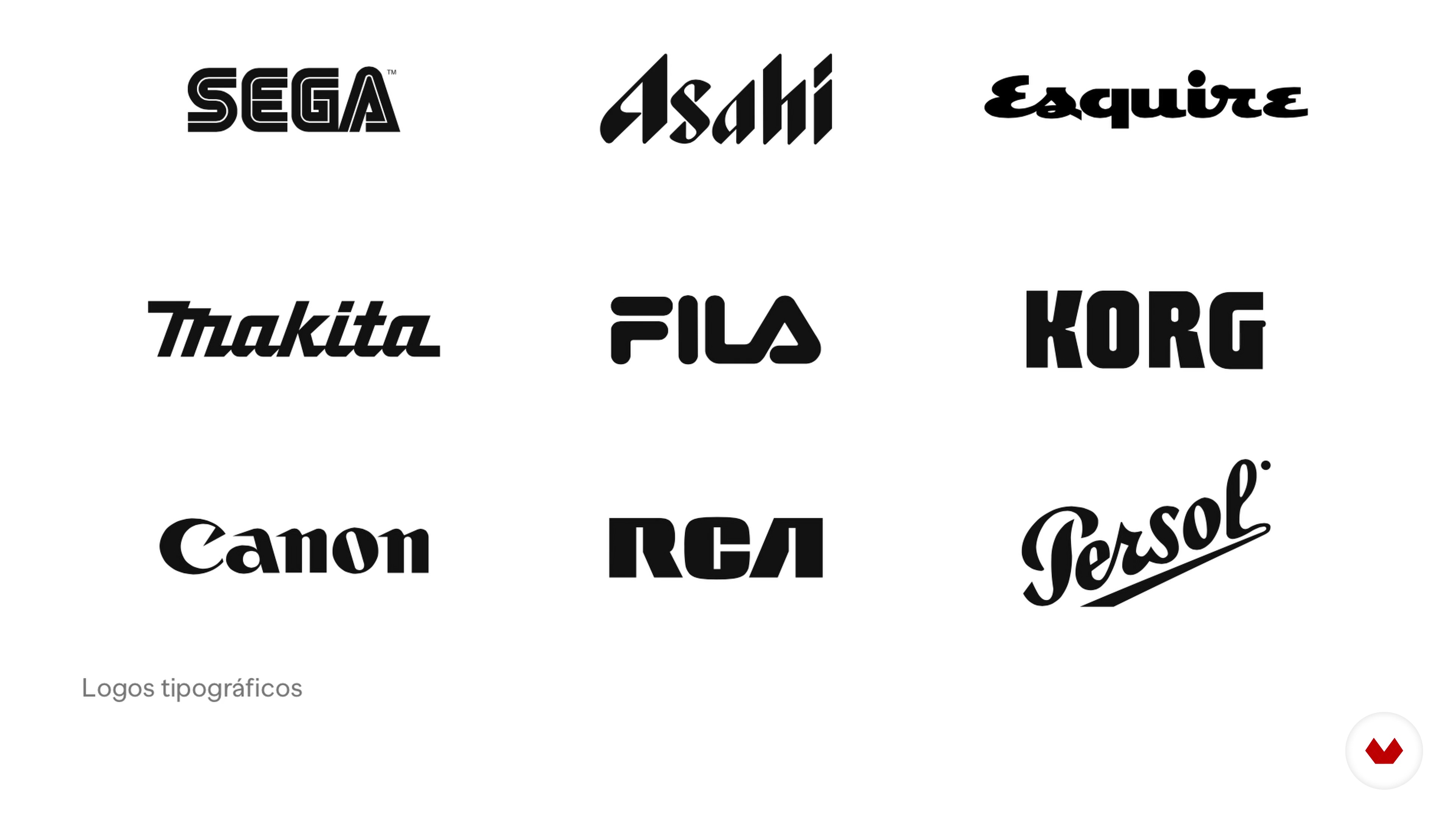
The power of letterforms is surprising. In this lesson, we'll look at some logos that stand out solely for their typography.
5m
5Basic concepts
Know the basic terms so we can use them however we want to create stylish shapes.
8m
6The eye commands
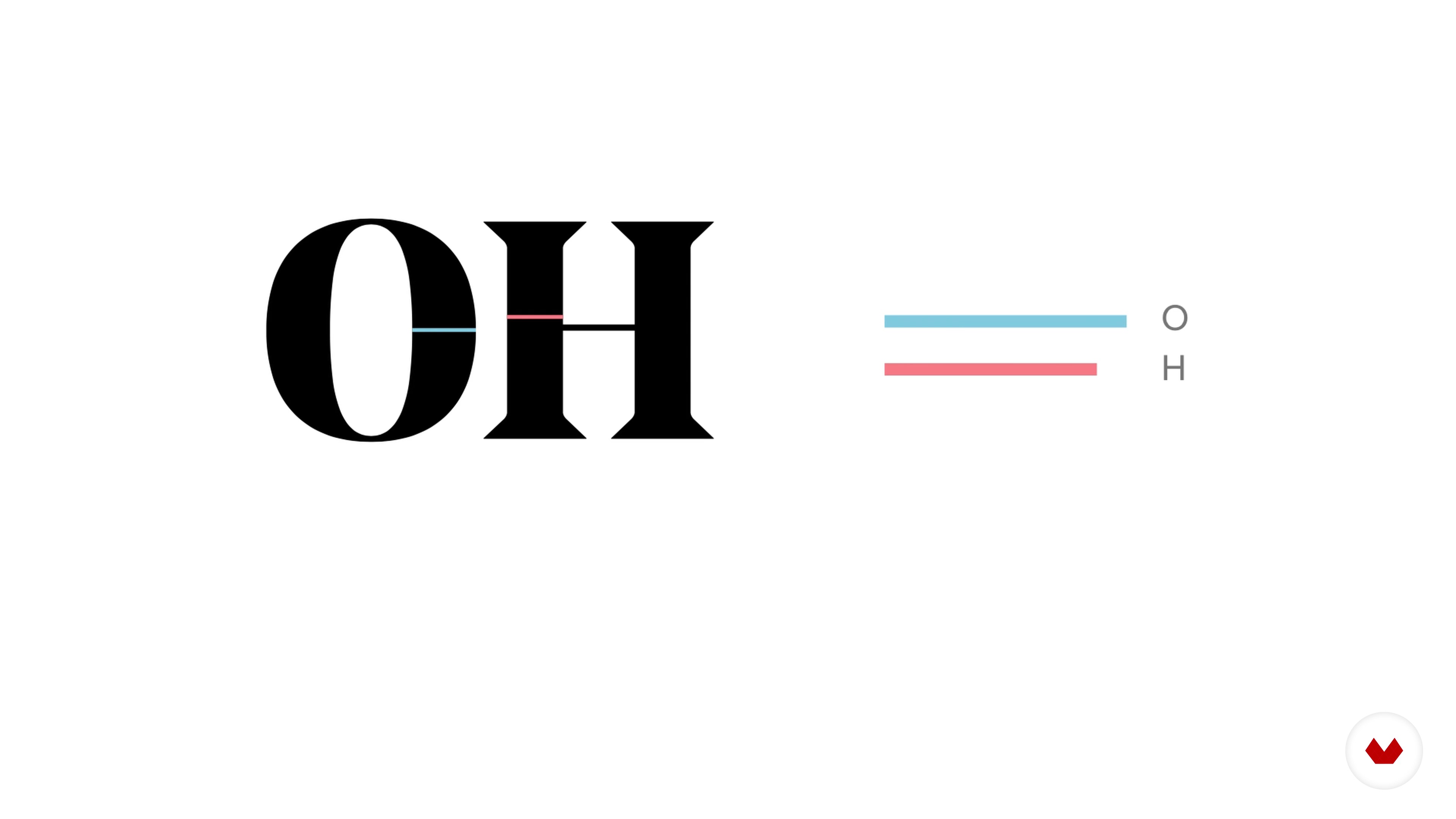
When I first started making letters, I was frustrated because the characters didn't look equivalent to each other. I didn't realize they weren't created solely with a grid and mathematical criteria. Creating letters is about playing with optical illusions, and there are some tricks to keep in mind to achieve uniformity. I'll share a few with you here, although every rule has its exceptions.
9m
7Hit the pencil!
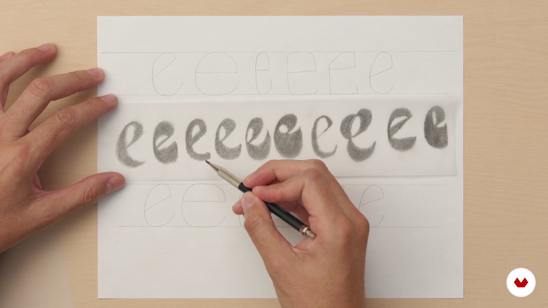
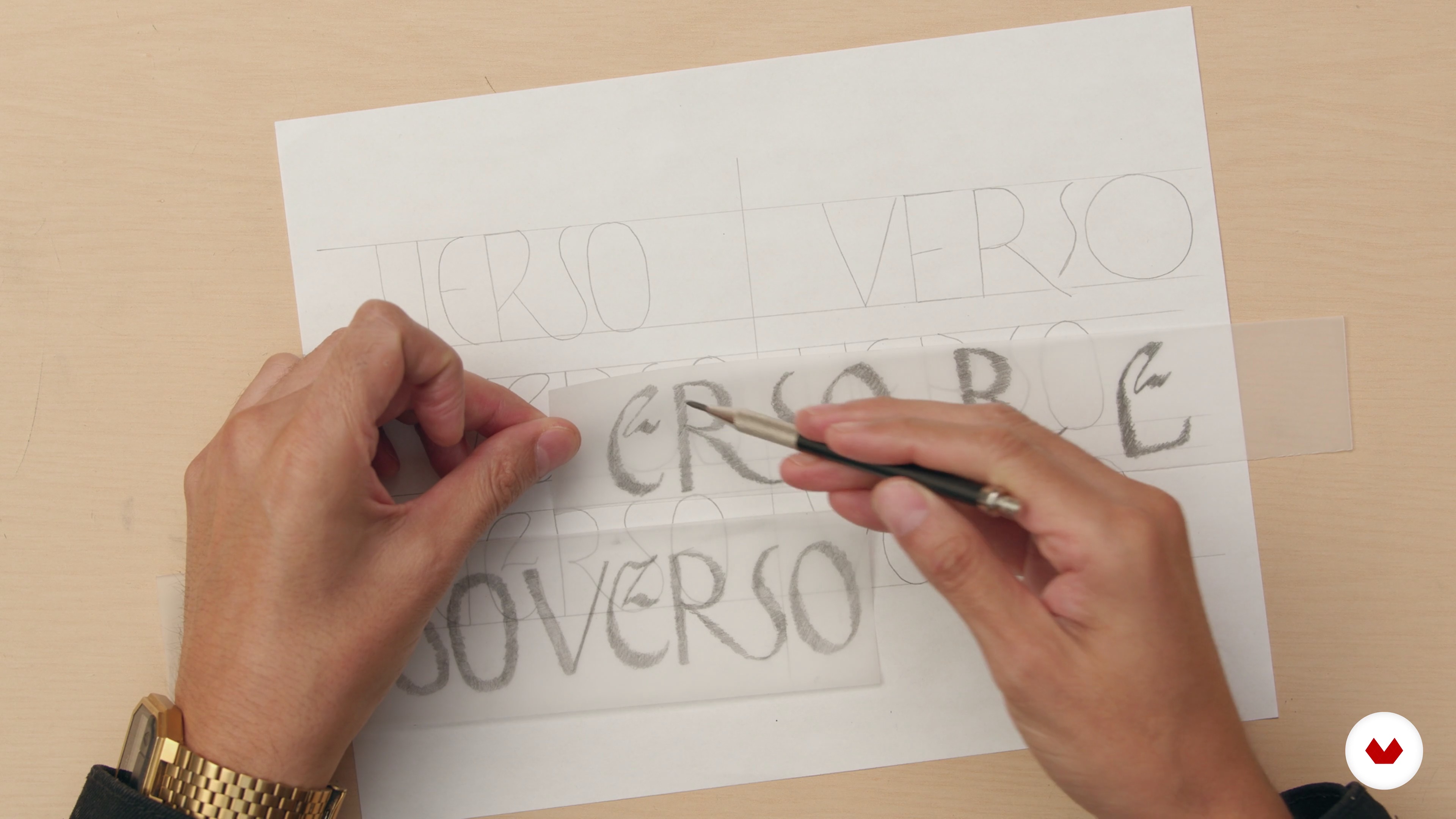
Pencil sketches to loosen up a bit and identify opportunities for shapes, find ligatures, and play with letters.
16m
8A well-posed problem is half the solution
Starting your projects with a brief and research will help you understand the context of what you're creating, and it's also a source of inspiration. In this lesson, I'll describe how to leverage what you've learned from the brief.
8m
9Inspiration
You can draw inspiration from almost anything, but I'll share some good starting points.
5m
10Sketches
Thanks to sketches, we can quickly conceive several solutions, although it requires intuition and practice to recognize the right path.
3m
11Digital retouch
Let's take advantage of digital tools to streamline the process and refine our ideas.
16m
12The sketch
The importance of sketches shouldn't be underestimated; they help us train our eye and understand shapes precisely. Clearly defining each part of our letters will save us the frustration of deciphering them with vector art.
6m
13From paper to vector
At this point our logo is almost ready, but poor vectorization could ruin it, so be patient and follow the tips I share with you.
15m
14The letter manifests
If your logo is the product, the presentation is the packaging. Make sure you show it off in the best possible way.
5m
15A functional logo
Now I'll tell you what you should include in the manual and the details to consider so that the delivery is completed professionally.
3m
4Introduction to typography and branding
In this lesson, we'll provide a brief introduction to typography, its historical evolution, and its relationship with branding (corporate identity) as a sales-enhancing factor.
16m
5Basic concepts and visual codes of typography.
In this lesson, we'll delve into basic typography concepts such as letter anatomy and structure. How many letters have a basic geometric structure, how structural elements of letters can be manipulated, and their role in distinguishing a typed logo from one that uses typographic manipulation.
10m
6How to manipulate fonts for a purpose
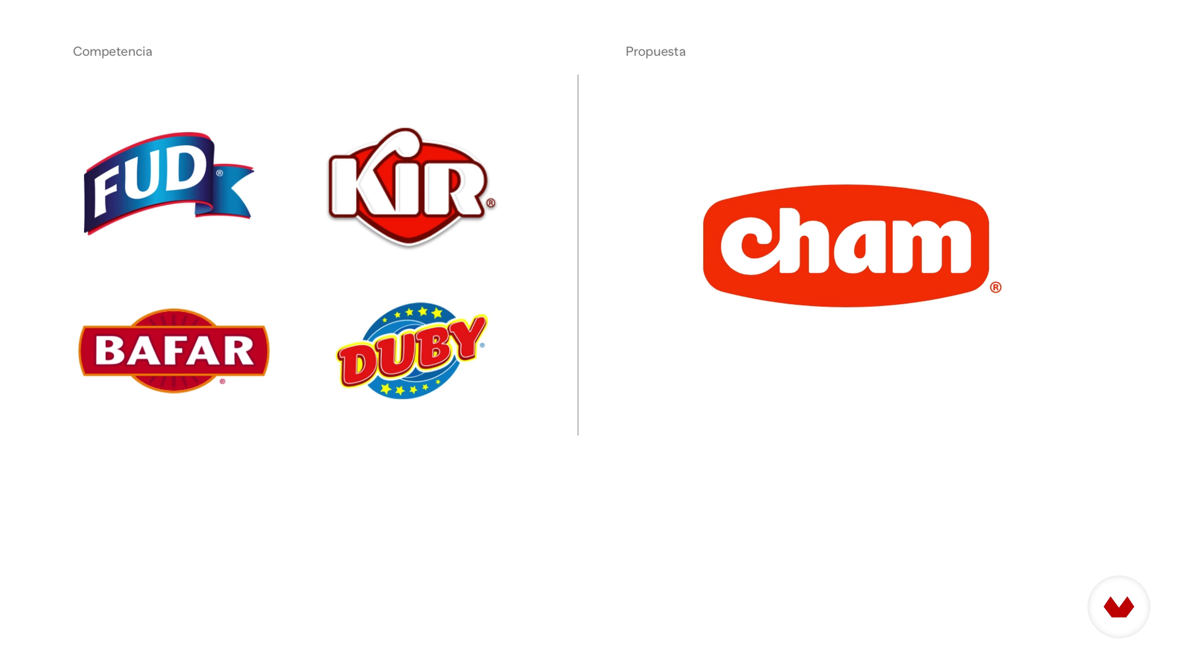
Now, we'll look at the importance of manipulating typographic fonts for a specific purpose. That is, giving a logo uniqueness and personality so it can stand out in the market.
5m
7Commissioning and conceptualization of the project
In this lesson, I'll teach you how to discern the nature of our project from the brief provided by the client, and we'll conduct research that will allow us to conceptualize our project.
4m
8Documentation
In this lesson, we are going to graphically structure the results of our conceptual research (typography, color, shape).
8m
9Type selection
In this lesson, based on concept analysis, you'll learn how to select the right typography for your project, including combining two fonts.
9m
10Analog process
In this lesson, you'll learn the basics of sketching using an existing font in a traditional way. This way, you can modify it to give it the personality you want to create for your project.
12m
11Digitization and vectorization 1
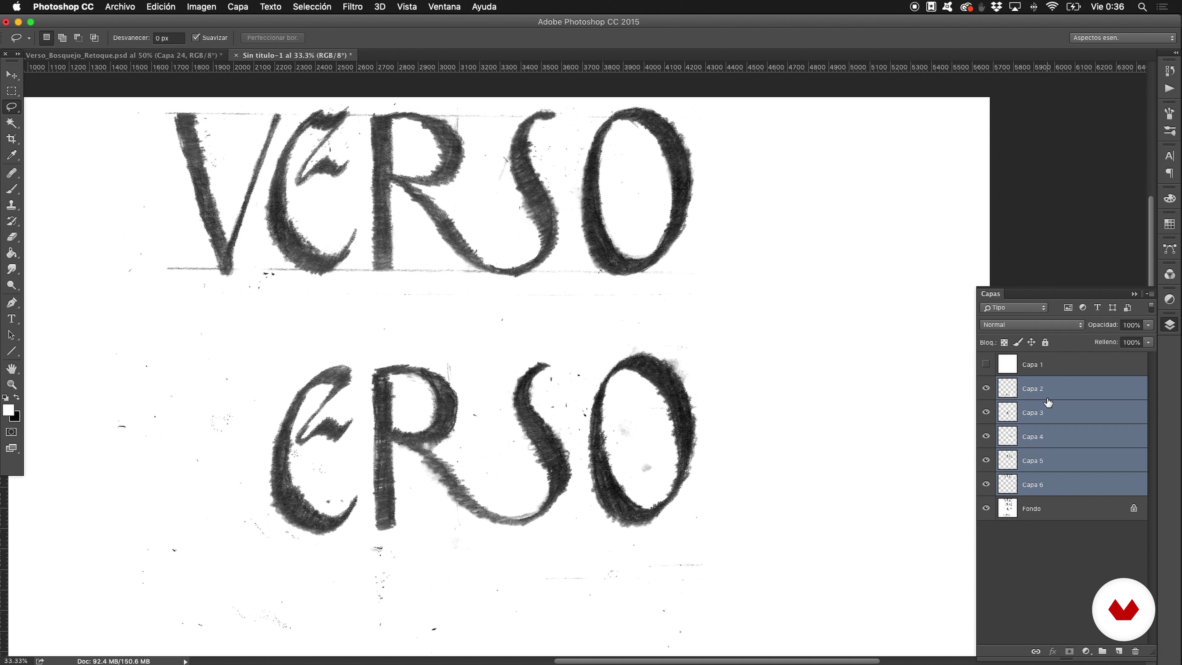
We will begin the digitization process, cleaning our image and working on the first part of vectorization.
11m
12Vectorization Process 2
In this lesson, we'll continue working with vectors. We'll use tools like the magic wand, duplicate, and pathfinder to optimize the process.
14m
13Optical adjustments
Now, we'll make optical adjustments that will help you avoid issues with your logo's readability.
4m
14Selection and application of color
Now that we've completed the vectorization, I'll show you how to make the right color selection, which will allow you to dress up and add the finishing touches to your branding project.
7m
15Auxiliary Elements
We'll look at how to apply some auxiliary elements, such as illustrations or vectors, to give our brand personality across the various media it will be present on.
3m
16Printing Methods
Here, I explain some printing methods (screen printing, hot stamping, letterpress), and I talk about some of their peculiarities that will allow us to capture our design on different supports.
5m
17Application on different supports
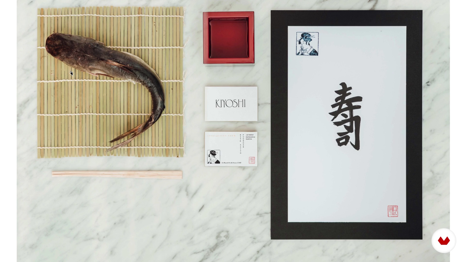
Once our logo is finalized, we'll apply it to the most traditional media (business cards, letterhead, folders). Once finished, we'll apply the color and typographic selection principles we discussed in the previous lessons to create a uniform brand identity and ensure visual consistency.
5m
3Pillars of a brand with history
To start, I'll talk about the right questions to ask yourself before starting to design a brand with a great story. I'll also explain why it's important to make your research process as thorough as possible.
7m
4How to interview a client
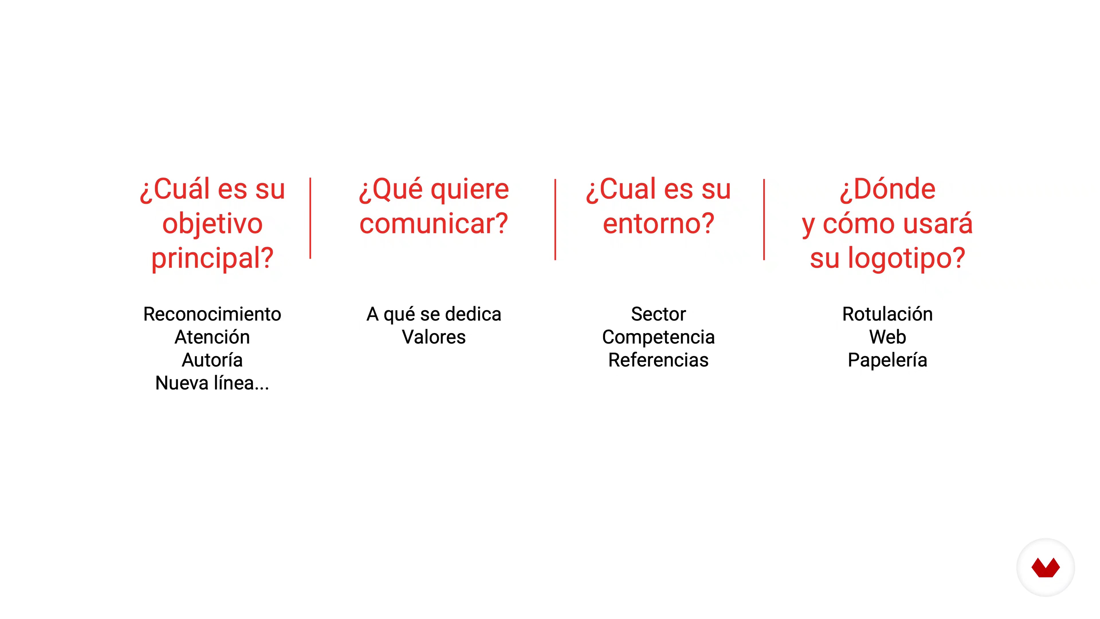
Now I'll share some general guidelines for conducting an interview with your client. If it's a personal project, you might consider writing down what you would normally answer.
16m
5The preliminary mood board
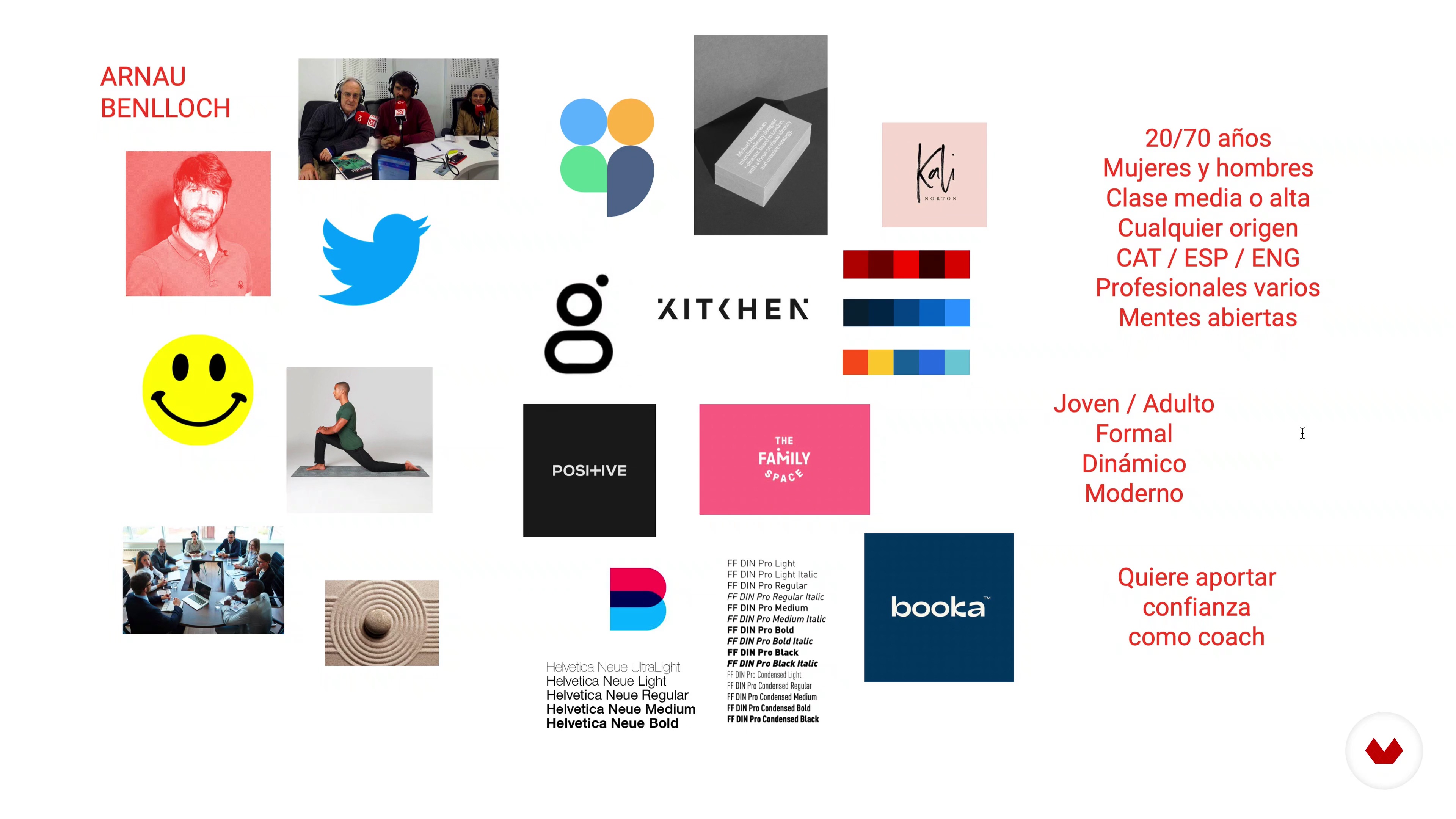
Do you know what a mood board is and how to make one? In this lesson, I'll show you how to create a multisensory mood board to see your brand's personality from different perspectives.
14m
6The wheel of archetypes
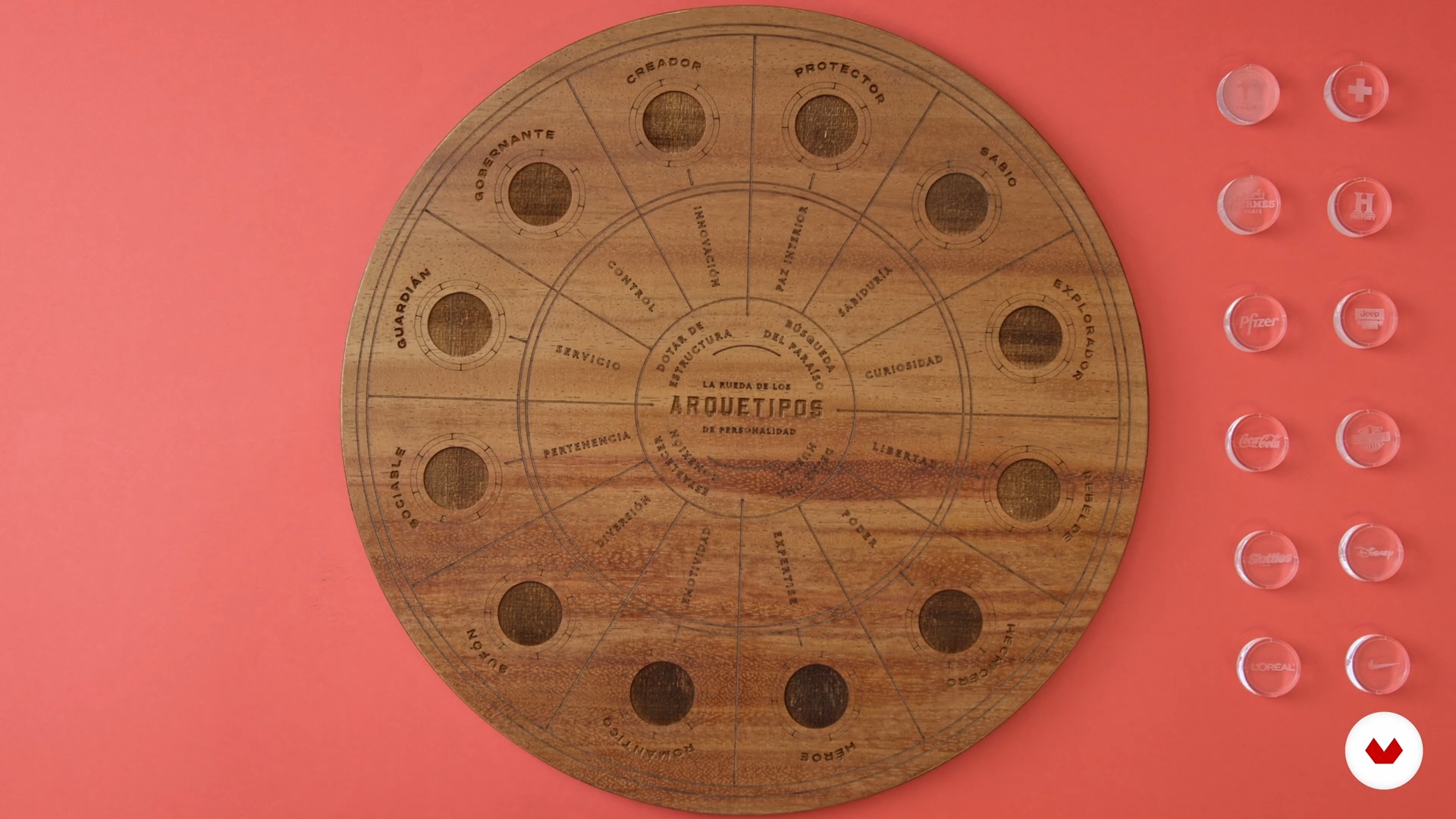
Do you know your brand's personality? In this lesson, I'll show you how, using the archetype wheel tool, you can identify the personality of the brand you're about to design.
15m
7The personality of fonts
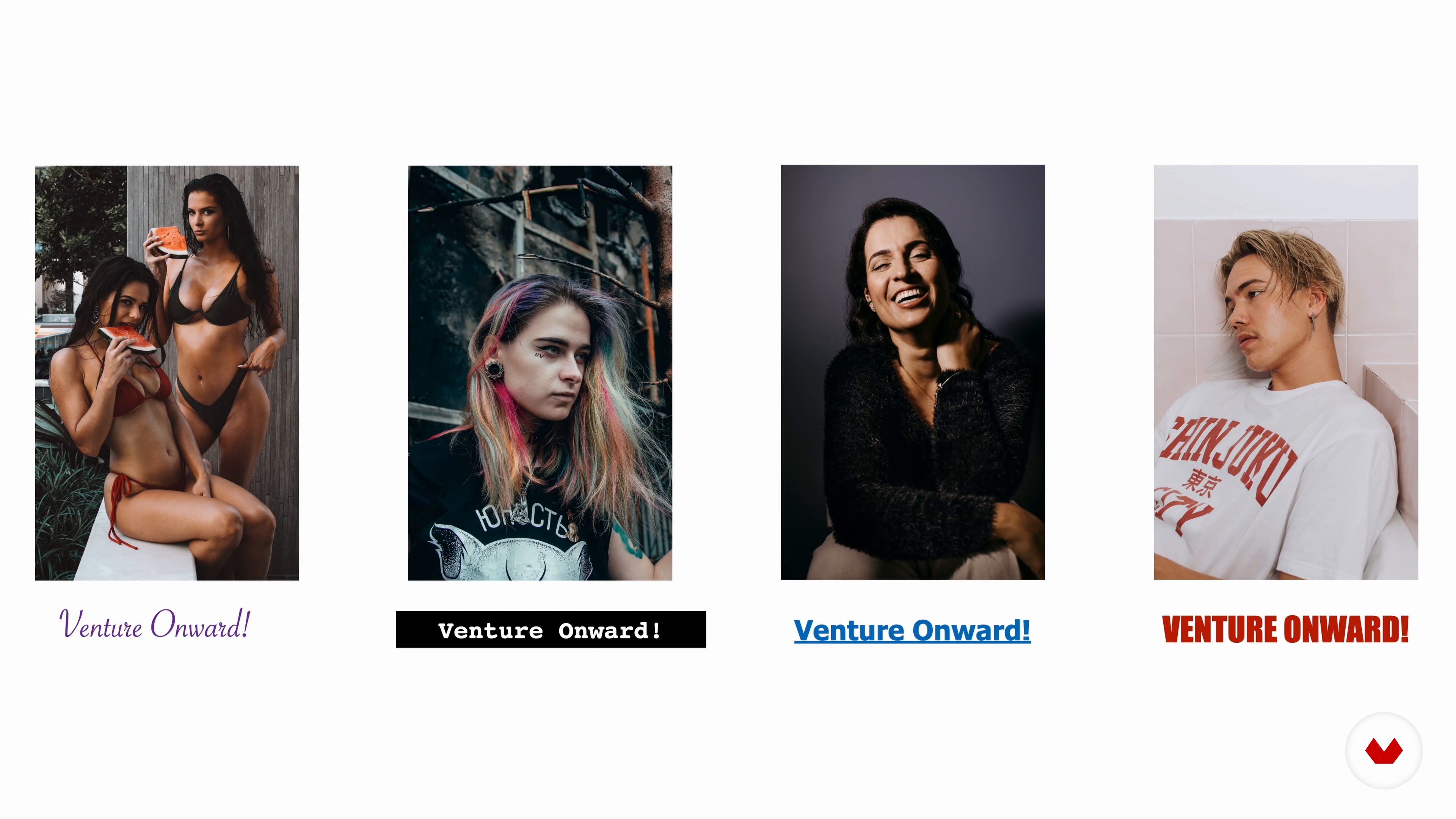
Let's move on to the next step. Now you'll see how to use the results of the archetype wheel to find the right typefaces for your project.
8m
8The right typography
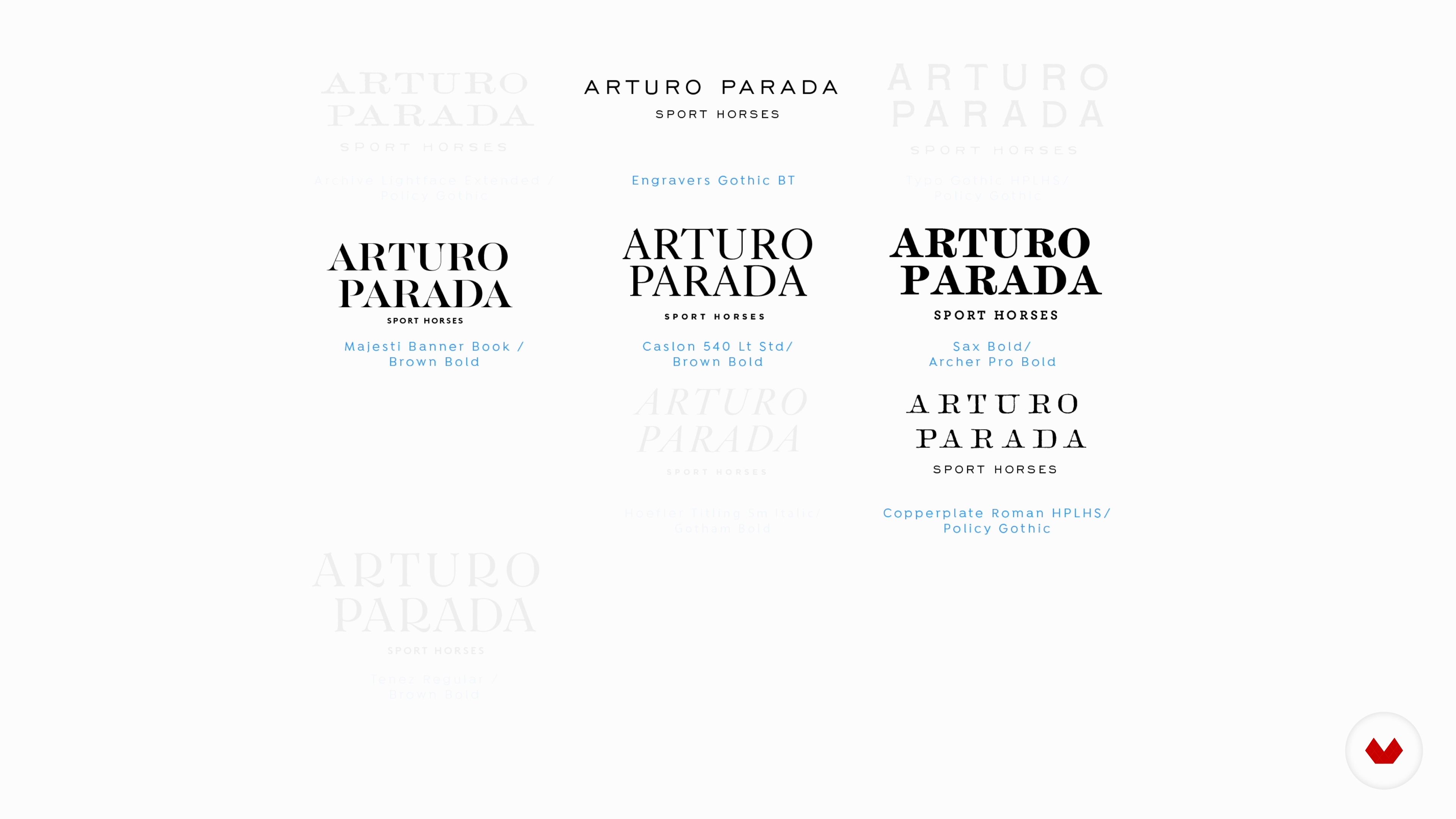
In this lesson, I'll explain how to create your own font selection. You'll also learn how to start creating the initial shapes of your logo from there.
11m
9The isotype from typography 1
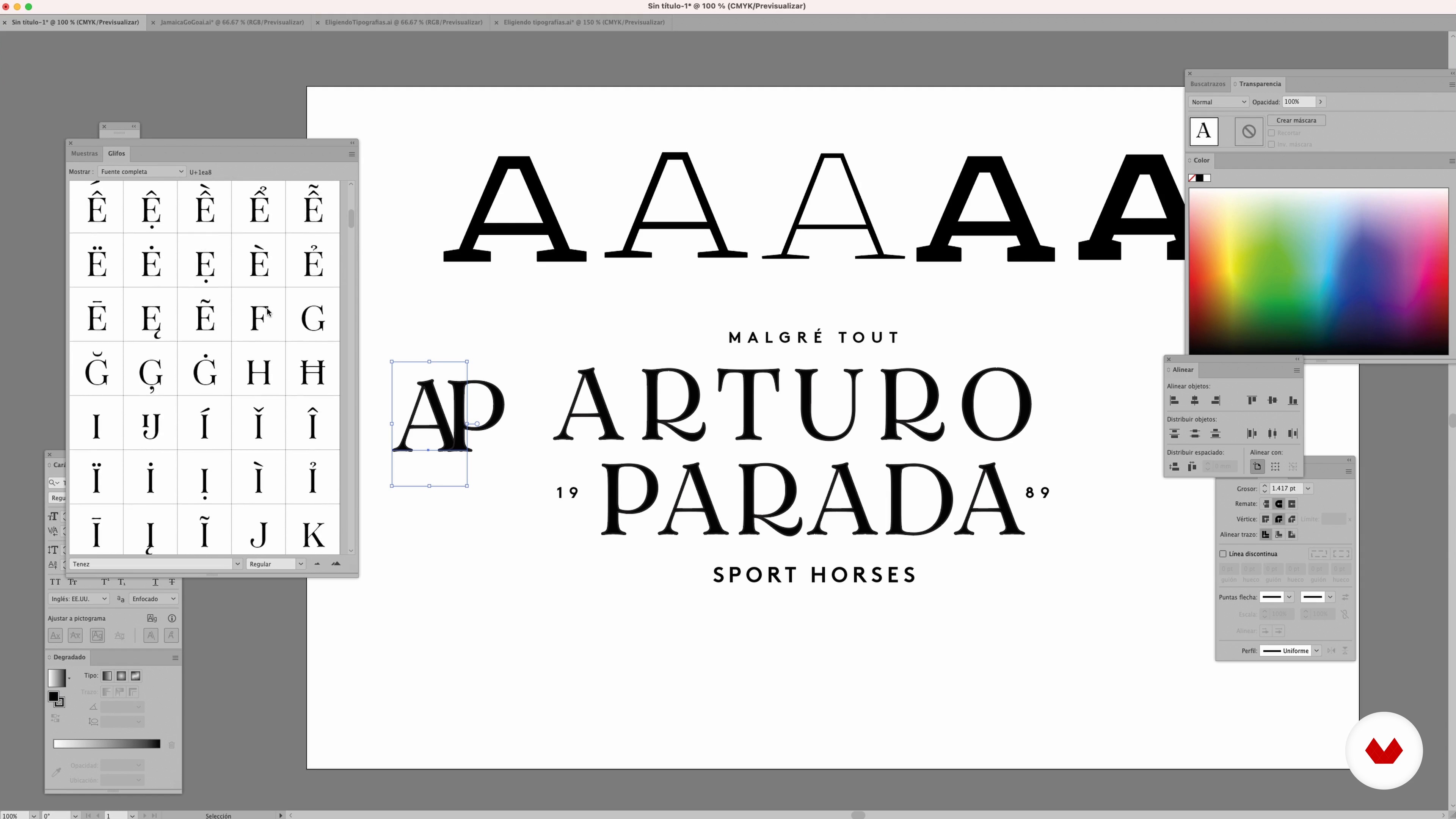
Finding the basis for creating your logo in the shapes of your fonts is a great tool because it allows you to create something that's visually coherent from the start. Therefore, in this lesson, you'll learn how to build abstract shapes based on typography to visually communicate the story you want to tell with this design.
19m
10The isotype from typography 2
Sometimes the only thing that survives from the original glyph is the line weight of the font you started with, but don't worry too much about being rigid about the creative freedom you take. Remember that this is just one of many ways to arrive at an isotype solution.
12m
11Graphic synthesis
In this lesson, I'll share how to achieve the maximum expression of synthesis in the brand you're creating. It's complicated, but it goes a long way toward achieving great visual strength.
5m
12How to make the essentials memorable
Now I'm going to share some key tips to make your logo more powerful through maximum synthesis.
12m
13Presenting your brand
Finally, we'll gather all the material we've worked on to share with the client. Use everything you've researched so far to present your logo, justifying every aspect of the design!
15m
You'll develop a narrative logo that encapsulates a brand's story and personality, integrating typographic design and storytelling techniques. You'll create coherent visual elements that connect emotionally with your audience, culminating in a powerful visual identity system.
Graphic designers who want to specialize in typographic logos will find this specialization a complete guide. From beginners to professionals looking to perfect their technique, everyone will develop the skills to create memorable and effective brand identities.
No extensive prior knowledge is required, but a basic interest in graphic design and access to a computer with design software are essential. Basic drawing and creativity skills will help you get the most out of your apprenticeship.


Great One, Learn lot about research.
I definitely recommend
Está genial el curso :D
Me gustan mucho estos cursos de especialización porque van al grano, sin rellenos e introducciones innecesarias. Muy útil y recomendable.
Excelente, los diseñadores y el contenido, me ha gustado mucho
Enjoy learning from home without a set schedule and with an easy-to-follow method. You set your own pace.
Learn valuable methods and techniques explained by top experts in the creative sector.
Each expert teaches what they do best, with clear guidelines, true passion, and professional insight in every lesson.
If you're a Plus member, get a custom certificate for every specialization course. Share it on your portfolio, social media, or wherever you like.
Videos of the highest quality, so you don't miss a single detail. With unlimited access, you can watch them as many times as you need to perfect your technique.
Ask questions, request feedback, or offer solutions. Share your learning experience with other students in the community who are as passionate about creativity as you are.
The community is home to millions of people from around the world who are curious and passionate about exploring and expressing their creativity.
Domestika curates its teacher roster and produces every course in-house to ensure a high-quality online learning experience.
You’ll learn how to create custom logos, manipulate typography, build distinctive visual identities, apply both historical and modern techniques, and use digital and manual tools for unique branding projects.
This course is designed for those with intermediate skills in graphic design or typography who want to deepen their professional techniques in visual identity and typographic manipulation for brands.
Basic knowledge of graphic design and familiarity with programs like Illustrator and Photoshop is recommended to get the most out of the course content.
You’ll need a computer, access to Illustrator and Photoshop, paper, pencil, rulers, and a scanner or camera to digitize sketches. Internet access is also recommended for additional resources.
The course covers typography history, letter manipulation, Spencerian calligraphy, kerning, logo creation, visual identity manuals, font selection, and visual codes by industry.
You’ll master advanced techniques to customize typographic features, apply optical adjustments, combine styles, and conceptualize brands with historical and cultural foundations to create memorable logos.
Typographic visual identity focuses on designing and manipulating letters, while icon-based identity uses standalone graphic symbols. The course teaches you to master both approaches.