Effective Data Visualization: Transform Information into Art
Looking for Data
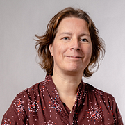
A course by Sonja Kuijpers , Data Illustrator
About the video: Looking for Data
Overview
“It's time to dive into your subject and choose the angle of your project. Next, you will decide which method or technique you're going to apply. Look for inspiration in several directions―it can help you choose colours, style, and approach.”
In this video lesson Sonja Kuijpers addresses the topic: Looking for Data, which is part of the Domestika online course: Effective Data Visualization: Transform Information into Art. Learn to effectively bring data to life with creative shapes, colors, and layouts.
Partial transcription of the video
“In this lesson, I'm going to introduce you what source I'm going to use for this course. The book I'm going to use is The Wonderful Wizard of Oz, which I have here in front of me. And I hope everyone's familiar with it because there's been films other books and musicals about it. But of course, you can take your own book or movie or whatever interests you. To create a visualization about. The reason that I chose this book is because it's from Gutenberg Project that is an online collection which has copyright expired. I advise you to go check if you can freely use the data that you found onl...”
This transcript is automatically generated, so it may contain mistakes.
Course summary for: Effective Data Visualization: Transform Information into Art
-
Category
Design -
Areas
Graphic Design, Infographics, Information Design, Interactive Design

Sonja Kuijpers
A course by Sonja Kuijpers
Sonja Kuijpers is an award-winning data illustrator based in The Netherlands. Growing up in a small town meant Sonja was always on the lookout for a creative outlet. She began drawing at a young age before going on to study advertising and public space design. After graduating, she worked as a designer at a landscape design firm before developing an interest in information design that kick started her career.
Sonja currently runs STUDIO TERP, a one-woman data illustration studio where she specializes in making challenging data easy to understand as well as visually engaging. She has worked with clients such as Philips, the Dutch government, Scientific American, Frankfurter Allgemeine Zeitung, Friends of the High Line in New York, and F19 Digital Reporting, and has also been recognized multiple times by the Information is Beautiful Awards.
- 97% positive reviews (147)
- 9,806 students
- 14 lessons (1h 43m)
- 22 additional resources (7 files)
- Online and at your own pace
- Available on the app
- Audio: English, Spanish, French, Italian, Portuguese, Turkish
- Spanish · English · Portuguese · German · French · Italian · Polish · Dutch · Turkish · Romanian · Indonesian
- Level: Beginner
- Unlimited access forever
Category
Areas


