Effective Data Visualization: Transform Information into Art
Course final project
A course by Sonja Kuijpers , Data Illustrator


About the final project for: Effective Data Visualization: Transform Information into Art
Effective Data Visualization: Transform Information into Art
“
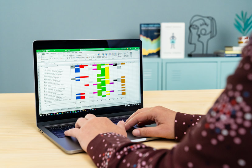
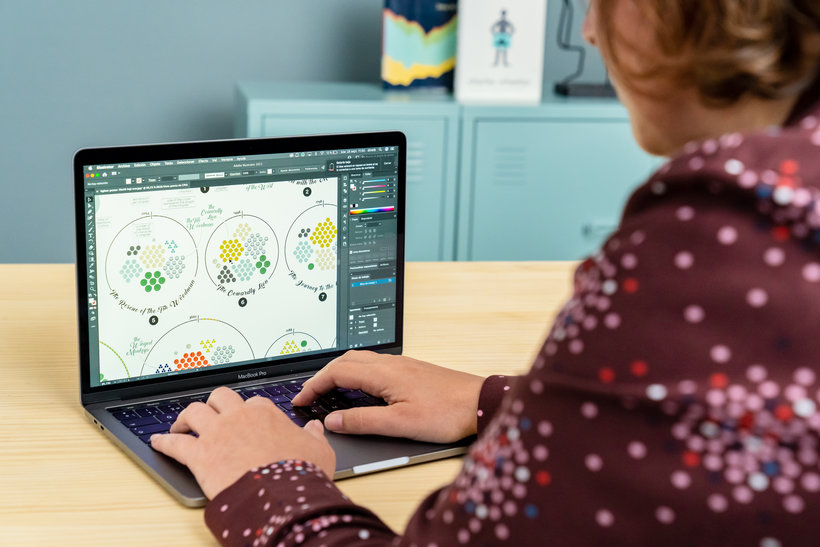
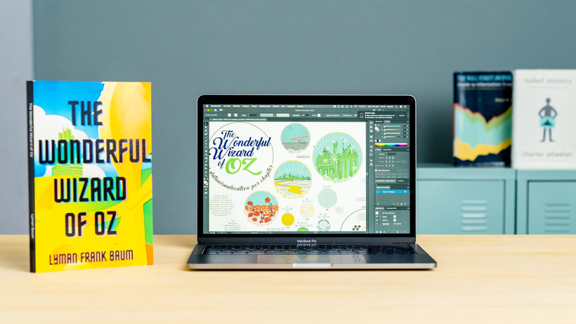
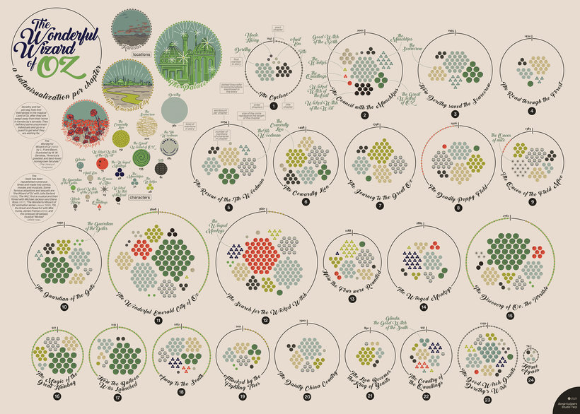
Congrats! You have reached the end of the course. I hope you now feel as excited as I am with DataViz and data-art projects, and this project may be just the beginning for you! Before saying goodbye, I'd like to do a quick summary of the steps you'll need to take to face your Final Project. First of all, search for a subject that personally interests you and look for inspiration.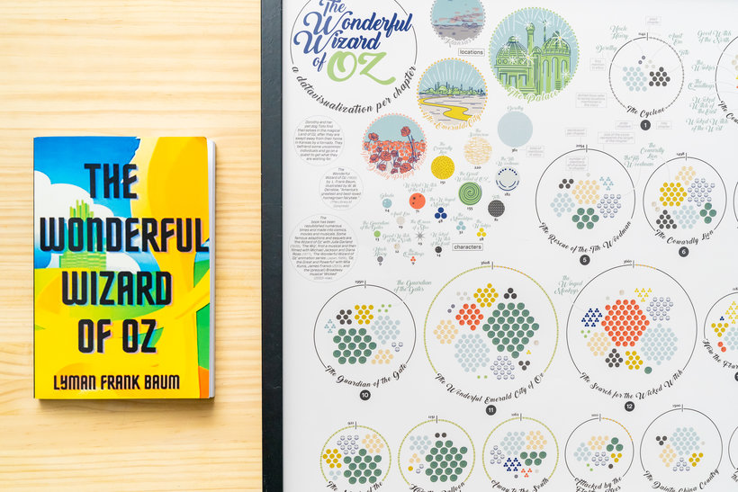


Partial transcription of the video
“Congratulations! You have reached the end of this course. I hope. You have enjoyed the experience of data illustration. Now I would like to review with you some highlights of the process. I recommend you to start with something that you feel emotionally connected about. That way it will be more easier to start. Feel free to use any other method, whether it's analog or digital. or mixed up to create your own project. Don't think of data just in terms of big data or Excel sheets. It's everywhere surrounding you. Go enjoy and find something that feels comfortable to you. Please share all your ...”
This transcript is automatically generated, so it may contain mistakes.
Course summary for: Effective Data Visualization: Transform Information into Art
-
Category
Design -
Areas
Graphic Design, Infographics, Information Design, Interactive Design

Sonja Kuijpers
A course by Sonja Kuijpers
Sonja Kuijpers is an award-winning data illustrator based in The Netherlands. Growing up in a small town meant Sonja was always on the lookout for a creative outlet. She began drawing at a young age before going on to study advertising and public space design. After graduating, she worked as a designer at a landscape design firm before developing an interest in information design that kick started her career.
Sonja currently runs STUDIO TERP, a one-woman data illustration studio where she specializes in making challenging data easy to understand as well as visually engaging. She has worked with clients such as Philips, the Dutch government, Scientific American, Frankfurter Allgemeine Zeitung, Friends of the High Line in New York, and F19 Digital Reporting, and has also been recognized multiple times by the Information is Beautiful Awards.
- 97% positive reviews (149)
- 9,852 students
- 14 lessons (1h 43m)
- 22 additional resources (7 files)
- Online and at your own pace
- Available on the app
- Audio: English, Spanish, French, Italian, Portuguese, Turkish
- Spanish · English · Portuguese · German · French · Italian · Polish · Dutch · Turkish · Romanian · Indonesian
- Level: Beginner
- Unlimited access forever
Category
Areas

