Effective Data Visualization: Transform Information into Art
Influences
A course by Sonja Kuijpers , Data Illustrator
About the video: Influences
Overview
“In this lesson, I will show you some of the work of people who I admire. They work manually and analogue in data visualization: counting, noting, and presenting data. Nature is also an influence and a stress relief for me: I like to go out and take my camera with me.”
In this video lesson Sonja Kuijpers addresses the topic: Influences, which is part of the Domestika online course: Effective Data Visualization: Transform Information into Art. Learn to effectively bring data to life with creative shapes, colors, and layouts.
Partial transcription of the video
“In this lesson, I want to share my influences and where I get my inspiration from. So I want to show you some people that really inspire me and they all have this same approach to data viz or data art. What really attracts me in their work is that they have the same approach in their methods and you can see the passion and how they are emotionally attached to a subject. So the first one I want to share is Stephanie Posavec. Her work is very intriguing in a way that you can follow her steps from first sketch to the final project. In this project, she manually gathered all the data from a boo...”
This transcript is automatically generated, so it may contain mistakes.
Course summary for: Effective Data Visualization: Transform Information into Art
-
Category
Design -
Areas
Graphic Design, Infographics, Information Design, Interactive Design

Sonja Kuijpers
A course by Sonja Kuijpers
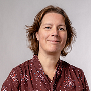
Sonja Kuijpers is an award-winning data illustrator based in The Netherlands. Growing up in a small town meant Sonja was always on the lookout for a creative outlet. She began drawing at a young age before going on to study advertising and public space design. After graduating, she worked as a designer at a landscape design firm before developing an interest in information design that kick started her career.
Sonja currently runs STUDIO TERP, a one-woman data illustration studio where she specializes in making challenging data easy to understand as well as visually engaging. She has worked with clients such as Philips, the Dutch government, Scientific American, Frankfurter Allgemeine Zeitung, Friends of the High Line in New York, and F19 Digital Reporting, and has also been recognized multiple times by the Information is Beautiful Awards.
- 97% positive reviews (147)
- 9,804 students
- 14 lessons (1h 43m)
- 22 additional resources (7 files)
- Online and at your own pace
- Available on the app
- Audio: English, Spanish, French, Italian, Portuguese, Turkish
- Spanish · English · Portuguese · German · French · Italian · Polish · Dutch · Turkish · Romanian · Indonesian
- Level: Beginner
- Unlimited access forever
Category
Areas


