Design and Creation of Chalkboard Lettering
Distortion and spacing
A course by Paola Vecco , Graphic Designer Specialized in Lettering and Typography
Joined August 2017
About the video: Distortion and spacing
Overview
“Something particular about lettering is that the letters can be adapted to different shapes. You can contain them in arches, waves, diagonal shapes, it is possible to test their stability. The letters are also governed by the force of gravity and it is important that they do not lose their balance. ”
In this video lesson Paola Vecco addresses the topic: Distortion and spacing, which is part of the Domestika online course: Design and Creation of Chalkboard Lettering. Learn the principles of lettering and design an attractive chalkboard composition for a bar, restaurant or business .
Partial transcription of the video
“Distortion and spacing Something particular about lettering is how the letters they adapt to different shapes. We can adapt it to waves, diagonals, curves, testing its stability. The letters are governed by the force of gravity so they don't lose their balance. A common mistake is to draw letters as if you "type" them on a computer, without taking into account the distortion so that they do not lose their balance. Here I show you some examples. This is what we normally have, a balanced letter, balanced on a baseline. Here we have no problem. But what happens when we adapt it to some form? F...”
This transcript is automatically generated, so it may contain mistakes.
Course summary for: Design and Creation of Chalkboard Lettering
-
Category
Calligraphy & Typography -
Areas
Hand Lettering, Lettering

Paola Vecco
A course by Paola Vecco
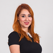
Paola Vecco is a graphic designer specialized in lettering and typography whose work combines her passion for design and letters. She has been working in branding for almost fourteen years and after passing through some of the most renowned studios in Peru, Paola became creative director at Infinito Consultores where she works on designs for well-known brands.
She studied lettering and calligraphy in Buenos Aires, Argentina and went on to complete a postgraduate degree in advanced typography at the EINA in Barcelona. Her typeface, Tocapu, was selected for the Pangramme International Student Type Design Exhibition. She was ambassador for the brand Tombow and has also taken part in the Tipos Latinos biennale.
- 100% positive reviews (40)
- 1,002 students
- 18 lessons (1h 23m)
- 23 additional resources (14 files)
- Online and at your own pace
- Available on the app
- Audio: Spanish
- Spanish · English · Portuguese · German · French · Italian · Polish · Dutch · Turkish · Romanian · Indonesian
- Level: Beginner
- Unlimited access forever
Category
Areas


