


@amyvsnelling
COP26: 3 Key Factors That Shaped the Brand Identity
From bypassing borders to going beyond politics, discover the story behind the now globally-recognizable design
Over the past two weeks, all eyes have been on Glasgow, Scotland for the 26th UN Climate Change Conference of the Parties (COP26). From October 31 to November 12, 2021, the conference brought together leaders from around the globe to discuss and negotiate the actions necessary to avoid irreversible and catastrophic climate change.

It’s a critically important event, carrying an important message: “hope with a sense of urgency.”
Tasked by the Cabinet Office to create a design system that would carry this message forward, founder of branding consultancy, Michael Johnson (@michael_johnson) explains, “the brand identity [had] to appeal to a vast array of different audiences, from climate change activists to businesses, to the press, and to governments—and demonstrate the UK’s commitment to taking a global lead in tackling climate change.”

Splashed across banners and billboards, headlining webpages, the backdrop for key speeches, and printed on merchandise, the COP26 designs are everywhere—pictured with global leaders and iconic activists including Joe Biden, David Attenborough, and Greta Thunberg.
But how do you go about creating a striking, memorable design that will hit home with a global audience and carry an incredibly important message?
Here, Johnson breaks down three key elements that went into the design, and why.

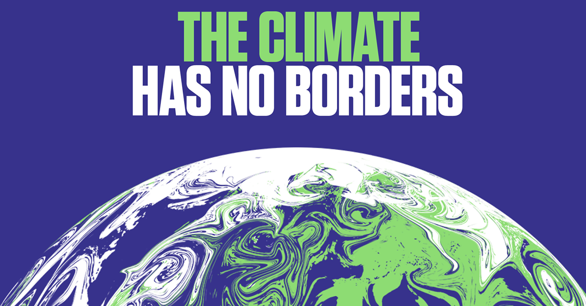
Depicting a global issue, without borders
“Most of the previous conferences haven’t boasted particularly strong visual identities. We were determined to find a solution that was memorable, distinctive and inspiring—and expressed the agreed positioning of ‘hope with a sense of urgency,’” says Johnson. With this in mind, they initially tried to avoid the concept of using a globe, “because so many of the previous COP logos lapse into cliché.”
However, after a long process of exploration, Johnson explains how “a route that began as a marbled green and blue sphere became the clear favorite.” Unlike a traditional globe, the animated “swirling” image “was ‘Earth-like’, but side-stepped the issue of representing any one continent or landmass.”
“The swirling colored globe illustrates that the climate has no borders, alludes to currents and weather systems—and is intentionally beautiful. It deliberately avoids directly using recognizable country shapes and is designed to fascinate people, wake them up, and compel them to take urgent action to save our precious planet.”
After obtaining approval from the Cabinet Office, the team developed the design toolkit featuring stills of the swirling globe from different angles that have become a key visual of the conference, as well as the animated version that swirls and spins (designed in collaboration with animators at The Mill) for TV and social media campaigns.

Keeping the message simple
To appeal to a global audience from all backgrounds, clear and concise messaging was key to help get the message across. This was important for Johnson and his team, who wanted to stress the idea of it being a global issue that requires a collaborative effort, without assigning blame:
"It’s really important that the delegates feel they are on a level playing field and that no one is to blame, so an abstracted globe ticked a lot of boxes there. Looking back at some of our initial ideas, they were probably too ‘wordy’ or too specific to certain ideas. With such a diverse audience we needed something that had universal appeal, and an early copy line that ‘The climate has no borders’ really hit home for us…”

Going beyond politics
For Johnson and his team, in order to achieve maximum impact, the campaign required putting political views aside and focusing on the bigger, global picture. “We really wanted this to be a powerful piece of work, but when we were approached two years ago we were initially reticent (we don’t exactly share the same political views as the current administration),” he explains. Ultimately, they decided that, “this should be ‘above’ politics and that a very important Climate Conference really needed a unique and arresting visual brand.”
Although delays caused by the pandemic arguably added extra pressure to creating the brand identity (“we designed this pre-pandemic, then the conference was delayed, and in that time climate issues have come increasingly to the fore”), Johnson is happy with the result.
"We’re relieved that the COP team have really used the graphic idea and the supplied toolkit without fear—and our hunch that the illustrated globes would make great backdrops has been really borne out by what we’ve all been seeing on TV."

For Johnson, one of the key takeaways from the experience of creating the design for COP26 has been demonstrating that “a big, powerful, conceptual idea can be used for a huge public event like this." He continues, "I’ve learned that we should keep searching for powerful ideas because they can have a dramatic effect.”
As for the conference outcomes? Johnson concludes, “We can’t control that! But we can at least ensure that the conference is at the front of people’s minds."
To find out more about Johnson Banks' COP26 brand identity, take a look at their Domestika project. Or, to learn how to create a striking brand identity, check out Michael Johnson's Domestika course, Contemporary Brand Identity: Using Verbal and Visual Branding.
You may also like:
- The Expert: Michael Johnson Dissects 3 Top Brands
- 15 of the Most Talked About Rebranding Campaigns of 2021
- Paula Scher: Insider Advice From the Trailblazing Designer


0 comments