


@isaque_criscuolo
17 of the Most Talked About Rebranding Campaigns of 2021
Discover the big-name brands that changed their visual identity in recent months and the trends that guided them
Brands are everywhere. From the smartphone we use every day to the clothes we wear, we're surrounded by companies' logos, concepts, and values. If we look at the digital world, this exposure multiplies and demonstrates just how closely brands are intertwined with our lives on an almost intimate level.
Over time, brands have become associated with identity, with values and purpose, not simply packaging. Defining a strategy for how your brand will relate to people, the stories it will tell, even the causes it will support is all part of what we now call branding or brand management.

Although it's not always easy to navigate, sometimes, a brand needs to change, update, or reinvent itself at a certain point in its life. This process is called rebranding.
From food companies to car manufacturers, here we take a look at some of the most striking, noteworthy, and controversial rebrandings of 2021—and why.
Burger King
After 20 years of using the same branding, Burger King's new logo refers back to its visual identity from the '70s through the '90s with a retro, minimalist aesthetic that draws on nostalgia to refresh the face of the well-known brand. The shift towards a more natural look marks the brand's move to push its commitment to natural ingredients—the fast-food chain recently announced it would be banning 120 artificial ingredients from its menus.

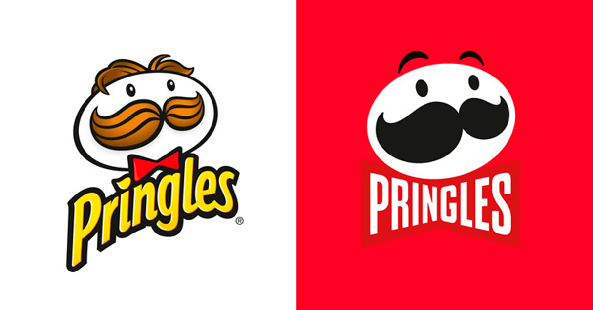
Pringles
A traditional snack brand, Pringles opted for a flat design with minimalist packaging and font to reposition itself as a young and modern company.
Inspired by emojis, the new simplified aesthetic is the first makeover the brand's mascot Mr P. has had in the past 20 years. As a global brand, the change reverberated on social media among those who both loved and hated the new look.

Magnum
The redesign of the Magnum ice cream logo is subtle, marked by a flat aesthetic that features the brand's traditional colors, except they're inverted. Pulling the focus to the golden background is a classic strategy to emphasize a brand and convey the feeling of a more refined, premium product.

Renault
Renault's new logo features a simple, geometric design that gives the brand more movement. In addition to simple, double lines that add depth, the logo references the wheels of a car on the road.

Peugeot
For the first time in almost 50 years, Peugeot removed the image of the lion's body from the center of its brand identity. Drawing references from its 1960s logo, the revamped lion's head logo is clean, minimalist, and accompanied by new typography, celebrating the car manufacturer's entry into the era of electric cars.

BMW
Perhaps this year's most radical rebranding, the new BMW logo seeks to synthesize all its power and influence in the simplicity of the brand's lines, colors, and typography. After all, it is a globally recognized icon, but now with a lighter, more modern feel.

GM
Car manufacturers of all kinds have moved toward more modern, digital, and minimalist designs to signal a shift toward a new era of electric cars, environmental conservation, and clean technologies. Another one to add to the list is GM that reimagined its identity to ride the wave of a more conscious society.

Disneyland Paris
To celebrate Disneyland Paris' 30th anniversary, Disney decided on a minimalist approach that connected its aesthetic with emotional memory. Combining the number 30 with Mickey Mouse's silhouette, the company demonstrated that it could take on a more modern identity without renouncing the iconography it has built over decades.

Warner Bros.
As part of the celebrations in the run-up to its centennial in 2023, Warner Bros released the first iteration of its new logo design back in 2019—the sleek design featured a longer look for the iconic shield, and gone was the gold (pictured left).
Early this year, WB brought back some of its old shine with a new iteration of the ultra-minimalist flat logo featuring 3D touches and metallic accents (right). The Warner Brothers emblem remains simple, striking, and elegant.

Pfizer
One of the most talked-about brands of 2021—thanks to its COVID-19 vaccine—pharmaceutical company Pfizer transformed its logo into something simpler and more modern to celebrate a new era of the company, more focused on science and world-changing technologies.
The primary reference of the new symbol is the DNA structure, accompanied by a slight reinterpretation of the company's traditional typography.

SurveyMonkey
One of the digital sphere's most traditional brands, SurveyMonkey is undergoing not just a visual rebrand but a complete relaunch. It's a risky move, strengthened by good design, as the company seeks to position itself as a "leader in agile experience management".

Discord
Another simple but effective rebranding is that of Discord, a chat platform popularized by the gaming community, which updated its color palette and made minor adjustments to its typography and mascot, Clyde.
Following announcements that the company wanted to appeal beyond the gaming community and become a chat platform for everyone, when the logo dropped back in May they announced in a Tweet: "We're updating our brand look. Improved logo, font, colors. Not too different: just a little friendlier. Discord has become a place where people come to explore, grow, and belong. so we're updating our look to be just as welcoming."

Wise
A good example of design rebranding, Wise has simplified the key elements that identify its brand (and its name) facilitating consumer recall. Dropping the "Transfer" also reflects the company's move to broaden its focus beyond transferring money to an array of international banking features. It's simple, powerful, and efficient—as a good logo should be.

Bandai Namco
One of the biggest gaming companies in the world, Bandai Namco has gone for a cleaner and more minimalist look with the message, "Fun for All into the Future"—the brand's new purpose. Plus, the comic book speech bubble format connects with Japanese manga culture and goes hand in hand with gamer culture.

CIA
The minimalist trend has even reached the Central Intelligence Agency, which now has a logo with clean and easy-to-read typography, marked by a contrasting black background. The new logo is also a nod to the digital age and the cutting-edge technologies that are at the foundation of the organization.

Block
The umbrella company for payment processor Square (set up by Twitter founder Jack Dorsey) rebranded with a new name, Block, and an animated logo that represents the new possibilities and flexibility of cryptocurrency, and the blockchain it is named after. This design is always shifting and changing, giving it a playful feel.

Meta
Finally, how could we forget arguably the biggest rebranding of the last year? Facebook announced its new parent company brand, forming a streamlined experience across its apps that will build towards a 'metaverse'. The metaverse will be a seamless social space, incorporating augmented reality, that will create an immersive experience for users when connecting with others around the world. If you want to learn more, we wrote a deep dive blog all about Facebook's announcement.

From the simple and subtle to the complex, these examples of rebranding campaigns all aim to expand the reach of the brand, make it more accessible, and, connect it with contemporary societal issues and trends.
Whatever the outcome, every brand at a certain point in its evolution will need to consider rebranding to remain relevant and modern. If you want to know more about branding and identity, check out all of Domestika's branding identity courses.
You may also like:
- The Expert: Michael Johnson Dissects 3 Top Brands
- Paula Scher: Insider Advice From the Trailblazing Designer
- Free Guide: Key Elements for Defining your Brand
- Contemporary Brand Identity: Using Verbal and Visual Branding, a course by Michael Johnson
- Art Direction for Creative Visual Branding, a course by Linus Lohoff


1 comment
robmeyerson
Teacher PlusThis is a great list, but when it comes to brand name changes, I'd definitely add Facebook --> Meta. Others to consider are Square --> Block, SurveyMonkey --> Momentive, and brands that got rid of offensive names, like Pearl Milling Company and the Cleveland Guardians.