What Is Color Harmony and What Types Are There?

Discover how to generate effective and attractive color combinations using this color theory technique
Color plays a vital role in the world we live in. It influences our thoughts, affects our reactions, and causes strong emotional associations. Color also impacts us on a physical level: our eyes can be soothed or irritated by a color; colors can increase blood pressure or suppress appetite. And when used correctly, color can even help us save energy.
As a communicative tool, color is irreplaceable. The universality of its language helps us make our messages flow and invoke certain emotions more easily. For all these reasons and more, it’s essential to learn to speak the language of color theory. And within this language, a technique we should acquire is color harmony.

What is color harmony?
Color harmony is a basic color theory technique for combining colors. This technique suggests potential relationships between colors that we can use to convey our messages or create a particular universe. It’s essential to master it for directing our art and expression meaningfully, creating pleasant aesthetics, and achieving better artistic results.
How can we learn those potential relationships? The answer is by understanding the color wheel, also known as the chromatic circle.
The color wheel compass
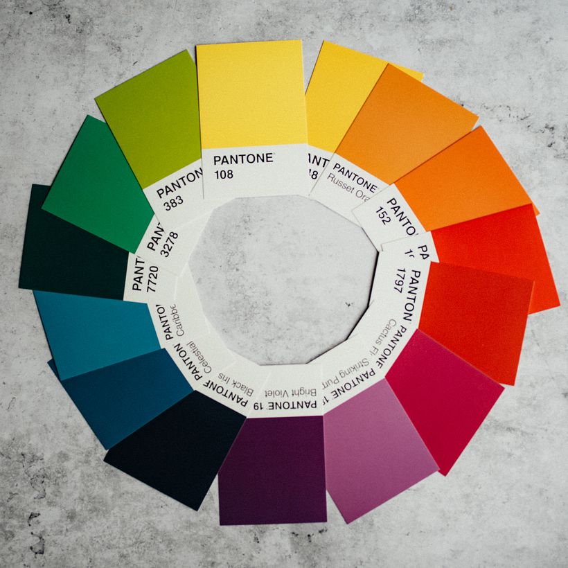
Color harmony relationships are usually determined by the color wheel, a circular diagram that can serve as a compass to guide our color decisions.
The color wheel, also known as a chromatic circle, provides an ordered and circular graphic representation of colors. It is composed of 12 colors based on the RGB system of red, green, and blue. Its location is immovable and universal, making it key in the creative process. It shows us where colors come from and how they were formed.
If you study the color wheel in detail, you will discover that primary colors (red, blue, and yellow) are located at a certain distance from each other, while secondary colors (purple, green, and orange, formed by mixing primary colors) are located halfway between those primary colors.
Tertiary colors are mixtures of a primary and a secondary color, filling in the remaining gaps. In theory, all possible colors could be included on the color wheel, although commercially available wheels typically contain approximately 12 colors.

The key color as a starting point
The key color is the main color that an artist chooses for their artwork. It can be a primary, secondary, or tertiary color. It is the color that we want to concentrate on in our creations. From this color, chromatic relationships are established.
Harmonious combinations from a key color
Once an artist has chosen their key color, with the help of technical tools, they can identify possible relationships to other colors. It is therefore critical to learn to use a color wheel.
Harmonies can occur at different levels of complexity. If you are getting into this language, photographer and art director Josefina Mogrovejo (@josefina_mogrovejo) recommends focusing on the simplest possible harmonic relationships.
- Complementary colors: They establish a relationship, as its name indicates, of complementarity. They are directly opposite on the wheel. They are visually striking hues when combined but can also be discordant, so it is better to use them sparingly, for example, to accentuate or highlight.
- Analogous colors: Analogous colors are found on both sides of the key color around the color wheel. They usually represent color combinations that are found in nature and are visually appeasing. Excessive use of analogous colors can make your work appear monochromatic, so it is recommended to use them very mindfully.
- Triads: Color triads, like primary colors, are spaced with some regularity around the color wheel. This color scheme can be quite elegant if we choose one color that dominates and use the others as accents. However, blindly relying on this scheme can make the result confusing.
- Monochrome: This harmony is achieved by a single color and its different tones. Monochrome relationships force us to play with shapes and textures more creatively. The biggest challenge they present, according to the expert, is being able to differentiate between them when putting together color schemes.

A secret to make it easy
According to the expert, the easiest way to establish relationships between colors is to pay attention to the difference between warm and cold colors.
- Warm colors are on the red, yellow, and orange sides of the color wheel. They are fiery, intense, and energetic.
- Cool colors are on the blue, purple, and green sides of the wheel. They are fluid, relaxing, and calm.
When planning your color scheme, keep in mind the mood you want it to evoke and start by deciding on the appropriate colors. Then you can move toward trying to understand more complex relationships.
Tones and shades are another way to approach this. They are created by adding black to the original color, that is, making it darker, or by lightening them, that is, by adding white.
Keep in mind that when we change a tone, the color remains in the same place on the color wheel. This means that you can create rich, multi-layered color combinations using just a few colors but with a wide variety of shades and tones.
If you are interested in understanding more about the relationships achieved by the combination of colors and the messages these can convey, especially when developing a product, be sure to sign up for Josefina Mogrovejo’s course Creative Direction for Product Photography. You cal learn to create a visual universe and enhance brand identity by defining the composition, color, and lighting of your images.
English version by @acesarato.
You may also like:
- 10 Free Color Palette Websites To Achieve Harmony And Contrast
- 7 Free Tutorials: Color Theory to Understand How to Use Color in Creative Projects
- 6 Interesting Facts about Color Theory


0 comments