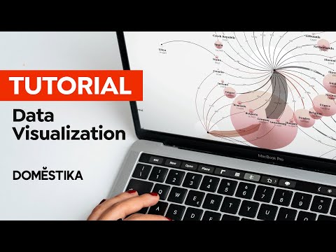
Design Tutorial: An Easy Way to Visualize Your Data

Learn how to visually represent your spreadsheet data using the free online tool, RAW Graphs, with Federica Fragapane
Creating graphs, tables, and charts from complex data can be tricky. You have to first choose the graphic that will best represent your data, then you have to arrange the dimensions and variables in a logical way, and finally achieve an end result that is simple to read and visually appealing.
Federica Fragapane (@federica_fragapane) is a data visualization expert with a few simple tricks up her sleeve. Among her clients are Google, the UN, and BBC Science Focus. She has also co-authored two books - ‘Planet Earth’ and the ‘Geopolitical Atlas of Water’ - that are full of both eye-catching and educational infographics.
Join Federica in this tutorial as she uses the free online tool RAW Graphs to demonstrate how you can easily transform your complex data into simple visualizations.
How to Visualize Your Data
1. Arrange the data in a spreadsheet
Choose the data you want to work with and organize this information in a spreadsheet. Make sure that each column has a clear title with no empty spaces or rows above.

2. Copy and paste the data into RAW Graphs
Select and copy the data in your spreadsheet, then open up RAW Graphs in your internet browser. Click the Use It Now button and paste the spreadsheet data directly in the blank box.
The data will appear organized in exactly the same way as it was organized in the spreadsheet.


3. Select your chart
RAW Graphs offers a variety of great charts, tables, and graphs to choose from, so select whichever one you feel will best represent your data in a visual way.
When you click on a chart, a little box will appear on the left hand side of the screen explaining what the chart is and how it represents data.

4. Choose your variables
In the Mapping section, you can see your dimensions on the left hand side and your chart variables, such as the X and Y Axes, on the right. Click and drag the dimensions into the different variables.
If you want to check how your visualization is taking shape, scroll down to the preview in the Customize section.


5. Edit the details
In the Customize section, edit the details of the chart, such as the colors, chart size, and the appearance of the labels.

6. Export your chart and add any finishing touches using Illustrator
Export your chart in a .svg, .png, .jpg, or .rawgraphs format. If you want to make visual tweaks to your chart, download your file in .svg and import it into Illustrator.
As it is now a Vector file, you can edit elements such as the typeface, font size, or colors.

Did you enjoy this tutorial? If you’d like to learn more about infographics and data visualization, check out Federica Fragapane’s online course Data Visualization and Information Design: Create a Visual Model.
You may also like:
- 10 Free Graphic Design Tutorials for Professionals
- Interview with Graphic Designer Diana Estefania Rubio, Winter of the 2018 Edition of Domestika Scholarships
- Design Tutorial: How to Prepare a File for Professional Printing in Illustrator
- Illustrator Tutorial: Essential Tips for Beginners
- Data Visualization for Editorial Projects, a course by Diana Estefanía Rubio


0 comments