


Five Amazing Facts About Logos
Discover 5 facts you never knew about the interesting world of logos
A great logo should communicate a brand’s identity in an instant and be remembered for a lifetime. That’s a lot to ask of one tiny image, but the greatest logo designs do just that. Who couldn’t draw up the Mercedes logo in an instant, or recognize a Lacoste shirt from a tiny, open-mouthed crocodile?
The fact is, there’s a lot we don’t know about these simple yet highly effective images. For example, do you know what the world’s oldest surviving logo is? Or which logo cost the most to design? Or perhaps you missed a few hidden symbols in some of the world’s most iconic logos?
Find the answers to these questions and more in the video.

5 Amazing Facts About Logos
1. What is the world’s oldest logo still in use?
In a constantly evolving world, loyalty is hard to come by. But Belgian brewery Stella Artois have stuck to their logo for more than three centuries.
The horn on its crest comes from the name of where it was first brewed, Den Hoorn, while its ornate frame is inspired by the city’s Flemish architecture.

2. How much does it cost to make a famous logo?
Twitter may be a multi-billion dollar company, but graphic designer Simon Oxley earned just $6 for the original logo. Nike’s “swoosh” has a similar story, costing the sportswear brand only $35.
At the other end of the scale, however, you have some truly mind blowing fees. Oil and gas company BP splashed out $211,000,000 on the redesign of their logo, while Norwegian state-owned postal company Posten felt the need to spend $55 million dollars on a rebrand.

3. What can you hide in a logo?
Have you ever noticed a bear hiding in the Toblerone logo of a mountain? Given that the brand comes from Bern, home of the infamous Matterhorn mountain and also known as the City of Bears, their logo perfectly encapsulates their Swiss roots.
The Tour de France also managed to turn the word Tour into a bicycle. If you think that’s clever, Unilever, who work in numerous sectors from hygiene to nutrition, snuck 24 symbols into their U-shaped logo.


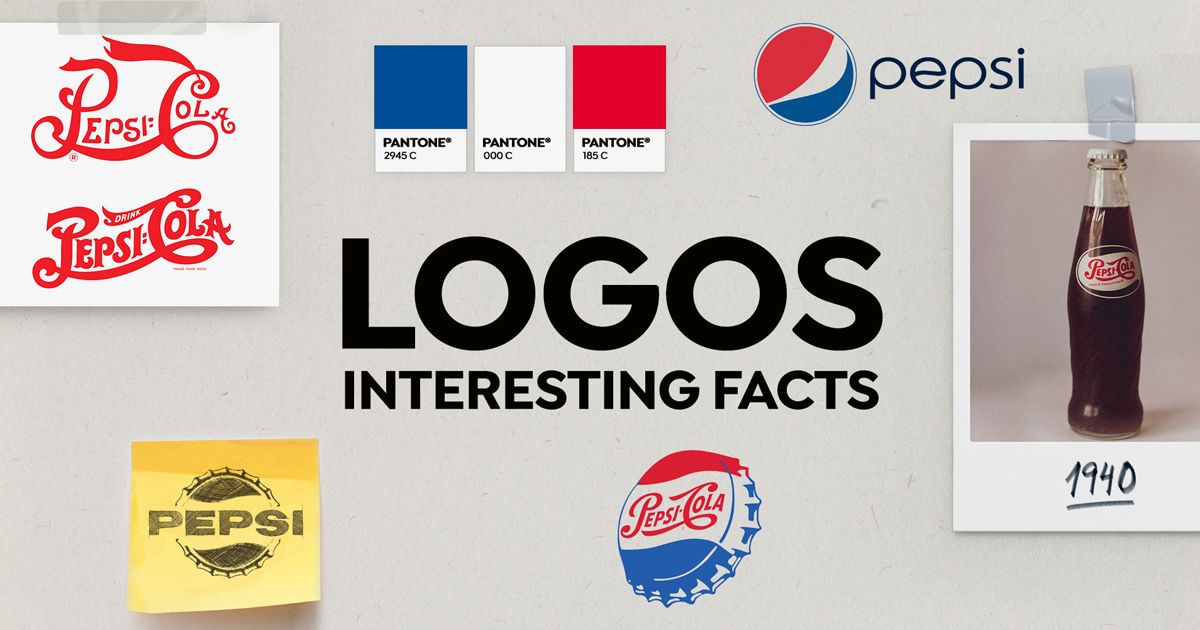
4. Sneaky soda: Pepsi versus Coke
Can you tell the difference between Pepsi and Coke? Back in 1898, Pepsi tried to design a logo that meant you couldn’t.
The brand used similar colors and typography to try and confuse customers into thinking they were the same, just so that the duped customer would give their drink a try. Pepsi have since moved away from imitation, basing their latest logo on something called “the golden ratio”.


5. A gamble with a crocodile
In 1923, René Lacoste’s tennis coach promised him a crocodile skin suitcase if he won his next Davis Cup match. He lost, but was reported to have “fought like a true crocodile” in a nod to his coach’s bet.
The Crocodile moniker was immortalized when Lacoste’s friend, artist Rober George, embroidered the animal on the blazer that Lacoste wore to each game - the first of countless garments to bear the iconic croc on its breast.

Want to learn more about what goes into a logo design? Check out Sagi Haviv's online course Logo Design: From Concept to Presentation.
You may also like:
- 5 Interesting Facts About Manga
- 5 Interesting Facts You Didn’t Know About TikTok
- Creation of an Original Logo From Scratch


0 comments