


Editorial Design Tutorial: How to Mix Typefaces

Learn why it’s important to select good fonts and the best way to choose yours, with Javier Alcaraz
Graphic designer Javier Alcaraz specializes in publishing, branding and typography. He knows that color, shape, space, balance, asymmetry and many other considerations are all important when it comes to achieving perfect typography.
In this tutorial, he explains how to use font combinations to perfect your editorial designs.
Discover his tips in the video.
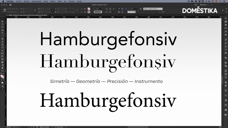
3 Steps to Lovely Typography
1. Use different font sizes
Using different sizes is a good way to generate clear contrasts, which makes things easier to read and achieves a more harmonious design.

It’s also useful to avoid using the same font family in titles and subheadings, as this makes it easier to distinguish between the two different categories of information.
2. Combine different font families
Combining a serif font with a sans serif font can generate the contrast you need on the page.

However, always remember that you need a certain symmetry. This is achieved by observing the shape of the letters and the ‘mark’ they leave on the page.
3. Try to match heights and proportions
The height and vertical proportions of each character are also key points to notice. Don’t combine fonts with radically different heights, unless you want to create a very asymmetrical look.

Love these tips? Learn to use key elements to create clear and appealing graphic structures with Javier Alcaraz in his online course: Compositional Techniques for Graphic Design.
You may also like:
- Automated Editorial Design with Adobe InDesign, a course by Javier Alcaraz
- Introduction to Adobe InDesign, with Javier Alcaraz.
- Get Inspired by These 7 Incredible Female Typographers.
- Creating Fonts in Glyphs


0 comments