


5 Maps and 5 (Very Different) Views of the World
In recent decades, designers, mathematicians, and cartographers have tried to redesign the world as we know it
Except for flat-earthers, there is a more or less generalized consensus on Earth's shape. It's a geoid—an imperfect sphere—and an ellipsoid, slightly elliptical and flattened at the poles. Representing these features on a two-dimensional plane is, in itself, a considerable challenge. Doing so reliably is a problem that has puzzled cartographers, geographers, and illustrators for centuries.
But some have decided to get to work and created different representations of the world that, with greater or lesser success, help us locate continents, islands, oceans, and countries. More often than not, they do so serving specific political and social interests, too.
1. The Mercator projection
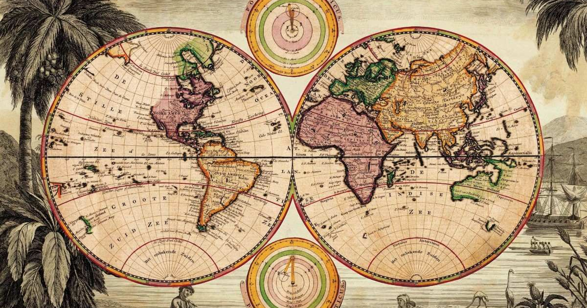
The most famous planisphere, whose variants continue to be used, for example, by Google Maps, is the one devised by Gerhard Kramer (in Latin, Gerardus Mercator). He was born in what is now called Belgium during the 16th century and introduced the so-called Mercator projection in 1569. In addition to the remarkable wealth of detail in the continents' design, this projection has a characteristic that has contributed decisively to its adoption in many countries: it places Europe at the center of the world and presents it larger than it really is.

On the other hand, the continental masses near the equator are distorted. They look smaller, making Greenland, for example, larger than South America and similar to Africa, when in reality that island is respectively 8 and 14 times smaller than the continents mentioned earlier.
This is because the Flemish cartographer created this map with a cylindrical projection. It is as if the globe were inserted into a cylinder, and its shapes transferred to it (as in the figure below), thus stretching everything that is at the ends.

Other artists, aware of these problems, set out to create their versions of the world map with marked differences.
Some simply used the Mercator projection, or its variants, to place their countries in the center or at the top. Or, in the case of the Argentinian, Chilean, and Australian maps, inverting the classical orientation of the continents and leaving the world "upside-down" (in reality, since Earth has a spheroid shape, so there is no "correct" position for the maps).


2. The Lambert projection
Another projection emerged in Europe centuries ago and became the norm for different contexts. Being conical rather than cylindrical (as in the image below), the map created by the Swiss mathematician Johann Heinrich Lambert in 1772—forgotten for many decades and rehabilitated in the mid-19th century—also distorts the continents, but curiously increasing their size in the southern hemisphere.


By allowing a better overview than that offered by Mercator (and without dividing Asia in two, as is often the case of that one), this map guides aviation charts. It is also the official map in countries such as Belgium, the Netherlands, and Scandinavia, given the privileged location of this part of the world, located in the center and on the top, and thus the natural focal point.
3. The Winkel-Tripel projection and the Russian variation

The Winkel-Tripel projection, developed by the German mathematician Oswald Winkel in 1921, is one of the least distorted maps.
The American cartographer Arthur H. Robinson developed a variation of this projection in 1963, created from geographical coordinates, not mathematical calculations, and that simulates the particular curvature of the Earth. Even so, it ends up causing excessive distortion at the poles, which is why the Winkel-Tripel projection was officially adopted by the National Geographic Society of the United States as its standard.

Winkel-Tripel also inspired a Russian reinterpretation, the great novelty of which is to place this country at the map's center. It is striking that Russia decided to make this map "official" rather than stick to Mercator, where its territory appears larger than Africa, when in reality it is much smaller.
Another merit of this projection's variations is that it provided more reliable dimensions of the continental United States, smaller than Brazil and Australia, but that appears much larger in the Mercator one.
4. The Dymaxion projection

Created in 1954, this projection by the American designer Richard Buckminster Fuller is an icosahedron that tries to find the solution to the challenging problem of transferring a sphere to a plane. By dividing the whole of the Earth's crust into 29 parts and mounting them side by side, this projection offers a correct idea of the connection between the entire continental masses, which cannot be appreciated on traditional maps. In the same way, the size and shape of the continents are perfect.
This map's primary defect is that it doesn't show the distance between continents, making it impossible to use in navigation and aeronautics.
5. Haijme Narukawa's AuthaGraph

Winner of the Good Design Award from the Japan Institute of Design Promotion in 2016, this map was created by Kawasaki designer and architect Hajime Narukawa. Like the Fuller icosahedron, this Japanese map is inspired by folds but, in this case, those of origami.
The shapes and sizes of the continents are perfectly represented. But, as in the Dymaxion projection, distances between them are not preserved.
The architect's goal was to provide the world with a planisphere free from geopolitical distortions, as he described. Interestingly, Japan figures prominently at the top and center (slightly shifted to the left) of the projection.
English version by @angeljimenez
You may also like:
- How to Capture a City's Personality
- 5 Sketchbook Styles That Will Inspire You
- Illustration Tutorial: How to Adapt Your Work to Different Media


0 comments