


What is an icon? And how does it differ from a pictogram?
Learn how to recognize an icon and what distinguishes it from another graphic symbol: the pictogram
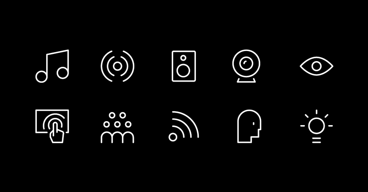
Icons are small designs with a high functional impact. In design, this means you can condense a large quantity of information into its minimal form of expression. In other disciplines, however, icons have a different meaning.
With this in mind, graphic designer and icon enthusiast Hermes Mazali (@hmazali), shares some of those meanings with the Domestika community and gives us some tips to recognize an icon and distinguish it from a pictogram.

What is an icon?
An icon is a symbol that maintains a likeness with the object it represents. The word originates from the Greek eikon, which means 'image' and 'clue.' Generally, icons are used to communicate information without the need for words.
They are symbols with a high degree of meaning, and they are easy to decode, yet sometimes they need an anchor for better interpretation. Icons start from a concept and a style of their own and communicate a message or a function. They are characterized by relevant visual treatment, their graphic freedom, and their color palette.
Icons hold an essential balance of function, synthesis, and aesthetics to create a language that everybody can understand regardless of language, race, or age. The key is to hold a great deal of information in something minimal that can immediately deliver the message.

What are the main applications of icons?
Because they are a powerful tool for visual communication, they can be used in various systems and media: in building signage, museums, airports, and many other corporate applications. They are also applied in the media and infographics, in user interface design, in mobile devices, and for using the internet.
The primary use of icons happens in the digital world and multimedia design.
Now that we know what an icon is and before we can start designing one, we must first understand what distinguishes icons from pictograms.
What are the differences between icons and pictograms?
The main difference is that an icon has greater artistic freedom. A pictogram schematically represents symbols and objects, without detail. One could say that it is the visual representation of a particular object with a high degree of abstraction.
The constraints of a pictogram are more significant than those of an icon because its meaning should always be clear and should be recognized by any culture, language, country, or faith. A pictogram must be extremely synthesized, reduced to its most basic expression.
Many pictograms tend to be used on warning and protective signs. They are more objective and formal, and their style is limited and strict. A key to identify them is that they appear as silhouettes. Pictograms are more formal, and icons, aesthetically speaking, are more fun in communicating a message or a concept.

Hermes Mazali teaches the Domestika course 'Introduction to Icon Design,' a great way to learn the process, techniques, and methods to create your own family of icons, from inception to exporting to different media.
You may also like:
- Design of Pictograms, a course by Romualdo Faura.
- Creation of an Original Logo from Scratch, a course by Tatabi Studio.
- Susan Kare: an Iconic Career.


0 comments