


@harry_davies
Calligraphy Tutorial: How to Draw an Ampersand in Just 4 min

Learn to draw the symbol & with these tricks and tips from Joluvian and apply them to your lettering projects
When we start lettering, it’s interesting to begin with the letters and symbols that are most common. That way, we can take what we learn from them and use it on more complicated commissions, adding the tools to our repertoire one by one .
In order for you to be able to enter the world of lettering with the best, Joluvian (@joluvian), graphic designer, calligrapher, typographer and illustrator, will share a few tips in the following video on how to draw an ampersand, the well known “&” sign, by hand.
What is an ampersand?
Basically, the ampersand (the & symbol) is a ligature, combining E and T to make this third symbol. As you probably already know, it is a more stylized way to simply write “and”.

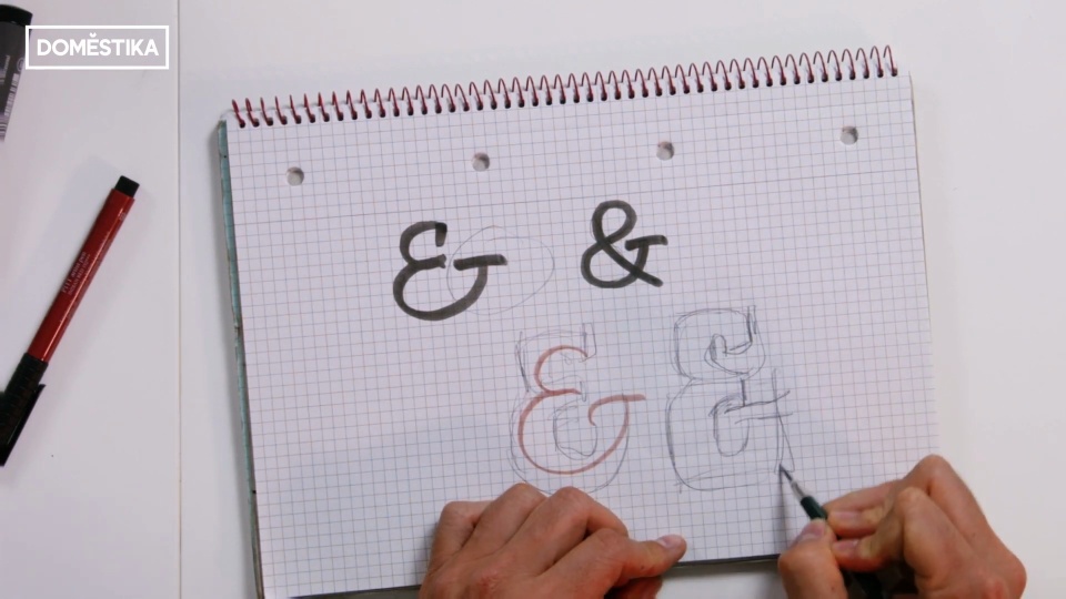
Drawing the ampersand
Joluvian recommends that we start with a sketch, looking for a shape as thick as possible so that we can later work on the textures in depth. The idea is to start drawing something similar to an eight, but giving it the extension that corresponds with the letter T.
The designer insists that, from the beginning, even before we start drawing or adding details, we must know what type of letter we want to achieve. If we don’t make the right adjustments before adding color, it will be much more complicated to adapt the letter to our requirements.

The importance of the finish
Joluvian insists that, beyond the internal form of the letter, we must think about the finish and contours we want to give it. In other words, do we want it to be more rounded, more square or somewhere in between?
We can also combine both approaches within the same letter, opting for more rounded endings in one area and more square ones in another. The important thing is that, stylistically, it is coherent and intentional.

If you liked these tips from Joluvian, remember that you can learn to draw letters, symbols, numbers and illustrated monograms with him in his online course 'Artistic Lettering: Tips to Decorate your Letters'.
And if you want to give your logo designs a personal touch, check out the Domestika course 'Design of Calligraphy Logos'.


0 comments