Typography Tutorial: 3 tips for choosing a typeface
Practical tips for choosing a typeface, to take into account before starting your graphic design project
When we want to communicate something, it is as important to decide what we say as how we say it: content is as important as form. When starting a graphic design project in which we are going to include text, this rule is even more essential: the typography we choose (the form) will completely transform what we want to say (the content)
To help you when choosing a typography for your project, the graphic designer specialized in editorial design Enric Jardí (@enricjardi) has 3 essential tips to always keep in mind
1. Reading fonts and display fonts
Most probably, in our project there will be texts of different sizes: headings, subheadings, whole paragraphs of smaller text... knowing the difference between reading and display typefaces will help us to choose the right typeface for each of the sizes.
Reading typefaces
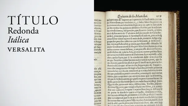
Although obviously all typefaces are for reading, we call reading typefaces those that arose for use in small-sized books, such as Roman and the different types derived from it (round, italic, small caps and larger for covers and other titles).
Typographies display
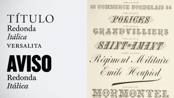
With the rise of signage, letters "go out into the street" and the need to create typefaces that can be seen from far away is imposed. This is how display typefaces were developed, among them the stick, Egyptian or ornamented ones, letters built no longer with materials such as metal but with other more malleable ones such as wood.
The display are more suitable for posters, short texts or similar needs, and it is not recommended to use them for the normal text of a book.
2. Paper typefaces and screen typefaces
When we start designing on our computer, there will be two typefaces that we can use: those created expressly for digital use and those that already existed before and were "imported" for computer use.
Paper typefaces
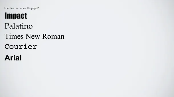
Whether for reading or display, paper typefaces were created before the appearance of digital design. They are letters such as Times New Roman, Palatino, Courier, Impact or Arial. Although they have obviously been adapted for computer and their use is widespread in the digital world, they are considered to look better in print than on a screen.
Screen typefaces
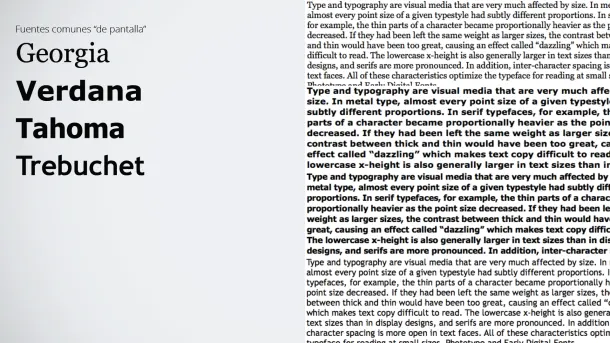
These are typefaces that were designed especially for computers and that are considered to look equally good both on paper and on screen: Georgia, Verdana, Tahoma, Trebuchet....
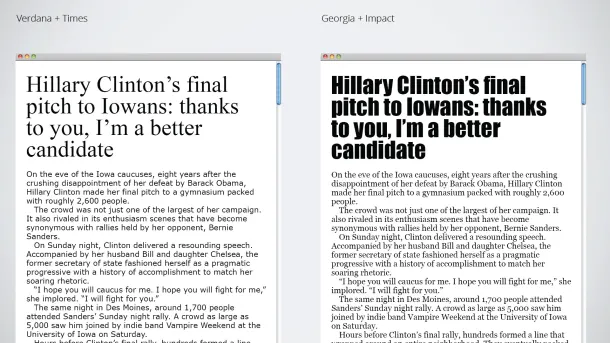
Therefore, if for example we are designing a website, the ideal will be to use screen typefaces for small bodies (since they are better optimized for computer) and paper typefaces for titles, subtitles or other highlighted texts.
3. Each typeface tells a different story
This is the basic rule of the editorial designer: we must choose the typeface that fits exactly what we want to tell. Because each typography has its own style, and each of them tells us completely different things.
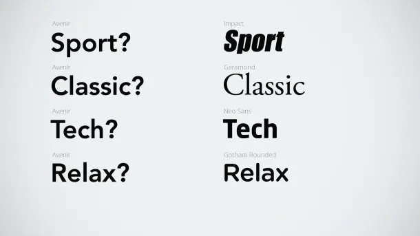
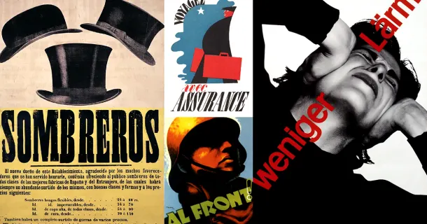
But, beyond taking into account what each typeface works for, it is important to consider what it does not[/i] work for. As we will see in the following photographs, a Gothic typeface can work for a rock band or for a book about the Middle Ages, but it will look very strange if, for example, we use it on a dentist's business card:
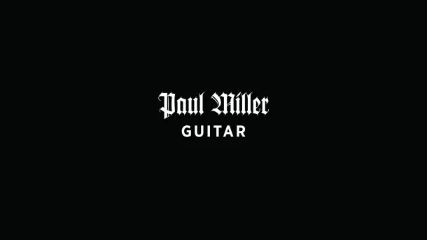

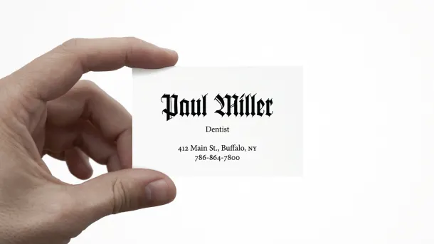
If you liked these tips, remember that in his online course 'How to choose typefaces', Enric Jardí expands on many of the keys mentioned here, helping you to discover what each typeface has and how to choose them for your work.
You may be interested in
- Typography and branding: designing an iconic logo, a course by Quique Ollervides.
- Editorial design: how a book is made, a course by Enric Jardí.
- Basic principles of typographic design, a course by Latinotype.
- Microtypography: basics of typesetting, a course by David Kimura.
- Art and design book editing, a course by Julius Wiedemann.


0 comments