


7 Impactful Brand Logos That Reflect Evolving Design Trends
We explore the evolution and current design trends seen in the iconic logos of seven companies, big and small
A successful logo should represent a brand, reflecting the purpose and needs of the organization. It should be identifiable, bold, and impactful wherever it is encountered.
But, as the theme for this year’s International Design Day (April 27), “Suspended in Transition”, suggests, designers are working in a period of change. How is this affecting the evolution of and trends within logo design?
Here, we speak to brand and design studio Friendhood's (@friendhood) co-founder, Izzy Bunnell, to identify the key trends, and explore their impact on brands as reflected in the seven logos below.
What is a logo?
A logo is a symbol or typographic representation of a company that exists within a wider system: the company’s brand identity. That means a logo needs to give an idea of the company’s purpose and values. There are four parts of a logo to consider:
1. A marque: a symbol or shape that represents the organization.
2. A wordmark: the company name written in a specific font and style.
3. A monogram: a type-based representation, usually of the company’s initials (think Yves Saint Laurent, a.k.a. YSL).
4. A lockup: a combination of the above marque and wordmark.
Logo trends in fluctuating times
International Design Day is on April 27, and this year the initiative encourages designers to reflect on change. As the website states, “The pandemic and its related crises have shown how some phenomena of our time will not end definitively, but will instead usher in [...] uncomfortable and unclear states.” They stress that now is the time to be “rethinking everything from the ground-up.”

Perhaps it's no surprise then that we've seen many a rebranding and restyling of company logos in the last couple of years.
An illustrator and visual designer, Izzy launched Friendhood Studio—alongside designer and art director Alex Reece—to help brands define their purpose, better connect with their audience, and create positive social and economic impact. Their client list includes Penguin Random House India and Hush Womenswear.
Closely following global changes and responses to them, Izzy identifies some key trends we’re seeing during these times of upheaval:
1. Renewed simplicity: removing gradients and 3D effects.
2. Modern retro: serif fonts, and big brands revisiting historical logos.
3. Flexibility: logos that change color and style but stay recognizable.
4. Wordmarks: logos that stick to typography, perhaps to make the brand name clearer.
5. Animated: dynamic logos that belong in the digital sphere.
So, what does this look like in practice? Here are seven companies, both international and local, who have responded to the flux state of the 2020s with interesting logo designs and redesigns.
Seven impactful logos exploring key trends
1. Volkswagen
Many car manufacturers have simplified their marques recently. VW revisited a style similar to its 1967 design, but with even slimmer letters and a sleek dark blue hue.
On the subject of simplification, Izzy noted that it could be “a reaction to the increasingly digital world, where elements sit closely beside each other more and more. Simplistic logos stand out. Taking away gradients, making logos more smooth and modern, creates a refreshing and relaxing look.”
She adds that it may also link to the lack of control we’ve all felt in the last few years—we could draw a line between this and the desire for simplicity and clarity.
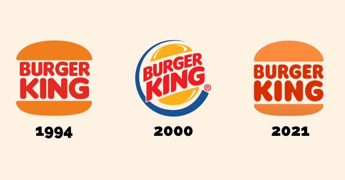
2. Burger King
Burger King's latest logo abandons the “shiny” look and refers back to its visual identity from the seventies through the nineties with a nostalgic, minimalist aesthetic. The shift coincides with the company’s commitment to more natural ingredients.
“It was really good to see a big company be bold with their choice,” Izzy comments, “I think smaller companies usually have the privilege of being more experimental. With a large brand that’s more recognizable, you have a lot more parameters you have to stay within… But now, chunkier, serif-based texts are more common, and I think that’s a reaction to the times as well. We’re looking for a reminiscent feeling.”
3. Graza
Speaking of reminiscent, the sixties and seventies are everywhere in branding right now, with hippie aesthetics being particularly popular. Izzy offers one example: the trippy website of olive oil company, Graza.
But this brand also exemplifies another trend. Izzy explains, “we’re seeing more wordmarks and a movement towards a primarily typographic approach in logos. This includes monograms too, and I think that’s about making your brand immediately recognizable using words.”
Graza’s site integrates the curly, serif wordmark with playful sketches and a typewriter-style font on their website for an overall friendly look.

4. Google Doodle
“Your brand isn’t just a static logo, it’s a framework,” Izzy tells us. Logos need to adapt to new situations, to affirm your brand’s support for awareness days, or to highlight holiday sales, for example.
Think about the Google Doodle on the search engine homepage, with illustrations marking significant events. Because it’s a key touchpoint and has the very distinct quality of Google’s brand, you can still associate any doodle with Google, even if the artist’s style is very unique.
We highly recommend falling down the rabbit hole of the Google Doodle archive.

5. Nike
Nike also reflects the trend of flexibility. Being able to change your logo’s colors and background essentially gives you instant content, in a time when content is necessary to stay relevant.
The Nike marque, also known as “the swoosh”, is so iconic that you can recognize it in any color, on any background — even with a distortion to its shape. This makes collaboration with artists very simple, and the simple shape can also easily integrate into wearable products.
6. MTV
MTV’s iconic logo has been shapeshifting for years, and continues to be one of the most successful examples of a flexible logo. The logo is both monogram and marque, and regardless of color and texture, the large M with the TV inset is instantly recognizable.
Recently, MTV launched their 80s and 90s collections as their own distinct channels, with these suitably fabulous variations of the logo.
7. San Francisco Symphony
Finally, we have a wordmark-focused logo that reflects the animation trend. Collins designed this incredible identity for the San Francisco Symphony. Izzy comments, “They took a wordmark and made it almost interactive-feeling, by making letters jump up and down to represent music”.
She adds that this is commonplace in Friendhood’s process too now: they often complete a brand package with a dynamic interpretation of the logo that can add even more flair.

So, with design in a state of transition and logos that constantly evolve, what comes next?
Izzy hopes to “see a return towards craft in the design space, and a return to a slower way of working. In logos, a more hand-drawn and letterpress approach would be interesting.” But those logos could also be everywhere, as she adds, “In the metaverse, perhaps we will all have a personal logo—as we have personal brands now.”
Have you seen any logos that reflect these trends, or introduce new ideas? Leave them in the comments!
Get creative with branding by exploring these resources
1. Friendhood Studio’s Domestika course will teach you how to design a logo using illustrator.
2. Then, bring your logo design to life with the help of Holke 79, in this course on animation for typographic logos.
3. Find more logo inspiration with these seventeen talked-about rebranding campaigns.
4. New to graphic design? We have ten online graphic design courses for beginners that will grow your confidence.
5. Have you also considered your brand's name? Read this interview with professional namer Rob Meyerson to learn more.


0 comments