Typography for Building Valuable Brands
A course by Fabio Haag, Type Designer


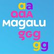

Discover the power of typography in creating valuable and effective branding. Learn how to make informed typographic decisions.

Explore the fundamental principles of selecting typefaces for visual identities, and learn how to make typography the star of any design project with renowned type designer, Fabio Haag.
In this course, you will delve into the impact of fonts on communication and brand personality. With Fabio's guidance, you'll explore the history of letters and their designs throughout different eras, understanding how typography reflects cultural and social worldviews.
Throughout the course, you'll learn about legibility, readability, and the importance of function and expression in corporate typography. Fabio will also provide insights into finding quality fonts, selecting the best options, and justifying your choices.
What will you learn in this online course?
19 lessons & 28 downloads

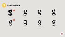
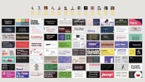

What's included in this course?
To start, you'll discover how typography can benefit businesses and explore the power of visual forms in awakening emotions and connections with the audience. Afterward, you'll dive into the rich history of letters, gaining insights into the evolution of typography and its impact on culture.
Next, you'll explore concepts such as legibility and readability, understanding how to create typography that effectively communicates a brand's message. Fabio will guide you through the intricacies of corporate typography, emphasizing the importance of both function and expression.
Throughout the course, you'll develop practical skills. You'll learn to think critically about design choices, build design briefs, and discover reliable sources for high-quality fonts. Fabio will share valuable tips on font selection and teach you how to defend your choices.
Finally, you'll explore real cases, putting your newfound knowledge into practice. By examining successful projects, you'll deepen your understanding of typography in action and learn how to apply your skills effectively.
- 100% positive reviews (60)
- 2,082 students
- 19 lessons (2h 41m)
- 28 additional resources (14 files)
- Online and at your own pace
- Available on the app
- Audio: Portuguese, German, English, Spanish (Latam), French, Indonesian, Italian, Dutch, Polish, Romanian, Turkish
- Portuguese · Spanish · English · German · French · Italian · Polish · Dutch · Turkish · Romanian · Indonesian
- Level: Beginner
- Unlimited access forever
Recommended software & tools for this course
 Adobe Illustrator
What is this course's project?
You'll have the opportunity to showcase your skills and apply your knowledge practically. Your task will be to select two existing fonts for a company and create a persuasive presentation justifying each choice.
By completing this project, you'll demonstrate your ability to make informed typography decisions and effectively communicate the rationale behind your font selections. It's an opportunity to put your skills to the test and solidify your understanding of corporate typography.
Projects by course students


Who is this online course for?
This course is tailored for curious individuals who find themselves in the position of selecting fonts for various purposes. Whether you're a graphic designer working on a packaging project or a social media enthusiast looking to enhance your posts, this course will equip you with the necessary skills.
If you're involved in creating visual identities, this course is especially valuable. From designers to marketers, entrepreneurs to creative professionals, anyone seeking to expand their knowledge of typography and its role in branding will benefit from this course.
Requirements and materials
To participate in this course, you'll need a basic understanding of graphic design and access to presentation software. As for materials, all you need is a computer with internet access and a passion for exploring the world of typography.
No specific software or tools are required. Fabio Haag will guide you through the course using easily accessible resources and share valuable insights from his years of experience in corporate typography.
Reviews

Fabio Haag
A course by Fabio Haag
Fabio Haag is a highly accomplished type designer known for his expertise in corporate typography. With over 17 years of experience, he has crafted custom fonts for renowned brands around the world, such as Banco do Brasil, Globo, GOL, and Tramontina.
Fabio's unique approach to type design sets him apart, as he combines his creative vision with a deep understanding of business strategy. His focus on anchoring design decisions to the core principles of each client's brand allows him to create typography that adds significant value.
Having worked as a global creative director for one of the largest corporate typography studios, Fabio gained a holistic perspective on how typography can enhance brand communication. He brings a wealth of knowledge and practical insights to his teaching, empowering students to unlock the potential of typography in visual identities.
Content
-
U1
Introduction
-
Presentation
-
Influences
-
-
U2
Theories, history and the science behind the lyrics
-
Brands and typography
-
Feeling the lyrics
-
The written letters tell our story
-
Printed types continue our history
-
The science of the reading process
-
Legibility and readability in practice
-
Expressiveness and functionality
-
-
U3
Putting everything into practice in your project
-
Typographic design brief
-
Typographic search
-
Typographic choice and analysis
-
Defending your typographic choice
-
Licensing
-
-
U4
Real project cases
-
Case Rio2016
-
Case Magalu
-
Case Tramontina
-
Case Globo
-
Case Banco do Brasil
-
-
FP
Final project
-
Custom typographies to strengthen brands
-
What to expect from a Domestika course
-
Learn at your own pace
Enjoy learning from home without a set schedule and with an easy-to-follow method. You set your own pace.
-
Learn from the best professionals
Learn valuable methods and techniques explained by top experts in the creative sector.
-
Meet expert teachers
Each expert teaches what they do best, with clear guidelines, true passion, and professional insight in every lesson.
-
Certificates
PlusIf you're a Plus member, get a custom certificate signed by your teacher for every course. Share it on your portfolio, social media, or wherever you like.
-
Get front-row seats
Videos of the highest quality, so you don't miss a single detail. With unlimited access, you can watch them as many times as you need to perfect your technique.
-
Share knowledge and ideas
Ask questions, request feedback, or offer solutions. Share your learning experience with other students in the community who are as passionate about creativity as you are.
-
Connect with a global creative community
The community is home to millions of people from around the world who are curious and passionate about exploring and expressing their creativity.
-
Watch professionally produced courses
Domestika curates its teacher roster and produces every course in-house to ensure a high-quality online learning experience.
FAQs
This is an intermediate-level course, designed for those with basic graphic design or typography knowledge who want to deepen their skills in brand projects.
It’s recommended to have prior graphic design knowledge and a basic understanding of typography to get the most out of the course content and exercises.
You’ll learn how to analyze, select, justify, and present typography for brands, explore font creation processes, understand legibility criteria, and apply visual identity and branding concepts.
The course teaches practical methods for typographic selection, considering technical criteria, expressiveness, historical context, visual alignment, and the needs of visual identity projects.
Yes, the course covers techniques for building strong arguments and presenting your typographic choices confidently, plus strategies for defending proposals with corporate clients.
Yes, you’ll explore the process and challenges of developing exclusive typefaces, including building font families, ensuring consistency, and optimizing for various uses.
The course examines how the right typography impacts visual identity, market differentiation, and brand value perception—both functionally and emotionally.
 Adobe Illustrator
curso completo
Curso muito bom! Auto explicativo, introdução incrível à tipografia!
que curso completo!
material excepcional, explicação nível master. Para uma pessoa completamente leiga em tipografia, você sai do curso sabendo mais de 99% das pessoas ao seu redor
Um profissional incrivel só poderia ter um curso mais incrivel ainda, to aproveitando cada segundo dessas aulas!!!
Este curso es fabuloso: Claro, profundo y completo. Imperdible.