


Lettering Tutorial: Hand Lettering Design Using Layers
Learn professional hand lettering tricks with step-by-step instructions so that you can confidently start from scratch, with Cyla Costa
Lettering allows you to create fascinating, exuberant and fantastic visual stories. It generates fantastic universes using combinations of colors and shapes. This technique has evolved since the dawn of time, when we first started using symbols to create meaning and label the world around us.
The possibilities are endless, which means you can experiment with combining manual and digital techniques. Cyla Costa (@cylacosta) is a lettering artist, designer and illustrator. She shares her step-by-step lettering exercise using layers to explore a range of creative opportunities.
Watch the video!

Design your basic skeleton
Start by designing the basic skeleton/outline for your lettering. In this example, we’re going to work on one word in italics and the other in block capitals to demonstrate the differences between them.

Use A4 paper
A4 is the ideal format for starting to work with lettering. It gives you enough space and comfort, unlike A3 which makes your arms work more.

You can always consult a lettering handbook to help you include details like the thickness or serifs.
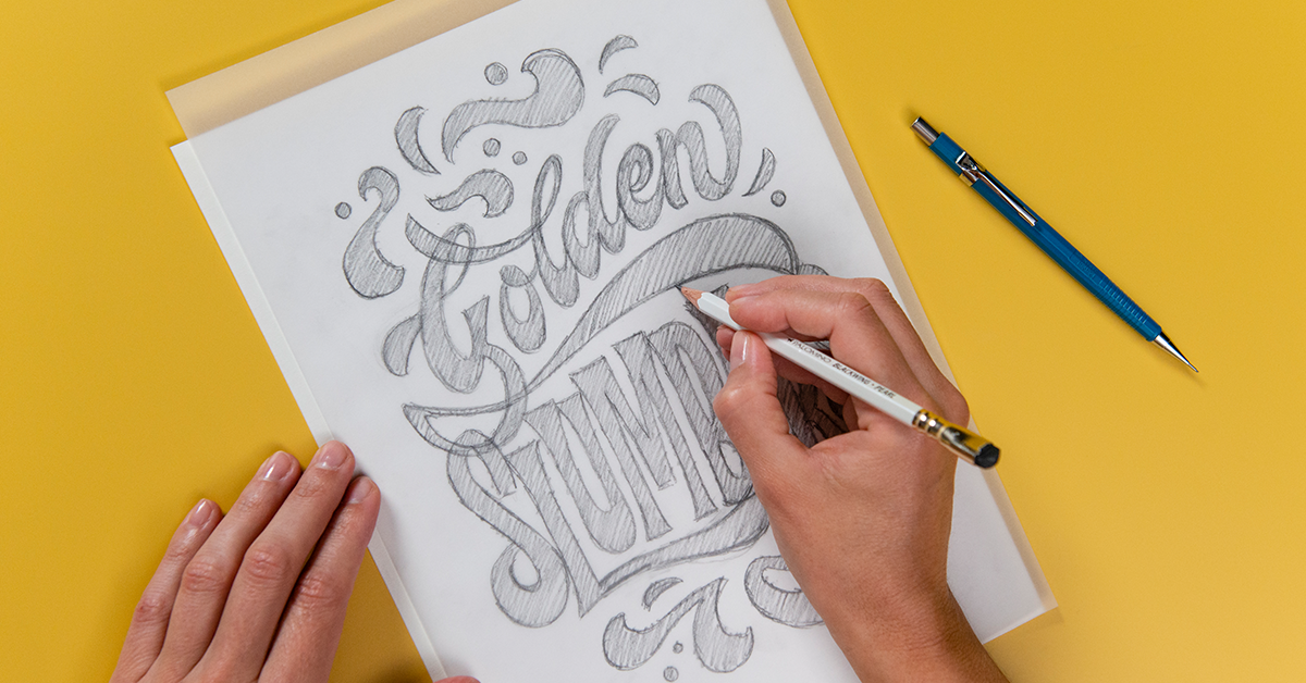
Use tracing paper to create layers and improve your design
Once you have finished the initial details and volumes, use tracing paper to improve your design and try out different parameters. The great thing about tracing paper is you can move it around and check the changes to your original design without messing up the original.

Test and vary your lettering
Now it’s time to start testing and playing around with your lettering. Always remember to number each layer so you can identify the versions you’re working on. This will make your work easier and provides great variety, as well as allowing you to see and analyze your progress. This interesting method allows you to go back to earlier versions in a logical order.

Use flourishes and details
Details and flourishes are important and useful when it comes to filling in empty spaces and giving your lettering character and harmony. You can use little illustrations like stars, lightning and lines.


Stop when you’re happy with your result, because you could go on forever. And... always remember to number your layers!
Love this tutorial? Learn how to discover your own style and create expressive lettering by combining digital and manual techniques in Cyla Costa’s online course: Introduction to Custom Lettering.
English version by @studiogaunt
You may also like:
- 8 Fun iPad Apps for Lettering and Calligraphy Practice
- Curious Minds Podcast: Why do People Hate Comic Sans?
- 6 Free Tutorials: Lettering and Calligraphy for Beginners
- English Calligraphy From A to Z, a course by Bego Viñuela Galarraga
- Calligraphy and Lettering for Instagram with Procreate, a course by Nubia Navarro


0 comments