


Domestika Projects: Greetings From Ha Tachana
The Ink Bad Company's founder tells us about one of his most exotic illustrated projects: postcards from Tel Aviv
My name is Juan Carlos, and I manage a one-person studio devoted to illustration: Ink Bad Company. I was born in a small town in Jaén (Andalucía, Spain), where I learned to harvest olives the traditional way, by shaking the trees. I made my mother happy choosing to study in Granada instead and ended up moving to Valencia, where I'll happily draw anything in exchange for financial compensation.
My field of expertise is adult, commercial, and media illustration. And even though I have worked for important clients and agencies in pretty awesome projects, I want to believe that I really draw for myself at the end of the day.
I love to dig into my brain, extract things that I have seen out there, mix them as well as possible, and try to make the result drinkable and tasty. Basically, this is how I work.

The seed of the project
The Greetings From Ha Tachana project came about because of Roger Omar, a Mexican friend, editor, and restless ass. One afternoon in April, a couple of years ago, we were at a bar in the Plaza del Xúquer, Valencia. He told me about the possibility of exhibiting some of my work in a gallery in Tel Aviv that he had already worked with. After resisting for as long as I could, I ended up agreeing to the deal, and that's how this story began.
Initially, I was tasked with making an illustration that would work as a poster for the exhibition. At some point, this original idea morphed into making a small souvenir, a postcard, that attendees could take home.
We ended up making a limited edition illustration printed in three inks using silk screening that we sent to Tel Aviv.


A digital creative process inspired in the analog world
For some time now, the digital part of my work has been eating away at the analog part. First, out of necessity (very tight timings and whimsical changes) and then just because it's easier. Nowadays, everybody is used to doing everything on a computer.
I'm still passionate about drawing and ink on paper, it's what I enjoy the most, but I admit that I'm now using a Cintiq. For me, it is a different way of drawing, more conscious and detailed. It forces me to synthesize what I'd create organically, drawing on paper.
I find the idea of "processing" an image attractive, but, otherwise, I'm very self-sufficient: no plugins, preset packages, or external software.

Inspiration and references: from the US West Coast to the Mediterranean
I've never been to Tel Aviv, so the first step was pretty obvious: open Google and browse around a bit.
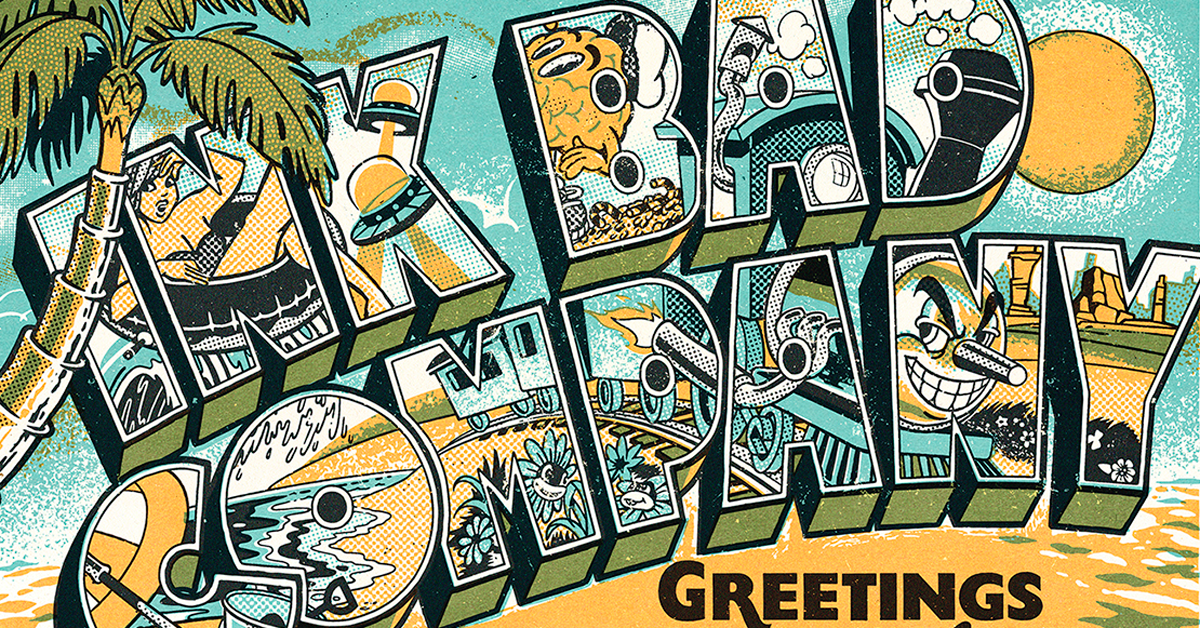
Ha Tachana, the gallery's location, was the former terminus of a railway connecting Jaffa to Jerusalem. It has been restored and turned into a cultural and leisure center. The station is almost on the beachfront, just a step away from the promenade, so this location already offered me the perfect ingredients–the train and the exotic beaches of Tel Aviv–, to put together this souvenir postcard idea.
Resorting to the iconic American postcard ("Greetings from CALIFORNIA") was not an incredibly revolutionary idea, but it was a practical decision. Those of us who work in illustration should stick to the basics sometimes, rather than go crazy searching for a unique angle. Using these recognizable elements, which anyone immediately associates with the concept of a postcard, made things a lot easier. I already had half the work done. I'm not a conceptual illustrator. I'm more interested in form. The only thing left to be done was to sketch everything and see how it looked, what worked, and what needed to change.

Following the original references, the image is composed of a bold, extruded lettering that takes up most of the space. Within the text, as a filler, I distributed all the graphic paraphernalia: the cartoon train, the beach, a wave, a bather on a float, a bouquet of flowers with a face, a brain with a sailor's cap, and a couple of flying saucers.
To all this, I added a second block of text and wrote the name of the exhibition as a subtitle using two different fonts, one simulating handwritten script and the other with a certain American flair. They worked well as a contrast to the main lettering.
Finally, I added a simple background that gave the piece the beachy atmosphere it needed.
As for the color, the palette was limited from the beginning to three different inks (black, blue, and orange) due to the silk screening process. My usual coloring technique adapts well to the requirements of silk screening, so everything went smoothly. We just had to pay special attention in the workshop and do some testing to get that fourth green color (overlapping blue and orange) right, but that was it. In the end, it turned out quite well.

Don't forget to share your projects with the community!
This article was written by Juan Carlos Guerrero, founder of the Ink Bad Company Studio (@inkbadcompany), illustrator, and graphic designer. Juan Carlos teaches how to create retro-inspired illustrations with analog and digital techniques in the Domestika course Lowbrow Illustration: Go Back to the Past in Style.
English version by @angeljimenez.
You may also like:
- What is Doodle Illustration?
- Challenge: Draw Captain Spock in Tones of Pink
- Domestika Diary: Lapin


0 comments