


@harry_davies
Blue Note: Where Jazz and Design Met
Learn the history of the jazz record label that has been defining jazz’s aesthetic and sound since 1939
Imagine a classic jazz record sleeve.
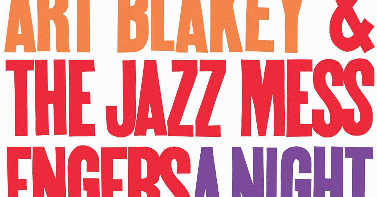
Chances are you’re imagining a smartly cropped photo of a sharply dressed black man with his instrument. The photography gives off a sense of action; maybe there is more than one image from the same moment, giving a sense of illusion. The cover isn’t a black and white photo but two-tone, the darker parts of the image contrasting with a blue, green, or orange maybe. A compact and creatively placed typography tells you who the artists are. The final touch: the simple and elegant logo of Blue Note records, the finest in jazz since 1939.
Blue Note was founded by two Jewish German immigrants who came over to America, saw this new movement that African Americans were pioneering, and realized they needed to document it. Those two men were photographer Francis Wolff and Alfred Lion. The record label would set the tone for jazz, specifically hard bop, it’s aesthetic, and it’s development, for what is now approaching eight decades.
The label was one of a flurry of others, including HRS the year before and Commodore the year before that. Those behind the companies were initially hobbyists but the labels that stuck were the work of people who quickly got wise to the challenges of the record industry.

Wolff and Lion knew they had to find a way to stand out from the crowd. They wrote a manifesto that continues to guide the company, just a few short paragraphs that set their mission statement: make uncompromising music rooted in authenticity.
Finding the music was the responsibility of producer and engineer Rudy Van Gelder. His ear helped build a roster of artists that included Miles Davis, John Coltrane, Herbie Hancock, Thelonius Monk, Lee Morgan, and many more.
In the same way that the music of Kendrick Lamar is heard at Black Lives Matter protests today, or Public Enemy wrote the anthems of political resistance in the 80s and 90s, these jazz musicians were the soundtrack to the civil rights movement in the 50s and 60s.
This was reflected in their style too. Artists could be seen in exquisite suits and beautiful cars, their sartorial and musical elegance and ingenuity its own resistance to the racism of the day. Their cover art had to communicate that same sense of sophisticated revolution.

As Holke 79 explains in the Domestika course Advanced Animation for Typographic Compositions, great album design needs a designer who knows the motivations of the group or sound they are trying to capture.
At Blue Note, this fell to the founder and photographer Francis Wolff and graphic designer Reid Miles. They took the inimitable components of jazz culture, stayed true to the essence laid out in Blue Note’s manifesto, and made artwork that caught people’s attention in record stores.
Wolff took the photographs, shooting pictures of the artists’ sessions as soon as the label began. Then, Reid would rifle through each one to find the perfect shot. His eye would lock in, not an entire image, but a section he would crop to create that sharp jazz effect.
In the 60s, Blue Note was well-established, and Miles grew more confident. He even began to omit photos entirely, trusting in his skill with typography. Jazz was defined by the innovation of its artists, and Miles´ album covers were no different.

Miles authored over 500 album covers before he left the label in 1967. The funny thing is: he didn’t actually like jazz.
If you want to learn more about where typographic design has got to today and achieve spectacular results with your own typographic animations, check out Holke 79’s course Advanced Animation for Typographic Compositions.
You may also like:
- Art Direction for CD covers, a course by Goster
- Illustration for Music Lovers, a course by Oscar Giménez
- The Art of Record Covers: Illustration Meets Lettering, a course by Steve Simpson


0 comments